Nifty Toota Hai Par Market Nahi: What History Tells Us About the 200-Week Breakdown
-
Nifty just broke its 200-week average. What happens next?
The Nifty has finally slipped below a critical line it defended fiercely for more than six years. If history is any guide, we should brace ourselves for some short-term pain. But there is a fascinating plot twist this time—the broader market is refusing to script the same horror story.
On Tuesday, September 29, 2026. The Economic Times reported a major technical breakdown: the Nifty cracked below its key 200-week moving average (WMA) for the first time since the 2020 Covid crash. By the close of the trading week on Thursday, the Nifty finished at 22,421.95, sitting below the average line which was hovering around 22,607.
To make matters worse, this marked eight consecutive weeks of losses—a painful losing streak we haven't witnessed since all the way back in 2001.
Now, I don't usually rearrange my entire portfolio just because an index crosses a random line on a chart. But a 200-week moving average isn't something you can easily ignore. Think of it as the ultimate long-term baseline—the mathematical average of the last 200 weekly closes, or roughly four years of market action. In plain English? The Nifty is officially trading below its average price level of the last four years.
The "Khaya-Piya Kuch Nahi" Phase of Investing
Let’s look at what this actually means for your hard-earned money.
Imagine you started a disciplined ₹10,000 monthly SIP in the Nifty back in October 2022. Fast forward to today, and you would have painstakingly deployed ₹4.8 lakh out of your pocket. Even if we count all the accumulated dividends, your portfolio value would stand at roughly ₹5.03 lakh today.
That works out to a meager 2.3% annualized XIRR.
After four years of diligently automating your investments every single month, it honestly feels like:
"Khaya piya kuch nahi, glass toda barah aana!"
[Literally: 'Ate or drank nothing, but still paid for the broken glass' — a classic cultural idiom used when you get absolutely no benefits but bear all the underlying costs and frustration.]This week's headlines have already told us what went wrong. But what got me really curious was the bigger picture: What historically happens after the Nifty snaps this 4-year floor? More importantly, how should a regular investor react?
To find out, I dug into the data and analyzed first breaks since 1995. Here is what the numbers reveal.
A. What happened the last five times?
A recent article by Business Today pointed out that the Nifty has decisively broken this line only twice before—during the 2008 Global Financial Crisis and the 2020 Covid panic. While those are certainly the two nightmares freshest in everyone's minds, they aren't the full picture. If we look all the way back to 1995, I count five distinct, meaningful breakdowns.
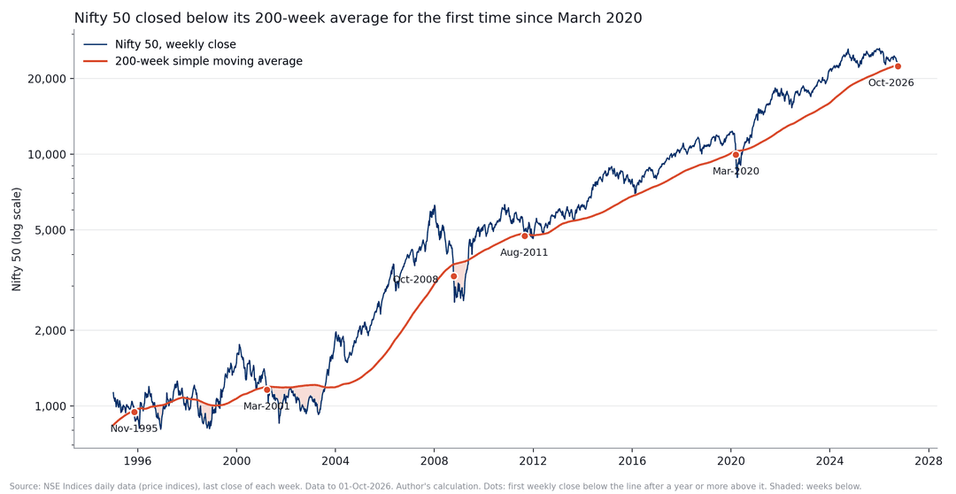
Nifty 50 weekly closes vs. the 200-week simple moving average (1995 to 1 October 2026). Dots mark first breaks; shaded areas show weeks spent below the average. Source: NSE Indices daily data; author's calculation.Interestingly, three of those historical episodes look a lot more like our current market than the vertical crashes of 2008 or 2020.
For this study, I defined a "break" strictly: it has to be the very first weekly close below the 200-week average after the Nifty has spent at least one full year safely above it. This helps filter out random, minor dips where the index briefly blips below the line and pops right back up a couple of weeks later.
Here is how the data looks across history:
Break week Close 200-week avg Weeks above before Below peak Weeks since peak Weekly RSI 10-Nov-1995 948.82 961.95 74 −31.2% 59 39.3 23-Mar-2001 1,161.30 1,193.65 98 −33.9% 58 35.6 10-Oct-2008 3,279.95 3,654.04 271 −47.7% 40 24.6 26-Aug-2011 4,747.80 4,830.86 118 −24.8% 42 28.0 13-Mar-2020 9,955.20 10,301.71 426 −19.4% 8 22.5 1-Oct-2026 22,421.95 22,606.97 327 −14.8% 39 30.9 First breaks of the Nifty 50 200-week average since 1995. "Below peak" is relative to the highest weekly close up to the break week.
Looking closely at the numbers, these five historical precedents clearly split into two very different regimes:
- The Sudden Crash (2008 and 2020): This is the violent kind of market correction. The Nifty fell hard and fast, completely blindsiding investors. By the time it actually broke through the 4-year moving average floor, it was already sitting on massive peak-to-trough losses of 19% to 48%, dragging the weekly RSI deep into the oversold 20s. In 2020, this entire destruction unfolded in a breathtakingly fast eight weeks.
- The Slow Bleed (1995, 2001, and 2011): This environment feels entirely different—and it mirrors exactly what we are experiencing today. Instead of a sudden cliff, the market simply drifted lower, exhausting investors over 10 to 14 months. The index eventually shed 25% to 34% from its highs, but because the decline was so gradual, the long-term moving average had plenty of time to catch up to the falling price.
The million-dollar question, of course, is: What happens to your money after the break happens?
Let’s look at the forward-looking returns from the exact week the line snapped:
Break week Kind Nifty below its peak Further fall within a year Nifty 1 year later Nifty 2 years later Nov-1995 slow fall −31% −14.1% −6.8% +13.3% Mar-2001 slow fall −34% −26.4% −2.0% −11.3% Oct-2008 crash −48% −21.2% +50.8% +86.1% Aug-2011 slow fall −25% −2.6% +13.5% +15.2% Mar-2020 crash −19% −18.8% +51.0% +67.1% Oct-2026 ? −15% ? ? ? "Further fall" indicates the absolute lowest weekly close during the subsequent 52 weeks relative to the break-week close. Returns are calculated using the raw price index (excluding dividends).
B. A few things immediately stood out to me:
1. Usually, the pain doesn’t stop here
In four out of the last five historical cases, the Nifty didn’t just bounce back immediately. It went on to drop another 14% to 26% at some point over the next 12 months.
The lone exception was 2011, where the extra downside was just a minor 3%.
To put this into perspective, a drop this steep isn't something that happens in a normal, random year. If you picked any random week on the calendar since 1995, the odds of the Nifty falling another 14% or more over the next year were only about 3 out of 10.
Translation: When the Nifty cracks its 4-year floor, it is a clear warning sign that the near-term risk of losing money is much higher than usual.
2. Spectacular recoveries happen after sudden crashes (Not slow bleeds)
There is a massive psychological difference between how a market recovers based on how it fell:
- After the Crash Breaks (2008 & 2020): If you had the guts to stay invested and keep your SIPs running through the panic, the rewards were massive. One year later, the Nifty shot up by nearly 51%.
- After the Slow Bleeds (1995, 2001, & 2011): The recovery was frustratingly ordinary. One year later, your returns would have hovered anywhere between a dull −7% and a modest +14%.
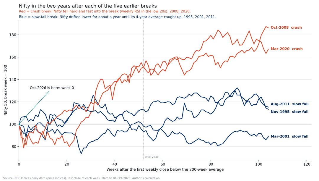
Nifty in the two years after each break, with the break week set to 100. Source: NSE Indices daily data, author's calculation.Right now, our market looks much more like a slow, exhausting bleed than a sudden panic crash. It has taken the Nifty a long 39 weeks to slide 14.8% from its January 2nd peak. In fact, compared to every historical correction we analyzed, this is actually the shallowest drop of the lot.
Our weekly RSI is sitting at 30.9. Compare that to 2008 and 2020, where the RSI was already deep in the painful low 20s.
Look at this as a key pattern to monitor—not a magical crystal ball predicting the future.
3. Nifty toota hai par market nahi!
(The Nifty has broken, but the broader market hasn't!)
This is by far the most fascinating takeaway of this entire study.
The recent Economic Times headlines warned that mid-caps and small-caps have been under immense pressure over the last few days. While that short-term volatility is true, the long-term, 4-year picture tells a completely different story.
In past crises (like 2011 and 2020), when the Nifty broke its 4-year baseline, small-caps and micro-caps were already absolutely crushed—trading way deeper in the red than the Nifty. Today, the exact opposite is happening!
Look at the stark difference in the data:
Distance from its own 200-week average Nifty 50 Midcap 150 Smallcap 250 Microcap 250 Aug-2011 break −1.7% +0.5% −4.0% −17.3% Mar-2020 break −3.4% −8.8% −25.6% −40.4% 1 Oct 2026 −0.8% +15.3% +17.6% +27.7% (Note: Reliable small-cap index data from the NSE starts in 2005, meaning we can only track this specific 200-week average comparison from 2009 onwards).
Here is the kicker: In all the weeks since 2009 where the Nifty was trading below its 200-week average, the Smallcap 250 was never trading above its own line. The closest it ever got was in August 2011, when it was still 4% below its average floor. Today? It is sitting comfortably 17.6% above its baseline!
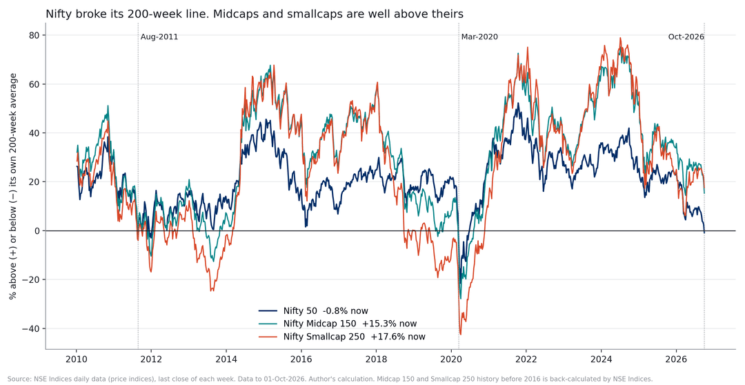
How far the Nifty 50, Midcap 150, and Smallcap 250 sit above or below their own 200-week averages. Source: NSE Indices daily data, author's calculation. Small and midcap history before 2016 is back-calculated by NSE Indices.So, at least for now, this isn't a whole-market meltdown. This is primarily a large-cap problem.
If the bulk of your money is parked in Nifty 50 index funds or top large-cap stocks, this breakdown signal applies directly to you. But if your portfolio is packed with small-caps, your charts look completely different right now.
This doesn’t guarantee that small-caps will keep soaring, nor does it mean large-caps are guaranteed to shoot up and catch up. The data is simply showing us that the two halves of the Indian stock market are living in two entirely different worlds.
As smart investors, the very least we should know is: which of these two markets do we actually own?
C. So what can investors do?
Nobody can call the bottom. Definitely not me.
But we don't necessarily need to know the exact bottom. What historical data can help us do is understand the possible risk and decide beforehand how we want to react if that risk actually comes.
Let's talk about the risk first.
In four out of the last five times the Nifty broke this line, it didn’t just stop there. It went on to slide another 14% to 26% over the next year. To put that into perspective, let’s look at your actual portfolio. If you currently have ₹10 lakh invested in Nifty index funds or large-cap stocks, a drop like that means your screen will temporarily show your portfolio shrinking to somewhere between ₹7.4 lakh and ₹8.6 lakh.
Be honest with yourself: how would you feel seeing that red on your screen? More importantly, how would you react?
This is exactly what you need to figure out before you deploy fresh cash. If your honest, gut-level answer is, "If my ₹10 lakh drops to ₹7.5 lakh, I will panic and pull all my money out," it is much better to acknowledge that fear right now—before you actually have to see it happen.
1. Accumulate slowly
When nobody knows the bottom, one very old solution is simply to spread out the buying.
I wanted to see whether that actually helped after earlier 200-week breaks. So I tested a simple approach. Assume an investor puts the same amount into Nifty every month for 12 months, starting from the week in which the 200-week average breaks. Here is what happened.
Break Average buying level vs break week Gain 2 years after starting Gain 3 years after starting Nov-1995 4.2% higher +7.8% −12.2% Mar-2001 7.9% lower −5.2% +58.5% Oct-2008 3.9% higher +80.1% +46.1% Aug-2011 5.9% higher +8.9% +57.2% Mar-2020 13.9% higher +48.8% +51.3% A 12-month SIP started in any month since 1995 (median) +18.7% +33.6% Gain on the total money invested, using the price index and excluding dividends and costs.
If you look at how things played out over a two-year horizon, the results were a bit of a mixed bag. In three out of the five past instances, starting an SIP right when the market broke its 200-week moving average actually gave poorer returns than an SIP started at any random, ordinary time.
But if you had the patience to hold on for three years, the picture completely flipped. Suddenly, four out of those five "break-period" SIPs comfortably beat a regular SIP. In fact, the median gains were a stellar 51% compared to just 34%. The only painful exception was 1995, a time when the Nifty practically went into a deep coma and refused to move for years.
So, what’s the real-world takeaway here? It’s not a fancy trading signal like "the 200-week break means buy everything right now." It is much simpler: historically, these rough patches have been excellent windows to accumulate assets patiently—as long as you don't touch that money for at least three to five years.
Another fascinating trend popped up in the data. If you had deployed a lump sum the exact week the market broke, you would have actually beaten a 12-month staggered SIP in four out of five cases! So, spreading out your money didn't really boost your returns most of the time. What it did do was act as an insurance policy during the brutal 2001 dot-com crash, cushioning the blow while the market kept bleeding.
And that brings us to a massive, often misunderstood distinction: An SIP isn't designed to maximize your returns; it is designed to manage your behavior.
For 95% of investors, the best strategy is also the most mind-numbingly boring one: just keep your monthly SIP running in a low-cost Nifty 50 Index Fund or ETF. You own India's top 50 companies, you don't have to stress over picking individual stocks, and when the market falls, your fixed monthly budget automatically buys you more units at a discount.
In personal finance, being boring isn't a bad thing. In fact, boring is what keeps most people invested.
2. A rule-based route: The MAUKA Strategy
If you prefer a strictly rule-based, objective approach over gut feelings, Definedge's MAUKA strategy is tailor-made for this exact kind of market.
The underlying logic is brilliant yet simple. The strategy patiently waits for the Nifty's weekly RSI to dip into technically oversold territory (below 30). Once that trigger hits, it scans for a basket of the strongest, most resilient momentum stocks that are still trading above their 200-day moving average and above DSmart Walking Line. Prashant Shah thoroughly breaks down the data-backed core of this framework in this video and latest one.
What really jumps out from the historical charts is how beautifully the MAUKA trigger aligns with a 200-week moving average breakdown. They almost always arrive hand-in-hand. In four out of the last five market corrections, a MAUKA signal flashed within just three weeks of the 200-week break. During the brutal drops of 2008 and 2020, both signals flashed in the exact same week.
As of this week, the Nifty's weekly RSI closed at 30.9. We are knocking right on the door, but the green light has not officially triggered yet. If you are planning to add this strategy to your playbook, history leaves us with two invaluable lessons:
a. The signal can drop early (Watch the drawdown)
Catching an oversold market can test your nerves. Back in 2008, if you had deployed ₹10 lakh into the Nifty the exact week the MAUKA signal flashed, that portfolio would have shrunk to around ₹7.9 lakh just fourteen days later. That is a staggering short-term drawdown. To combat this psychological trap, Prashant suggests a staged entry: deploy half your capital the moment the signal enters the oversold zone, and the remaining half only when the weekly RSI recovers and crosses back above 30.
b. Different market cycles crown different leaders
How a market falls dictates how it recovers. Take a look at the stark contrast between a slow burn and a vertical crash:
- The 2011 Slow Decline: After the market dragged its feet, smart momentum plays ruled. The Nifty200 Momentum 30 index gained 11.7% in the year following the RSI recovery, easily beating the Nifty's modest 4.3%. On the flip side, high-risk stocks crumbled, with the High Beta 50 shedding 16.1%.
- The 2008 & 2020 Sharp Crashes: When the market collapsed overnight and recovered violently, the tables turned completely. Momentum took a backseat while the battered High Beta 50 index more than doubled in value.
If our current environment keeps behaving like a slow, bleeding decline rather than a sudden panic crash, the 2011 playbook might be our closest historical guide. But remember, that is still just a sample size of one.
Your next steps: Large-Caps vs. The Broader Market
MAUKA comes in two distinct flavors: a large-cap version and a mid-small cap version.
Because of the massive price divergence we are seeing between large-cap stocks and the broader market today, these two variants are starting from completely different launchpads. Before risking real money, a highly practical approach is to import these pre-saved models as a virtual watchlist on Momentify. Paper-trade them, observe how they handle the upcoming volatility, and build your conviction before going live.
3. For stock pickers: hunt for the "Lions"
If you prefer picking individual stocks instead of passive indexing, there is a brilliant strategy that works remarkably well in a dull or falling market.
It comes from Prashant Shah’s fantastic book, Outperforming the Markets using Relative Strength and Breadth Analysis (2021). He actually dedicated an entire chapter to this exact kind of environment, which you can also read online on the Definedge Shelf chapter on relative strength patterns.
The logic behind this is incredibly simple. You compare an individual stock against the Nifty using a "ratio chart"—which is literally just the stock's price divided by the Nifty's price. If the resulting line goes up, the stock is beating the market; if it goes down, the market is beating the stock.
When the Nifty is sliding, two specific patterns on this chart become very interesting:
- The Lion: The Nifty is falling, but this stock is stubbornly rising anyway. Because it defies the market gravity, the ratio line shoots up. As Prashant beautifully puts it: "The bulls of those stocks are like lions, they are dominant."
- The Bullish Star: The Nifty is falling, and this stock is falling too—but it’s falling way less than the broader market. As a result, its ratio line still moves upward. Prashant calls these "silent performers" because they quietly hold their ground while the financial media ignores them.
The catch? Don't blindly hit "Buy" just yet.
The biggest mistake investors make here is jumping into these stocks immediately while the market is still bleeding. The goal right now is not to buy them today, but to build a high-quality watchlist.
Once the broader market finally stabilises and finds a floor, that's when you check if these stocks are still showing that same resilience. Prashant is very clear about waiting for confirmation: "Wait for the market to reverse before buying bullish lion stocks." If you catch a falling knife during a sharp, aggressive market crash, even a "lion" can turn on you.
Zooming out: The Index Level Lion
Interestingly, you can apply this exact same concept to entire indices.
Look at what has happened since April: the Nifty dropped 5.3%, but the Smallcap 250 index actually shot up 13.4%. If you plot a Smallcap-to-Nifty ratio chart, it looks like a massive Lion pattern at an index level. This perfectly captures the stark divide between struggling heavyweights and a booming broader market that we discussed earlier.
If you want to scan for these setups yourself, Definedge has a brilliant built-in scanner. My colleague @Brijesh-Bhatia has written a highly practical guide explaining exactly how to use it over at Multi-Timeframe RS Patterns.
Just remember the golden rule: use the scanner to build a watchlist, not a blind shopping list!
Two important levels to watch next week
For the coming week, there are two key levels worth keeping an eye on.
First, a weekly close above roughly 22,628 would push the Nifty back above its 200-week moving average. But don't pop the champagne just yet—that alone doesn't mean we're out of the woods. Back in 2011, Nifty climbed back above this average after just one week, only to break down below it twice more over the next four months.
On the flip side, a weekly close at or below roughly 22,307 would drag the weekly RSI below 30 and trigger our MAUKA condition. Remember, these aren't permanent lines drawn in stone. Both numbers will change every single week because moving averages and RSI dynamically shift with price action.
"Girta hua market darr nahi, plan maangta hai."
(A falling market demands a solid plan, not fear.)At the end of the day, I am not trying to predict the future here. For me, this entire exercise is simply about understanding where we stand today, learning how the market behaved in similar historical setups, and keeping our playbook ready if things get uncomfortable from here.
Over to you: How are you handling this current market phase? Let’s chat in the comments below—I'd love to hear your take or discuss these numbers with you!
Educational research only, not a recommendation to buy or sell any security, fund or ETF. Historical figures were calculated on 2 October 2026 from NSE Indices data. Past performance does not guarantee future results. Please consult a SEBI-registered adviser before investing. Investment in securities market are subject to market risks, read all the related documents carefully before investing.