Multiple Ratio Performance feature - UI enhancement request
-
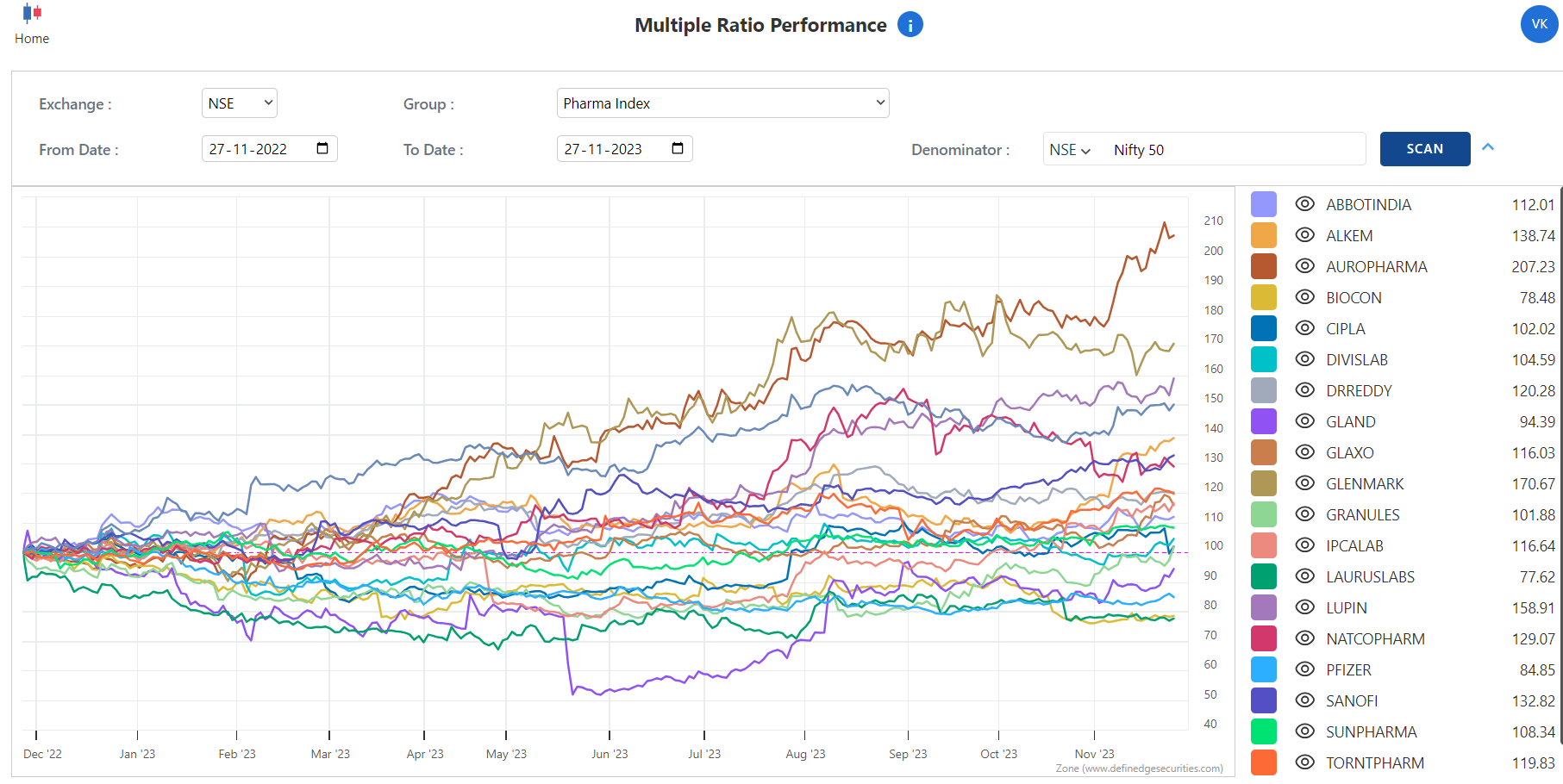
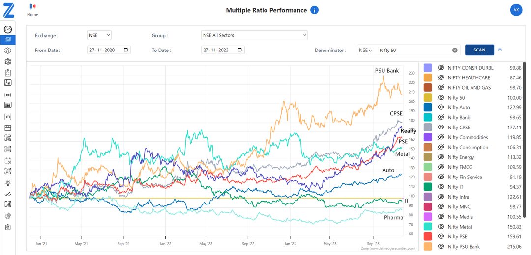
I find the feature really insightful where we could visually absorb/interpret the information easily. The chart plots the lines for each instrument in a given group and the only way to decode which line belongs to which instrument is by using the color-mapping for that instrument.

From the usability stand-point it would be great if we have a visual-cue in the UI where it shows the corresponding name of the instrument when we hover on the line. It would help increase the usability of the tool and reduces the effort it takes to hide/unhide each of the instruments to understand which line maps to which instrument.

-
Thank you for your suggestion. We have taken note of it and have forwarded it to the concerned team. We will get back to you with an update at the earliest.
