• Recent
  • Categories
  • 0 Unread 0
  • Popular
  • Tags
  • More
    • Guidelines
    • Disclaimer
  • Users
Skins
  • Light
  • Default
  • Cerulean
  • Cosmo
  • Flatly
  • Journal
  • Litera
  • Lumen
  • Lux
  • Materia
  • Minty
  • Morph
  • Pulse
  • Quartz
  • Sandstone
  • Simplex
  • Sketchy
  • Spacelab
  • United
  • Yeti
  • Zephyr
  • Dark
  • Cyborg
  • Darkly
  • Slate
  • Solar
  • Superhero
  • Vapor
Collapse
Definedge Forum Logo
B

Bhaumil Makwana

Pro User

About
Topics
20
Replies
28
Groups
1
Followers
2
Following
0

All Replies

Recent Best Controversial

    The Hidden Cheat Code In Smallcap Returns That Changes Everything
  • B Bhaumil Makwana

    If you follow the stock market even casually, you've probably heard this: "Midcap and smallcap stocks are outperforming the big 50 stocks.”

    Sounds straightforward, right? But here's the thing: we might be comparing completely different things.

    Think of it like this: imagine comparing the performance of a restaurant's "Top 50 Dishes" list against their "New Trending Dishes" list.

    If the trending list changes half its menu every year while the top 50 stays mostly the same, you can't really say the trending list is better. You're comparing different dishes, not different cooking.

    That's exactly what's happening with Indian stock indices.

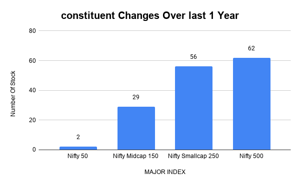
    Here Are The Numbers:
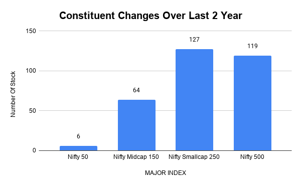
    Constituent Changes Over Last 2 Year.png constituent Changes Over last 1 Year.png

    Over the last two years

    • Nifty 50 (big 50 stocks): Only 6 companies changed. That's 12% of the list.
    • Midcap 150 (medium companies): 64 companies changed. That's 43% of the list.
    • Smallcap 250 (smaller companies): 127 companies changed. That's 51% of the list.

    In simpler terms: Half of the smallcap list is completely different from two years ago. But the big 50? Barely any changes.

    Why Does The Basket Keep Changing?

    Companies grow. A smallcap becomes a midcap. A midcap becomes a largecap. It's natural.

    When companies grow:

    • Their share price goes up
    • More people want to trade them
    • They become more important in the market
    • So they get promoted to bigger indices

    When new companies become important in the market like new-age technology, data centres, optical fibre, defence, electronics manufacturing, renewable energy and specialised financial businesses companies enter these indices.

    So What's Really Happening? Let me explain with an example:

    Scenario A: You bought a smallcap stock two years ago that was struggling. You held it for two years. Maybe it did well, maybe it didn't.

    Scenario B: You bought the Smallcap 250 index two years ago. Half of today's index wasn't even there two years ago. The index kicked out the struggling companies and brought in the winning companies.

    So the index looks like it did great. But that's partly because it constantly replaced losers with winners

    The Nifty 50 Works Differently,The big 50 stocks have a different approach. They say: "We're only going to make changes slowly and carefully. We're not going to keep swapping out companies just because something new is trending."

    Why?Stability. These companies are established. There's a formal process. Maximum 5 changes per year through regular reviews.

    The good part: You know what you're holding is solid and stable.

    The bad part: It takes longer to include new, exciting businesses. So if you're holding Nifty 50, you might miss out on the next big tech trend for a while.

    The Real Picture When business headlines say "Smallcaps have beaten Largecaps," what they're really saying is:

    The basket of smallcaps we're tracking today is performing better than the basket of largecaps we're tracking today but the smallcap basket is 50% different from two years ago."

    It's a bit like comparing two different car models by changing the parts halfway through the race.

    What Should You Actually Take Away?

    Smallcap and midcap indices are constantly refreshing themselves. Some of their stellar performance can come from repeatedly adding companies that are already showing strong growth and removing those that are struggling.

    Index returns and stock-picking returns can be very different. If you bought a smallcap stock two years ago and held it, your return could be nowhere close to the Smallcap 250's return.

    Comparing indices is not always an apples-to-apples comparison. When one index changes half its constituents while another changes only a handful, their returns are being generated by very different baskets of stocks.

    The real story isn't just "smallcap stocks are better." The real story is "the smallcap basket is constantly getting refilled with new success stories, while the largecap basket stays the same."
  • Infosys: RSI at All-Time Low – What Next?
  • B Bhaumil Makwana

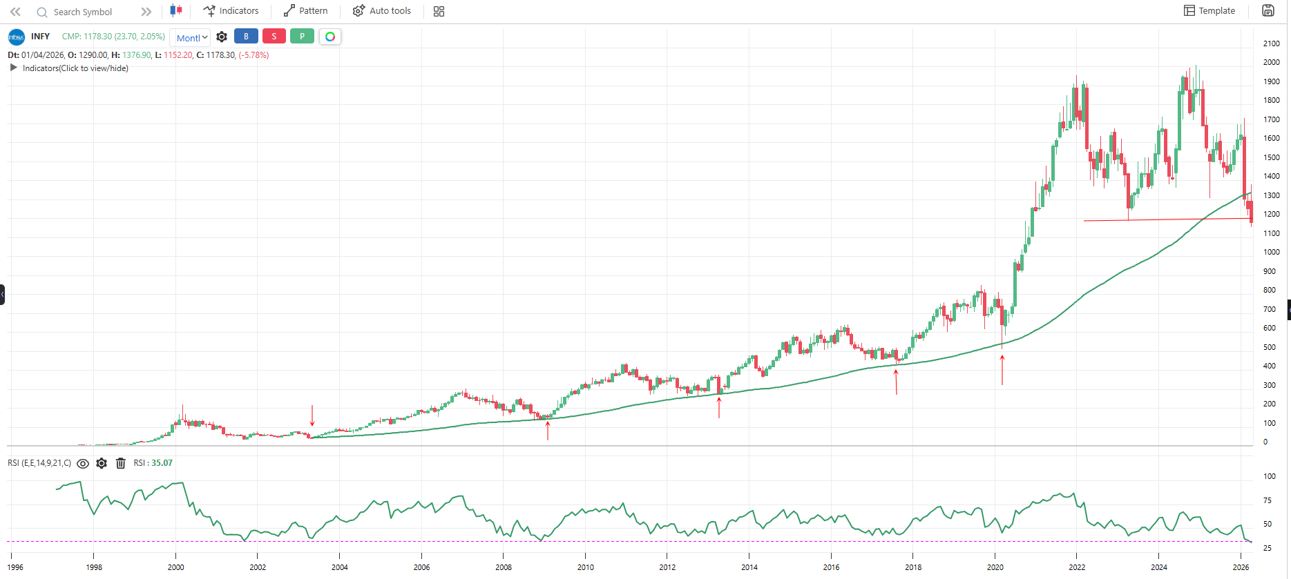
    On the monthly timeframe, RSI has dropped to an all-time low, which is quite notable from a long-term momentum perspective. At the same time, the stock was taking support around the 90- Month moving average, but has now broken below it. Additionally, price has breached the 2023 low, which puts the long-term uptrend at risk.

    This combination suggests some structural weakness, but I’d be interested to hear how others are interpreting this setup. Just sharing an observation from the charts for discussion and learning purposes. Would like to hear others’ views.

    3fe56c37-3e3f-45ae-80d1-f651ca182d66-image.png


  • Difference between ETF's Group
  • B Bhaumil Makwana
    1. ALL ETFs
      Includes all listed ETFs available on the exchange.

    2. ALL ETFs (Liquid)
      Contains only liquid ETFs from the complete ETF list. Updated every month for better scanning and trading.

    3. ALL-ONE ETFs
      Includes one carefully selected ETF from each category, helping you build a diversified portfolio without duplicates.

    4. ALL-ONE ETFs (Domestic)
      The same as ALL-ONE ETFs, but includes only Indian ETFs.

    5. ALL-ONE D ETF Assets
      A collection of selected ETFs from different asset classes like equity, commodities, and fixed income.

    6. ALL-ONE D ETF Factors
      Contains one ETF for each investment style, such as Value, Momentum, or Quality.

    7. ALL-ONE D ETF Sectors
      Includes one ETF from each major market sector, such as Banking, IT, Pharma, and FMCG.

    8. ALL-ONE D ETF Segments
      Contains one ETF from each market segment, such as Large Cap, Mid Cap, and Small Cap.

    9. ALL-ONE D SSFF
      A combined group of Sector, Segment, Factor, and Fixed Income ETFs in one place.

    10. ALL-Sector ETF
      Includes one ETF from each major sector, making it easy to track or trade sector-based opportunities.


  • WHILE THE WORLD ARGUED ABOUT OIL, INDIA QUIETLY BUILT A NEW ENERGY ARCHITECTURE.
  • B Bhaumil Makwana

    Most people watching this war are focused on the bombs, the missiles, the downed aircraft, the closed strait.
    India was watching something else entirely. The opportunity hidden inside the disruption.
    Let me show you what India has actually done, and why it may be the single most consequential strategic move of this entire war.
    FROM 27 TO 40-PLUS COUNTRIES. IN LESS THAN TWO DECADES.
    This number deserves to sit for a moment.
    In 2006, India sourced crude oil from 27 countries.
    Today, confirmed by India's own Ministry of Petroleum and Natural Gas...India imports from over 40 countries.
    Prime Minister Modi stated it himself in Parliament: "Earlier, we used to import from 27 nations. Now we import from 41."
    New suppliers now include the United States, Nigeria, Angola, Canada, Colombia, Brazil, and Mexico.
    In March 2026 alone, Angola emerged as India's third-largest crude supplier, surging from 103,000 barrels to 327,000 barrels, the biggest jump of any country after Russia.
    This was not luck. This was a decade of quiet, deliberate construction.
    RUSSIA DOUBLED. WITHOUT ASKING ANYONE'S PERMISSION.
    When the Iran war disrupted Gulf supplies, India did not panic. It did not beg. It did not hold emergency press conferences.
    It called Russia.
    Russian oil imports rose from approximately 1 million barrels per day in February to nearly 2 million barrels per day by late March 2026.
    Russia's share of India's total crude imports has grown from 21.6% in 2022-23 to nearly 36%, making it India's single largest supplier, displacing Iraq and Saudi Arabia.
    And India bought it at a discount.
    While Europe panicked and paid premiums. While Japan scrambled. While South Korea rationed.
    India negotiated. Quietly. Commercially. On its own terms.
    70% OF INDIA'S OIL NOW BYPASSES HORMUZ ENTIRELY
    This is the number that should make every energy analyst pause.
    India's Ministry of Petroleum confirmed that non-Hormuz routes now account for roughly 70% of crude imports, up from approximately 55% before the war began.
    In other words in the middle of the biggest Hormuz crisis in history — India structurally reduced its dependence on Hormuz in real time.
    INDIA JUST BOUGHT IRANIAN OIL FOR THE FIRST TIME IN SEVEN YEARS
    And it did it on its own terms.
    India had not received Iranian crude since May 2019 — when U.S. pressure forced it to stop.
    For seven years, India complied. Washington was happy.
    Then the war started. U.S. sanctions on Iranian oil were temporarily lifted.
    And India's oil ministry announced without apology that Indian refiners had secured crude including from Iran, with no payment hurdles.
    A vessel carrying 44,000 metric tons of Iranian LPG docked at Mangalore port and began discharging.
    India's statement was six words of quiet confidence:
    "There is no payment hurdle."
    Seven years of compliance. The moment circumstances changed — India moved commercially, independently, and without asking for permission from anyone.
    THE FOURTH LARGEST REFINER. THE FIFTH LARGEST EXPORTER.
    Here is what most people miss about India's position in this war.
    India is not just a buyer of oil.
    It is the world's fourth largest refiner.
    It processes more crude grades than almost any country on earth — over 216 crude grades at Reliance's Jamnagar refinery alone.
    That is why Trump asked Reliance to set up a refinery in the USA.
    Because nobody else can refine Venezuelan crude at that scale and quality.
    India has been supplying fuel to Sri Lanka, 38,000 metric tons to prevent its neighbors from collapse.
    It is supplying aviation fuel to Europe and the United States.
    It is feeding energy to countries that cannot feed themselves in this crisis.
    The buyer has become the supplier. The dependent has become the stabilizer.

    -Robert Kiyosaki


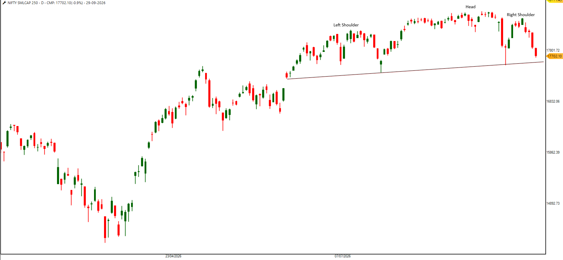
  • Head & Shoulders: Pullback or Market Top?
  • B Bhaumil Makwana

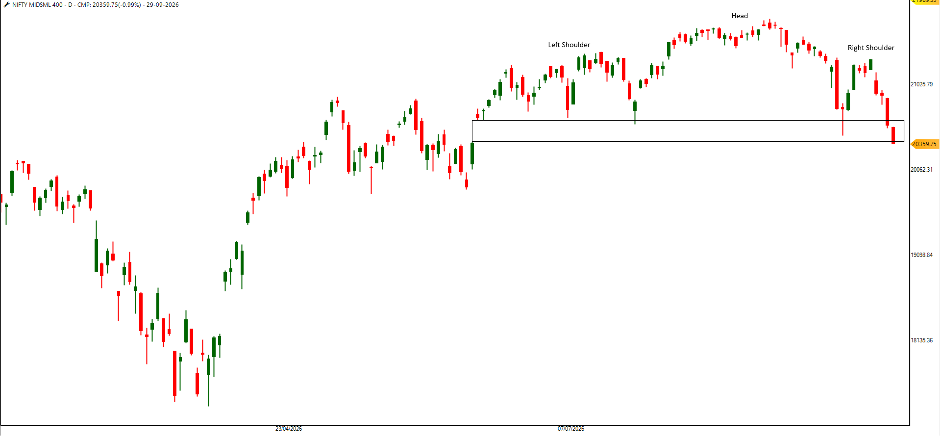
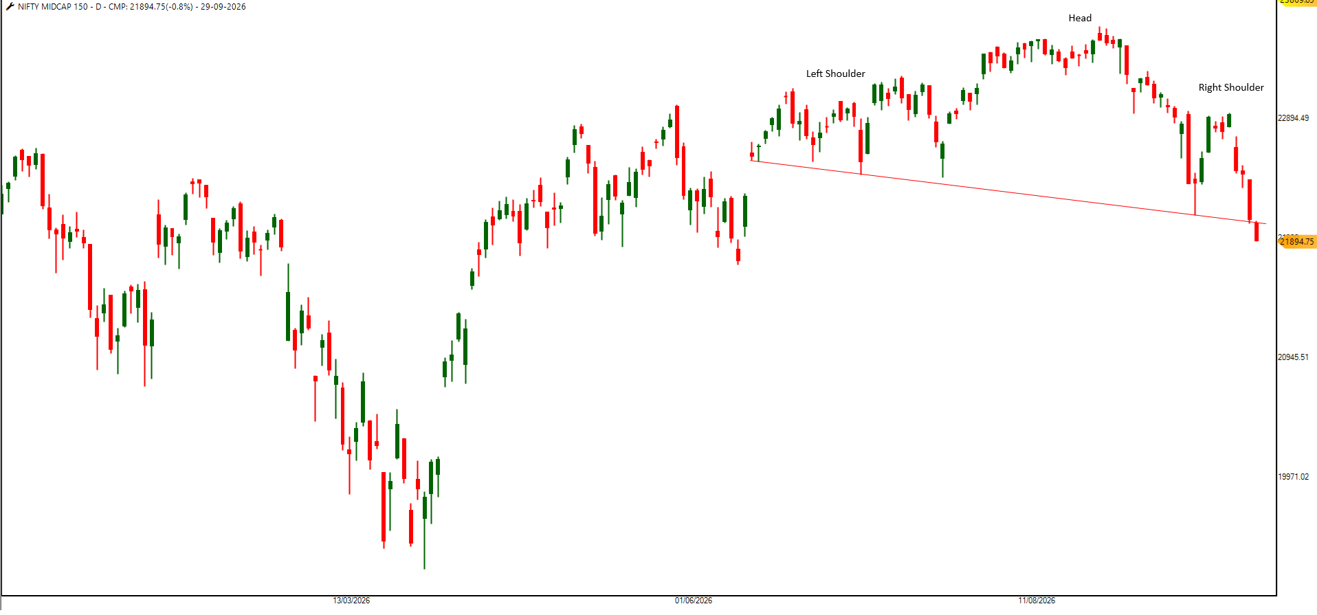
    Head and Shoulders formations are developing across the Nifty Midcap 150 and Nifty Smallcap 250 indices, which may indicate some signs of distribution.

    The key question is whether this pattern develops into a normal market correction, followed by a resumption of the broader uptrend, or becomes part of a larger trend change.

    NIFTY MIDSML 400
    nifty midsmall 400.png

    NIFTY MIDCAP 150
    midcap 150.png

    NIFTY SMLCAP 250
    nifty small 250.png


  • A small market structure change created a big difference in option calendar spreads.
  • B Bhaumil Makwana

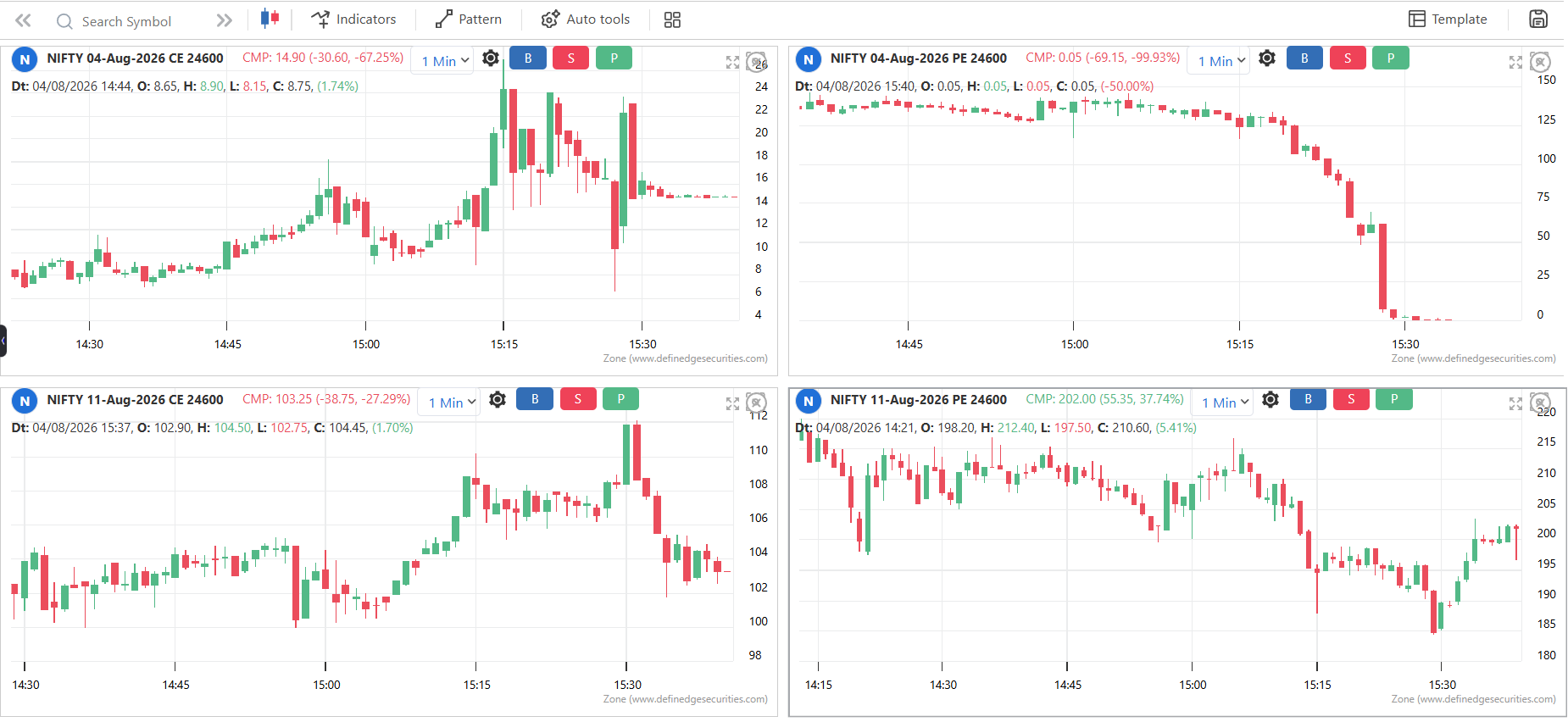
    The Nifty weekly expiry on 4 August provided an interesting example of how changes in market structure can influence option pricing.

    This was one of the first expiries after the introduction of NSE's Closing Auction Session (CAS). Under this new mechanism, the official closing price of the cash market is determined through a closing auction, with the aim of improving price discovery and making the closing price more representative of market demand and supply.

    Until around 3:15 PM, the Nifty ATM straddle was trading near 100 points, and the near-month Nifty futures were trading at roughly a 100-point premium to the spot index (contango).

    After the cash market entered the Closing Auction Session (CAS), index derivatives continued trading until 3:40 PM. During this period, the futures basis changed significantly, with the market moving from contango to brief backwardation by settlement.

    This had a noticeable impact on calendar spread pricing.

    Under normal market conditions, Nifty futures trade in contango most of the time. As a result, ATM Call Calendars generally close at a higher value than ATM Put Calendars. During periods of backwardation or unusual volatility, however, the opposite can occur.

    That is exactly what happened on this expiry. Because the futures curve shifted into backwardation near settlement, the ATM Put Calendar closed at a higher value than the ATM Call Calendar an outcome that is relatively uncommon in normal market conditions.

    This is a good reminder that calendar spread pricing is influenced not only by implied volatility but also by the shape of the futures curve (contango vs. backwardation). As market structure evolves, understanding these relationships becomes increasingly important for options traders.

    a5330fd5-ad1e-44a4-abe9-c01bad88d71f-image.png


  • India's Stock Market: The Hype, the Crash, and the Possible Comeback
  • B Bhaumil Makwana

    316ea955-acaa-43bb-9eb7-1bf6e25a328a-image.png

    So there's this thing called MSCI index that global investors use to track where their money goes, right? And India's been kind of the star of the show recently. Let me break down what's actually happened.

    A few years back, around 2020, India had like 9% of global emerging market investments. Not bad, but not crazy either. Then 2024 hits and boom. Everyone's like "India is the future!" Money starts flooding in from all over the world. By September 2024, India's share jumped to like 21% of emerging market investments. That's huge.

    If you were an international investor, you were basically putting your money into India. It was the hot stock everyone wanted to own. Foreign money was coming in constantly. It felt like it would never stop.

    Fast forward a few months. And it's like someone flipped a switch. Investors started thinking, "Wait, maybe India's stocks are too expensive now." Plus, other places started looking good, especially anything with AI and tech.

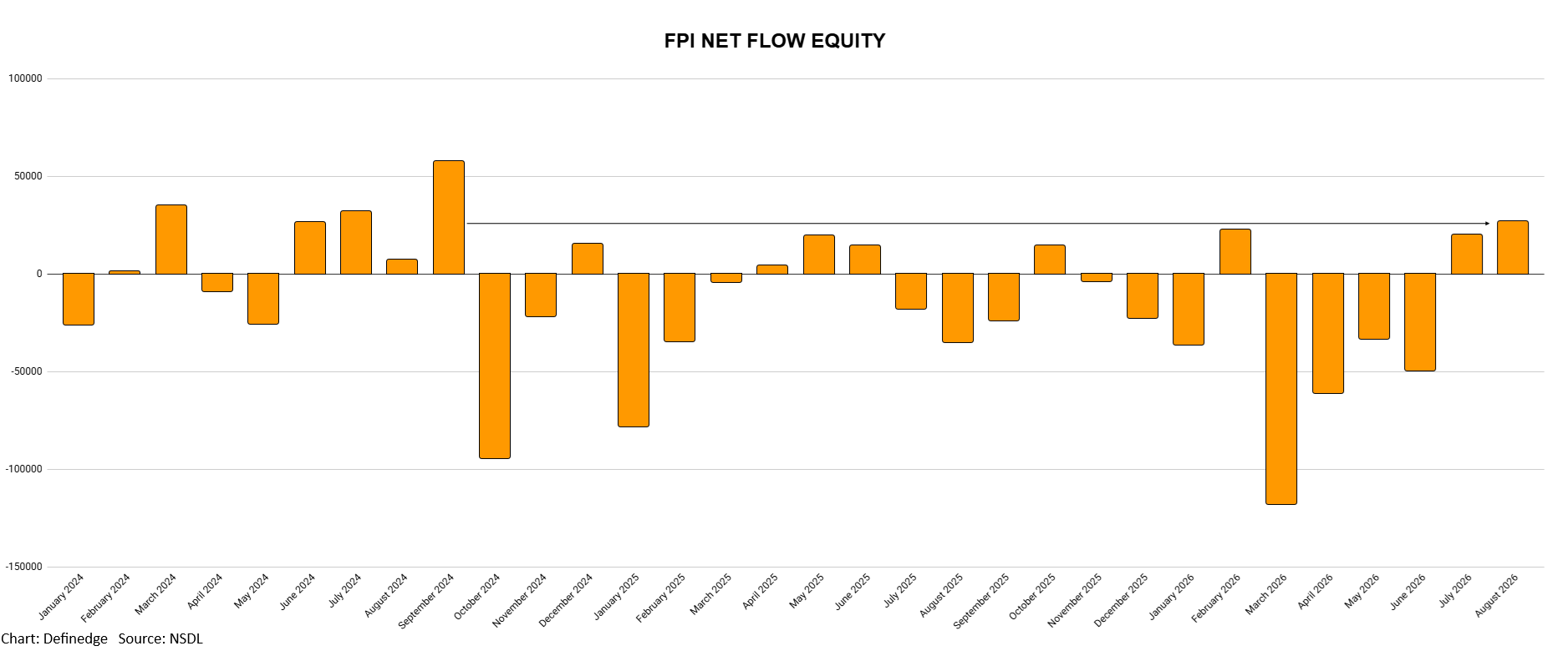
    What happened next? They started pulling their money out. Look at that chart and you can see it. The bars go down. Way down. Especially in early 2026, it was like everyone was running for the exits at the same time.

    For like 18 months, it was just selling. Money flowing out. Pretty brutal if you held Indian stocks. Now Something's Shifting Again, Look at July and August 2026 on that chart. The bars are going back up! Money's coming back in. FPI inflows reached their highest level since October 2024.

    This improvement also comes as MSCI increased India’s weight from 11.8% to 11.9% in August. Notably, this marks the first positive change in India’s MSCI weight after seven consecutive quarters. So think of it this way. These big global investment funds are like, "Alright, India is supposed to be 11.9% of our emerging markets bucket." So they automatically buy a bit more Indian stocks to match that.

    It's like that friend who ghosted you, and now they're texting again. You're not sure if it means anything yet, but it's nice to see. But here's the thing just because money's flowing in doesn't mean the market's gonna shoot up. It's more like a weather report. It's telling you what investors are thinking.


  • how to create strategies in defineedge
  • B Bhaumil Makwana

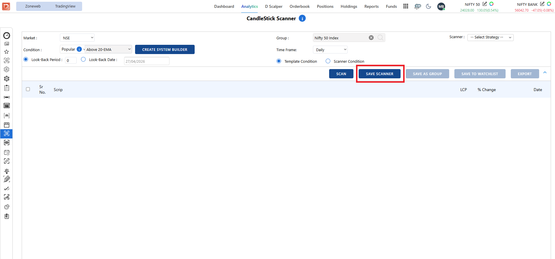
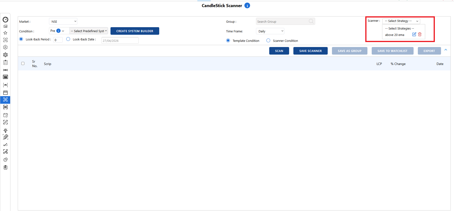
    Dear sir , After creating a strategy in the System Builder, when you run it in the scanner by selecting a group and time frame, you can save the entire strategy. This way, you don’t have to select the same group and time frame every day, and the saved scanner will be available there for you to use again.

    image.png

    be8476d0-1396-4cf4-9dce-c6203e29225a-image.png


  • Multi-Month Resistance in Focus
  • B Bhaumil Makwana

    3%.jpg

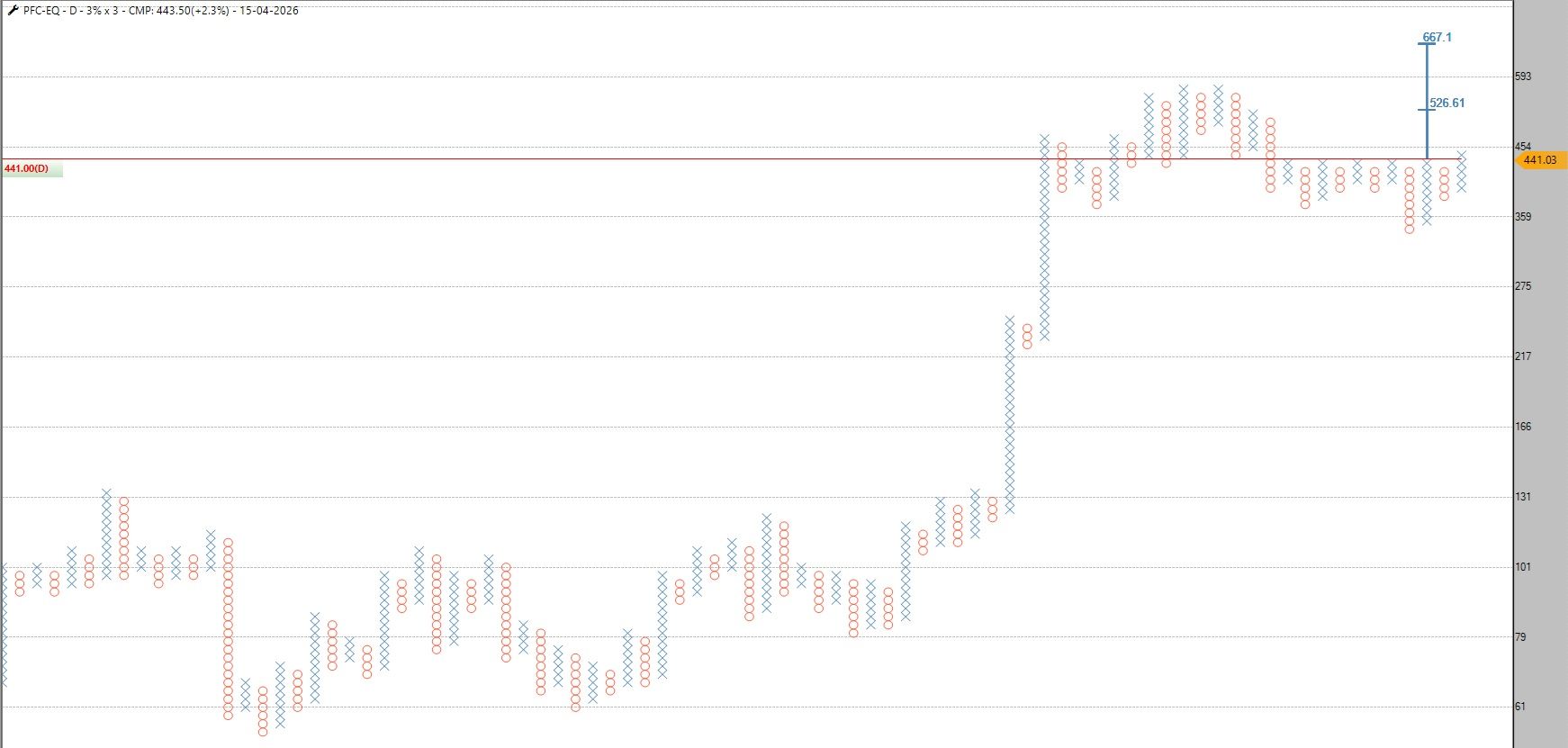
    I’ve been watching this on a multi-month P&F (3% box), and the 425–430 zone has clearly acted like a strong resistance for a long time. Every time price reached there, it got rejected, which shows consistent supply at that level.
    But what’s interesting is that after multiple tests, price is now starting to push above it. In technical analysis, there’s a common idea that when a level is tested repeatedly, it can weaken over time because sellers get absorbed.
    Now the key thing is whether this breakout holds and follows through, or if it turns into another rejection. If it sustains above the zone, it likely means the resistance has finally turned into support.


  • The Smile That Tells You Everything
  • B Bhaumil Makwana

    image.png

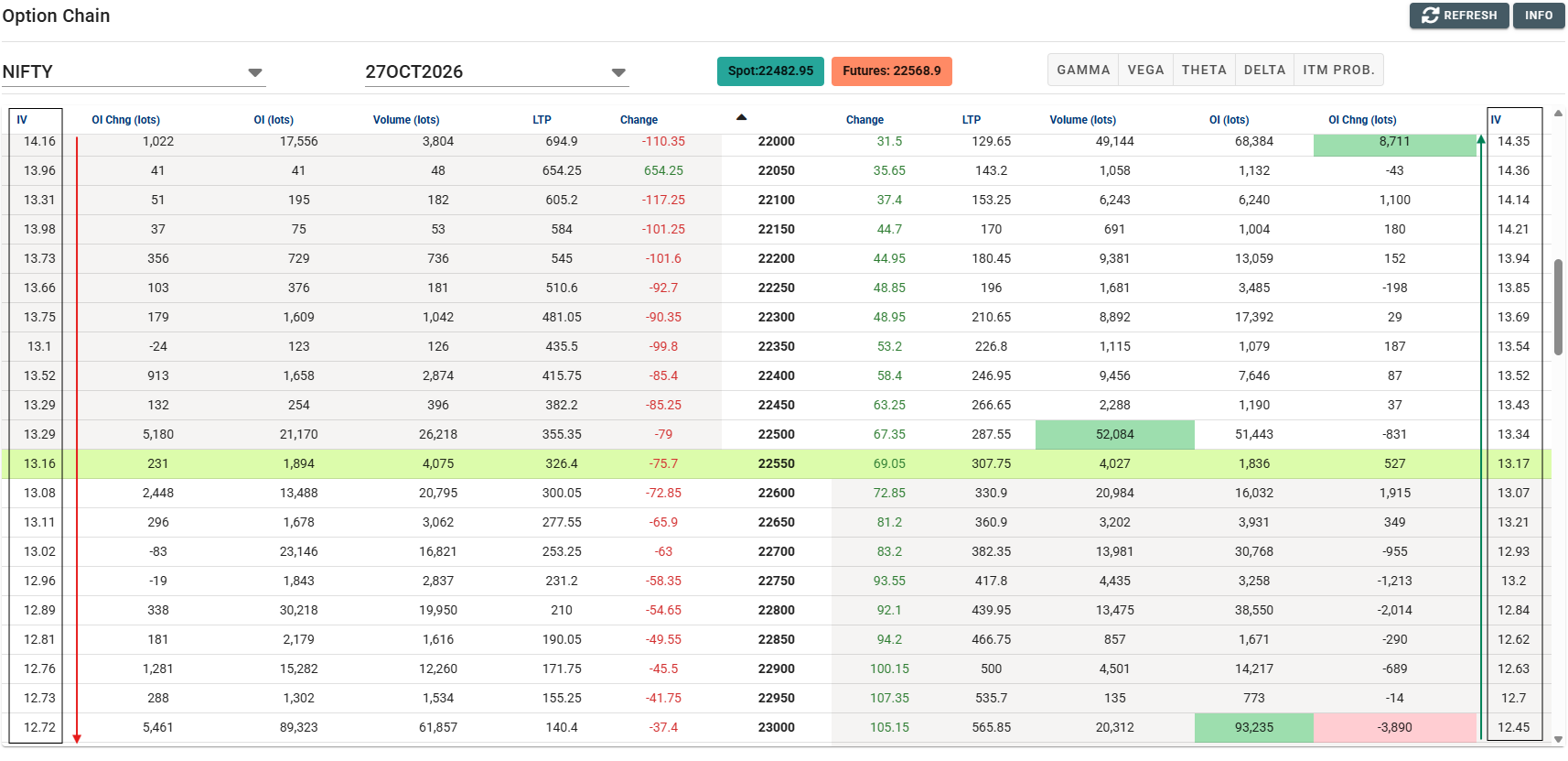
    In September, I wrote about how OTM puts on Nifty were trading at higher implied volatility than equidistant OTM calls, a pattern known as reverse volatility skew. Now that it's October, I checked the option chain again, and the structure has not changed. OTM puts are still more expensive than OTM calls at the same distance from ATM, which tells us there is still steady demand for downside protection.

    A persistent skew like this is not a one-day event. It suggests traders continue to hedge or position defensively, even after a month has passed. For option sellers and spread traders, this matters: the richer put premiums continue to favor structures such as put ratio spreads, and debit put spreads remain cheaper than comparable call spreads.

    As always, skew shows positioning and sentiment, not a prediction.


  • how to find stock which is in column of X
  • B Bhaumil Makwana

    Dear Sir,
    Please follow the steps below:

    Go to R Zone.
    Open Price Scanners.
    Select Point & Figure Scanner.
    Choose the stock group that you want to scan.
    In the Condition section, select Pre.
    Under Pre Condition, choose Last Column is X.
    Select the box size as per your preference.
    click Scan.

    This will scan the selected group based on the Last Column is X condition.


  • CHART OF THE DAY (GALLANTT)
  • B Bhaumil Makwana

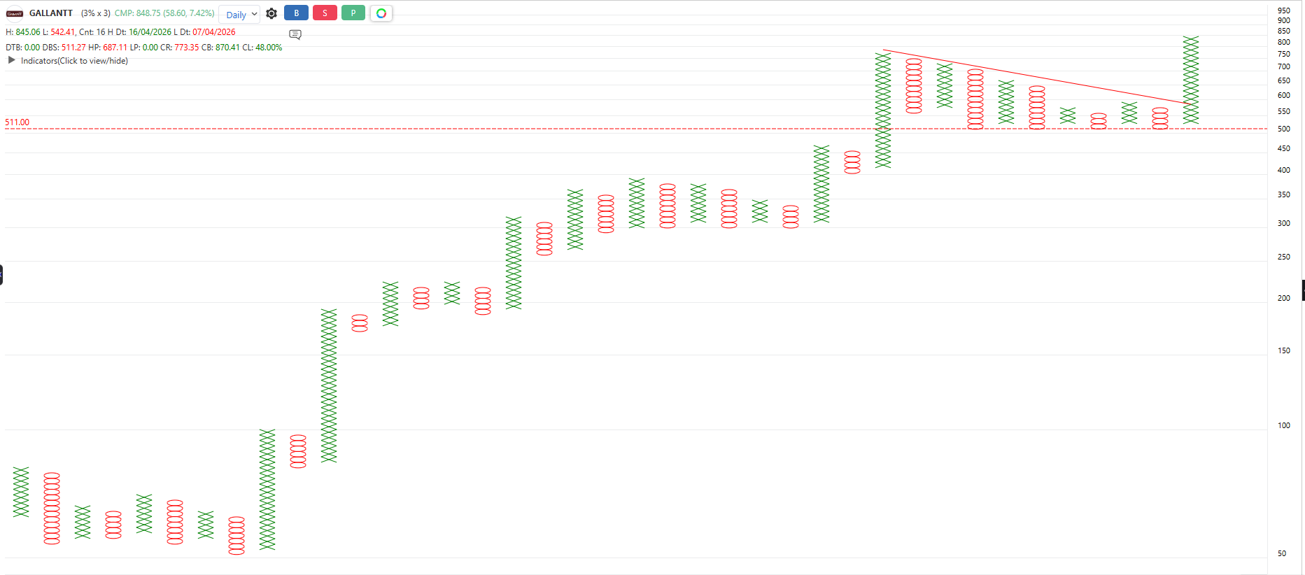
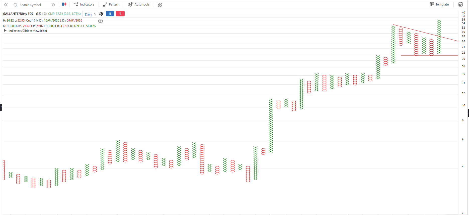
    GALLANTT has given an all time high Breakout on both the Price and Relative chart w.r.t Nifty 500.

    PRICE CHART
    d82e470a-5911-4175-8815-3bce95e77a80-image.png

    RS CHART
    861d3550-0339-4eda-92d6-218f77278c5b-image.png


  • is this a genuine reversal or just a trap?
  • B Bhaumil Makwana

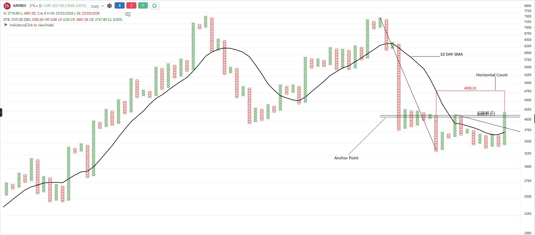
    Anchor point is an area where price has traded the most between a significant top and bottom. It is plotted using major swing high and low to identify where most of the action happened during the move. These zones often act as important reference areas when price revisits.

    Right now, KAYNES is approaching that anchor zone. However, the recent formation of a bullish anchor column suggests buyers are stepping back in, which is a constructive sign for the ongoing trend. At the same time, price is holding above the 10-column simple moving average, keeping the short-term structure positive.

    Also, Horizontal counts come into play when a sideways base forms before a breakout, helping estimate the potential move once the structure resolves.

    Failure near anchor - possible bull trap
    Holding + breakout - continuation setup
    We are at a decision point here price could go either way. What’s your take?

    Just sharing an observation from the charts for discussion and learning purposes.

    kaynes.jpg


  • PSU Bank Are Back, But Is This Sector Really Leading The Market?
  • B Bhaumil Makwana

    3aec2214-2fc0-4bc2-a5e9-1d8b3ab5f40d-image.png

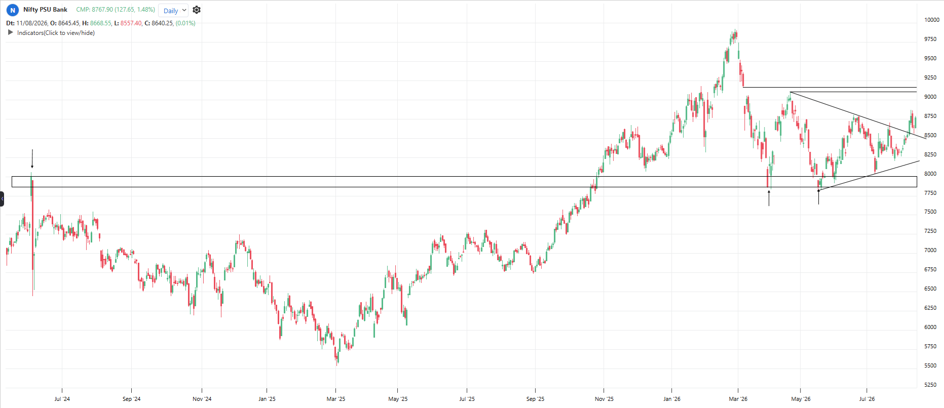
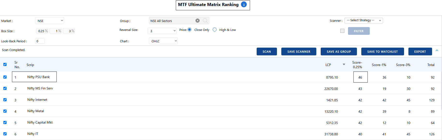
    Looking at the PSU Bank chart tells us that the sector is showing a positive setup. But one important question remains: Is PSU Bank actually stronger than other sectors, or is the whole market moving together?

    c0f3dc57-ea41-41c3-b86b-acee10fb621f-image.png

    This is where Definedge’s MTF Ultimate Matrix Ranking becomes useful.

    The tool compares all the instruments within a selected group and checks their strength across three different timeframes :- short-term, medium-term, and long-term.

    Each timeframe gets a score, and these scores are combined into a Total Score. A higher score means the instrument is showing better strength compared with the other instruments in the same group.

    In the current reading, PSU Banks have the highest short-term score, showing that the sector has been relatively strong recently. The ranking gives a quick way to compare sector strength instead of looking at one chart in isolation.

    Strong chart + strong relative ranking = a setup worth keeping on the radar.


  • Nifty Is Walking Back to the Pavilion. Will It Turn Around?
  • B Bhaumil Makwana

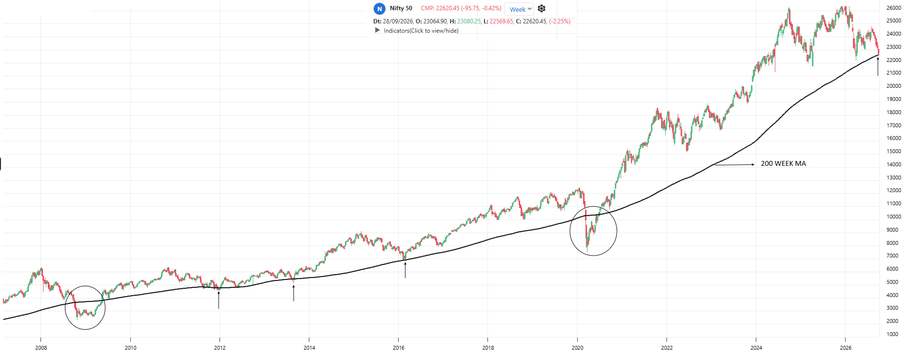
    200 sma.png

    Think of a long Test match.

    For the last few years, Nifty was batting like it was on a flat pitch. Big shots, fast runs, a happy crowd. Nobody was worried.

    Now the game has changed. The scoreboard has slowed down, and Nifty is walking back toward the pavilion end, around 22,600.

    What is the pavilion end?

    On our chart, it is the 200-week moving average. That is just the average price of the last 200 weeks, about 4 years. Think of it as the team's long-term batting average. It does not change fast, and it shows the real strength of the team over a long time.

    This is the first time Nifty has come close to this level since 2020.

    What happened here in the past?

    2012, 2013 and 2016: The team took a short break here, settled down, and then started scoring again.

    2008-09 and 2020: The team had a really tough session and dipped a little below this level, but later made a comeback.

    Now look at the crowd, not just the batsman

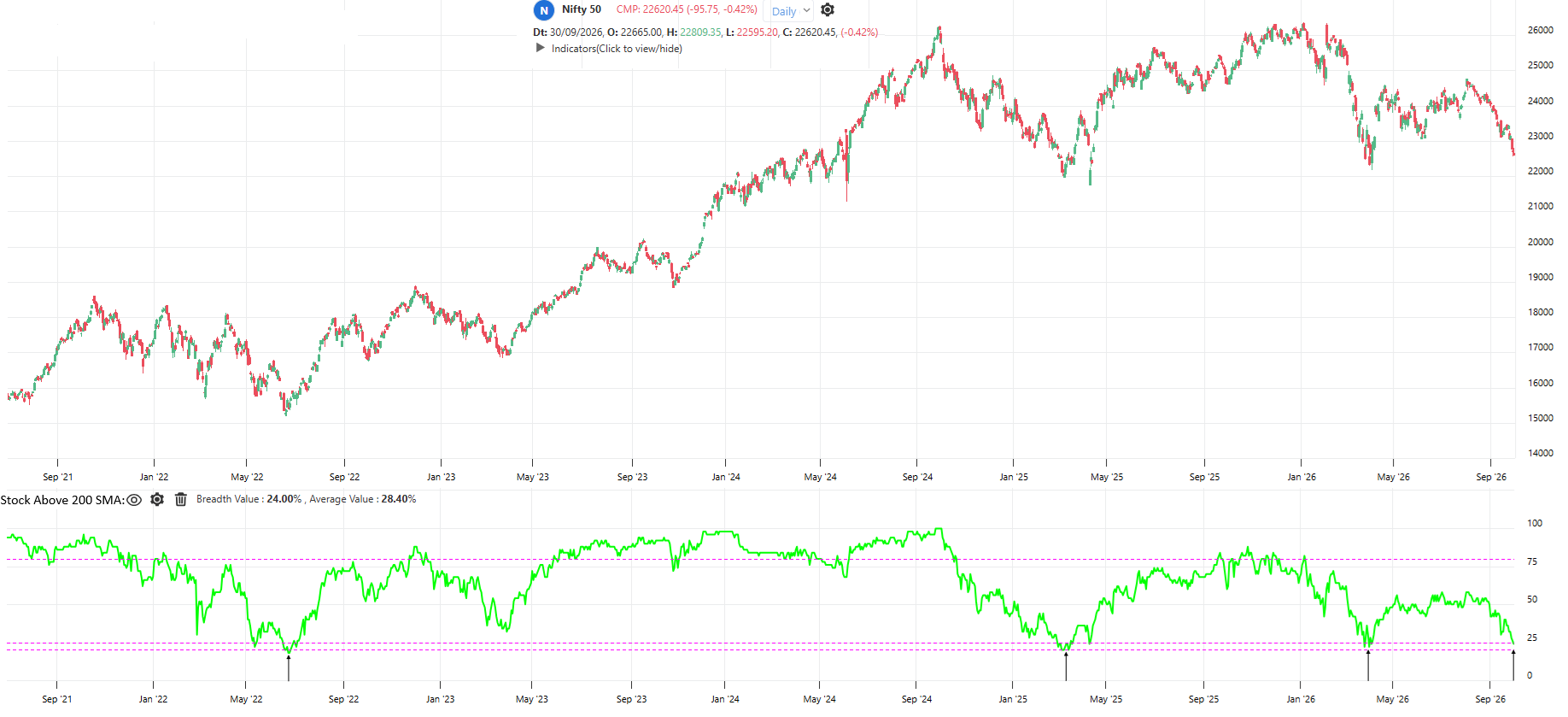
    stock above 200 dma.png

    A team is not one player. So let's check how many of the 50 players are still in good form. The chart shows how many Nifty 50 stocks are trading above their own 200-day average. Right now, only about 24%.

    That means most of the team is already tired and sitting on the bench. I have marked the arrows on this chart. Every time this number fell to these low levels (2022, 2023, 2025 and early 2026), the market bounced back soon after. It is like the whole team being exhausted at the same time. Usually, that is when fresh energy arrives.

    A record that nobody wants

    Here is a strange number. The longest losing streak in Nifty's history came in 2001, when it closed lower for nine weeks in a row. Right now, Nifty has also had nine weeks of losses, which matches that old record.

    So we are standing at a rare spot. Three signals are meeting at the same place:

    Nifty is near its 4-year average.
    Very few stocks are in good form.
    The losing streak is equal to the worst one ever.

    Does that guarantee a comeback? No. Every match is different, and nobody can tell how this innings will end. Will Nifty settle down and play a steady innings again? Or will it face a few more tough overs first? We will know only as the game goes on.

    For now, this is one of the most interesting moments on the chart to watch.

    "History never repeats itself, but it often rhymes."

  • 1 / 1
  • Login

  • Login or register to search.
  • Blog
  • Youtube Videos
  • Refresh
  • First post
    Last post
0
  • Recent
  • Categories
  • Unread 0
  • Popular
  • Tags
  • More
    • Guidelines
    • Disclaimer
  • Users
  • Login

  • Login or register to search.
  • Blog
  • Youtube Videos
  • Refresh