
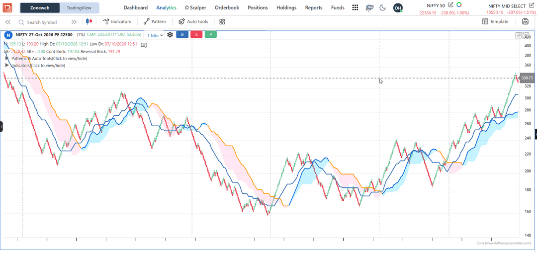
Kya Option Chart pe chalega... bilkul chalega --> Nifty 22500 PE Oct expiry 1% 1min with Ichimoku cloud and Donchain Channel Middle Band.... Buy Above Donchain Middle Band and signal above Ichimoku Cloud AND exit below Donchain Middle band. Experimental ideas to test 
 D
D
Dushyant Thakker
All Replies
-
-
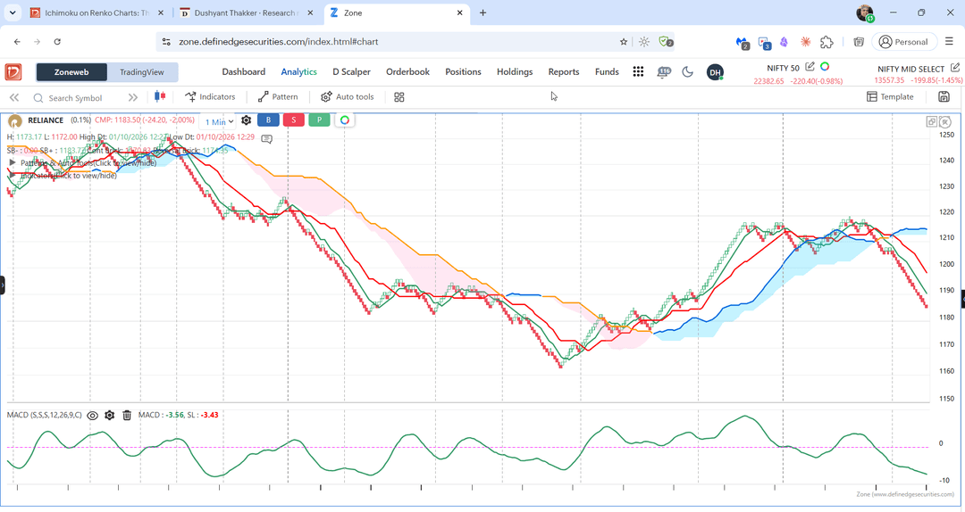
@Dushyant Thakker to remove unwanted signal... try adding oscillator like MACD ... MACD line above 0 for bullish confirmation and below 0 for bearish confirmation... let me know what do you think!
-
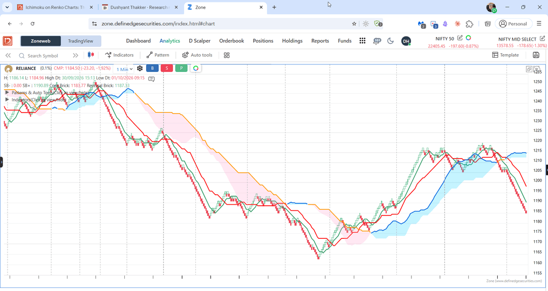
Reliance 0.1% 1m
-
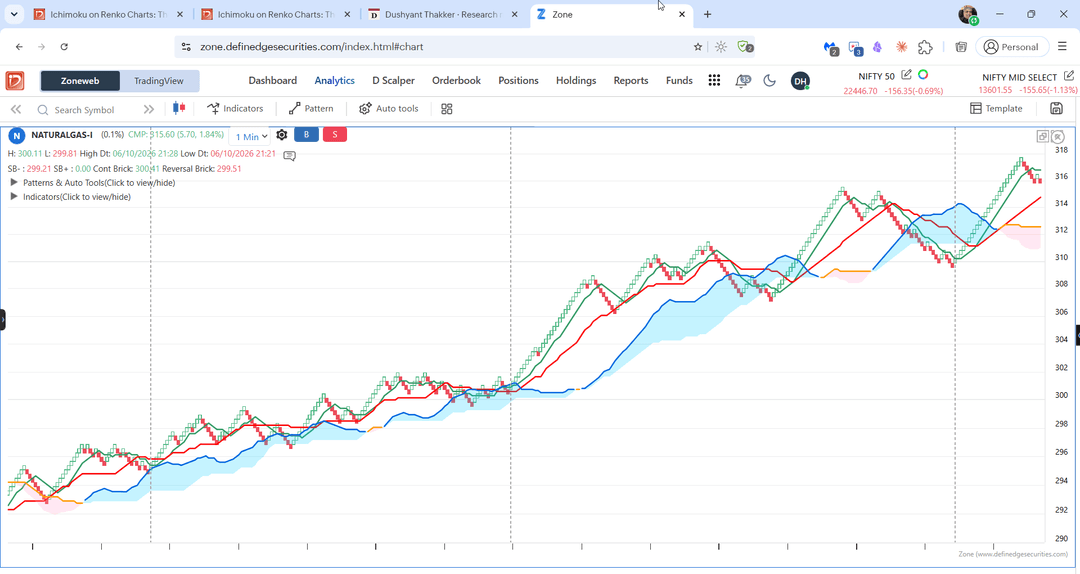
On NaturalGas at 0.1%
-
Ichimoku on Renko Charts: The Ultimate Noise-Free Trading System!
A forum member asked me a great question the other day: "Does the Ichimoku indicator work with Renko charts?"
I really loved this question! Why? Because very few Indian trading platforms let you apply Ichimoku on Renko charts. Plus, there is very little information available online about this combination.
Now, I am not going to give you boring backtest data or historical percentages here. Instead, I will give you three practical ways to build your own trading system using Ichimoku and Renko.
Let's dive in!
Ichimoku in two minutes
A Japanese journalist named Goichi Hosoda created this system back in the 1930s. The coolest thing about Ichimoku? It does not care about the closing price. Instead, it looks at the exact middle of the highest and lowest prices over a set time.
Here are the 4 simple parts you need to know:
- Tenkan (fast line): This is just the middle point of the highest high and lowest low of the last 9 sessions.
- Kijun (base line): This is the middle point of the last 26 sessions. It tells you the medium-term trend.
- The cloud: This is the magical part! It is made of two lines, Span A and Span B. They are calculated from the first two lines and shifted 26 sessions into the future.
- Price above the cloud? Super uptrend!
- Price below the cloud? Heavy downtrend.
- Price inside the cloud? Market is confused. Sit on your hands!
- Chikou (lagging Line): This is simply today's closing price pushed 26 sessions backward. It helps you see how current momentum compares to the past. Some traders treat it as a confluence layer as it confirms the environment. I generally ignore this line for Renko as I combine other indicators and pattern for confirmation.
Definedge's Ichimoku explainer and this longer guide cover the topic in detail.
What changes on a Renko chart
When you switch from a normal candle chart to a Renko chart, everything changes. Why? Because on Renko, a "period" does not mean 1 minute, 5 minutes, or 1 day. A period means one single brick!
Let’s look at the math simply: if we set our brick size to 0.05%, and Nifty 50 is trading around 22,500, then every single brick is worth about 11 points.
So, our Ichimoku lines change their behavior:- Tenkan becomes the middle point of the last 9 bricks.
- Kijun becomes the middle point of the last 26 bricks.
When Nifty goes into a super clean, non-stop uptrend, the Kijun line will quietly sit exactly 13 bricks below the price.
What does this mean for your exit strategy? If you want to exit your trade only when the price closes below the Kijun line, Nifty has to fall roughly 13 to 14 bricks from its absolute peak. At 0.05% brick size, that is a drop of about 0.7%, or nearly 150 Nifty points.
The biggest benefit? On Renko, Ichimoku simply becomes a game of brick counting! If the market goes completely sideways for hours, no new bricks are printed. And if there are no new bricks, the Ichimoku lines cannot move or give you false signals.
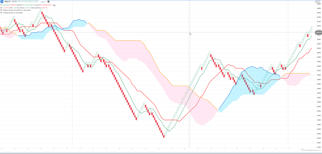
Nifty 50, Renko 0.05%, 1-minute close, Ichimoku 06/10/2026Look at the chart above that I pulled from the Zone platform (Nifty 50, Renko 0.05%, 1-minute close, Ichimoku settings 9/26/52). Once Nifty broke heavily below the cloud, the red bricks just kept stepping down like a clean staircase with only tiny pauses. This beautiful, noise-free trend is exactly why traders fall in love with this combination!
Here are three solid trading ideas you can start testing right away. Let’s break them down in pure trader style!
Idea 1: The Classic Cross on the bricks!
This is your textbook Ichimoku strategy, but with a Renko twist. The Renko bricks completely wipe out the market noise, and the Kijun line automatically works as your trailing stop-loss!
For Long (Buy) Trades:
- Entry Trigger: Buy immediately when the fast line (Tenkan) crosses above the base line (Kijun) AND the current brick closes completely above the cloud.
- Exit Trigger (Square Off): Exit the trade the moment a red down-brick closes below the Kijun line.
For Short (Sell) Trades:
- Entry Trigger: Short the market when the Tenkan crosses below the Kijun AND the brick closes completely below the cloud.
- Exit Trigger (Square Off): Cover your position the moment a green up-brick closes above the Kijun line.
Idea 2: Cloud as the Filter, Swing Breakout as the Trigger
In this setup, the Ichimoku cloud acts like a filter to tell you which side to trade, while the Swing Breakout (SWB) behaves like the main trigger to tell you when to jump in.
For Long (Buy) Trades:
- Entry Trigger: Buy only when the brick is trading above the cloud (both Span A and Span B) AND a Swing Breakout Bullish signal prints.
- Exit Trigger (Square Off): Exit when a brick closes completely below the cloud.
For Short (Sell) Trades:
- Entry Trigger: Short when the brick is trading below the cloud AND a Swing Breakout Bearish signal prints.
- Exit Trigger (Square Off): Exit when a brick closes completely above the cloud.
Idea 3: Long-Only Strategy (Cloud as On/Off Switch)
Let’s be practical. Major Indian indices like Nifty and Sensex have structurally moved upwards over the long term. If your system keeps shorting as often as it buys, you are fighting against this natural upward drift and paying heavy charges/slippage!
A much cleaner way is to take only the long trades using the bullish rules from Idea 1 or 2. When the bricks drop below the cloud, you don't short—you just sit flat with your cash in hand. My advice? Backtest the long side and short side separately before deciding if you actually need both.
A Few Extra Tips from One Trader to Another
- Compare it with standard Time Charts: Run these exact same rules on a 5-minute or 15-minute candlestick chart at the same time. If the normal time chart gives similar performance, it means Renko is just one option to cut market noise, not the only magical solution.
- Play around with different Brick Sizes: Starting Nifty with a 0.05% brick size on a 1-minute close is a very smart move. But don't stop there! Try a smaller brick size, a larger one, and test it across different sectors, mid-cap stocks, and commodities (like NATURALGAS). If a strategy only works on one specific brick size and fails everywhere else, be very careful—it might just be a fluke!
- You can also try this for signal on index and trade in options --> credit spread --> Can options trading generate income? Notes from my Finding Edge episode
Want to Learn more
For Renko itself, Prashant Shah's book Profitable Trading with Renko Charts is free to read for Definedge demat holders, and there is a video course on Gurukul for a deeper dive. If you would rather start with Ichimoku on candles, the Ichimoku strategy template in Momentify is a ready starting point.
Have you tried this combination? Which conditions did you use? If you share a chart or test, please mention the brick size, data interval and costs.
Dushyant Thakker, CFA, FRM
Educational only, not a recommendation to buy or sell any security or derivative. Investment in securities market are subject to market risks, read all the related documents carefully before investing. -
Anchor column bullish at 2 AND
Number of boxes in column = 3 at 1 AND
DTB at 0 .... You can also check out at Super pattern Bullish and ARF Bullish they are similar.
When you say max 3 O, pls remember that in 3 box reversal there will be minimum 3 Os. -
I get asked a lot that when is it a good time to sell or buy index options. Here is a little handy cheat sheet which over the years many traders have recommended and what i have observed from my trades. Most imp column is "What Not To Do" (AP Sir style
) . I look at IV Percentiles (IVP) .IV Percentile (IVP) is a metric that shows the percentage of trading days in the past year when a stock's implied volatility (IV) closed below its current level. It helps you judge if option premiums are cheap or expensive compared to their past behavior.
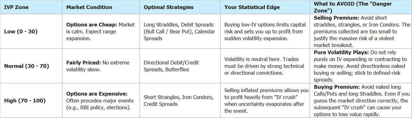
You can observe IVP values in Opstra --> Options --> Options Dashboard.
Please be aware this DOES NOT APPLY for intraday and DTE1 and DTE0 trades because IV has insignificant impact on expiring options.Please note this is only a guidance and observation and not a recommendation.
Let me know your thoughts and questions below. -
@Nishanth B Hi, Can you provide more info... What chart are you using - Pnf or Renko, asking because you said WL-6 and Donchain 6 which are too low for Renko. Also 2nd & 4th condition will automatically be met when you use Donchain as indicator and select UB rising. What timeframe are you using? 1m or 1D? I am asking because i use similar on Index with Pnf and Donchain UB rising and falling along with other condition to take credit spread.
-
Can a fund's price lie? What Turkey's frozen funds teach Indian investors
On 17 September 2026, Turkey's market regulator froze 131 mutual funds in one go. About 4.5L investors had money in them, worth roughly $20 billion -close to ₹2 lakh crore. Investors will get their money back only after two large banks sell the assets held by these funds. The regulator has said this process could take up to six months.
Most of us are probably never going to invest in a Turkish mutual fund. But I still think this story is worth understanding. Because what happened there teaches us something very basic about investing:
The price you see on the screen may not always be the price at which you can actually sell.
And this can happen in any market, including India.
What happened
Turkey has been struggling with very high inflation. Prices there have risen by around 50% a year on average over the last three years. Naturally, investors were looking for investments that could beat inflation. A few fund houses seemed to offer exactly that. Their biggest fund went up by more than 15,000% in less than two years.
That itself should make us curious. How does a fund generate that kind of return?
Many of these funds were buying shares of small companies where very little trading was happening. This creates an interesting problem. Suppose you are one of the biggest buyers in a small stock. Your own buying starts pushing the share price higher. The higher share price increases the NAV of your fund. The rising NAV attracts more investors. That brings more money into the fund. The fund then uses this fresh money to buy more of the same shares. And the cycle continues.
Indian investors will immediately understand this. In our market language, you could say the funds were effectively becoming operators in their own stocks. We have seen similar behaviour before. In 1992, Harshad Mehta used money routed from the banking system to push up shares such as ACC. Once Sucheta Dalal exposed the money trail in April 1992, the whole structure started falling apart.
In Turkey, according to Bloomberg report, the problem went even further. Some supposedly “safe” money-market funds — similar to our liquid funds — were also lending money against these inflated shares.
Then came the problem. In late August, the regulator told the funds to reduce some of their biggest holdings by December. But selling large quantities of illiquid shares is not easy. The moment you start selling, the price can fall sharply. Investors understood this and rushed to withdraw their money. Within three weeks, two fund houses were unable to meet redemptions.
The regulator eventually froze the funds.
A simple way to understand it
Anyone who has held a small-cap or microcap stock during a bad market will understand this situation. Your screen may show that the stock is trading at ₹100. But the stock is locked in lower circuit. There may be lakhs of shares waiting to be sold and almost no buyers. So is ₹100 really the price? Technically, yes. But practically, you cannot sell at that price.
That is the difference between market price and real liquidity.
Now imagine the same situation inside a mutual fund. The fund owns crores of rupees worth of such shares. At the same time, lakhs of investors ask for their money back. The fund now has to sell those shares. But who will buy them? That gap between the value shown on paper and the value you can actually realise in the market is where the real problem starts.
Was this one fund house or the whole Turkish mutual fund industry?
This was one question I wanted to understand. Most news reports did not clearly explain it, so I checked the data. The 131 frozen funds belonged to seven fund houses Interestingly, none of these seven fund houses was owned by a bank. Just before the crisis, these funds represented around 12.6% of the total Turkish mutual fund industry. One fund house, Tera, accounted for almost half of that amount. The large bank-owned fund houses were not part of the freeze. So this was not a collapse of the entire Turkish mutual fund industry. It was mainly a problem in one part of the industry.
However, fear did spread. Other independent fund houses that were not frozen also saw one of their worst three-week periods of withdrawals since the beginning of 2025. That is also normal behaviour in financial markets. When investors suddenly lose confidence in one part of the system, they often start questioning everything else as well.
Indian investors may remember what happened with Franklin Templeton in 2020. In April 2020, Franklin Templeton shut six debt schemes holding around ₹25,215 crore because the bonds could not be sold quickly during the Covid panic. But there was an important difference. Those bonds were real assets. The problem was that selling them required time. By August 2023, investors had received around ₹27,508 crore — roughly 109% of the value of the schemes when they were closed.
The Turkish situation is more complicated. If the funds themselves helped push the share prices higher through their own buying, then nobody really knows what those shares will fetch when large quantities are finally sold.
What the data shows
I downloaded the daily data for Turkish funds from TEFAS, the official platform where these funds are bought and sold.
Three things stood out.
1. A large part of the growth came from rising asset prices
Over three years, the frozen funds became around 74 times bigger. At first glance, we may think huge amounts of new investor money entered these funds. But that was only part of the story. Fresh investor money explains around 43% of the increase. The remaining 57% came from the value of the shares held by these funds going up. And remember, the funds themselves were major buyers of many of these shares.
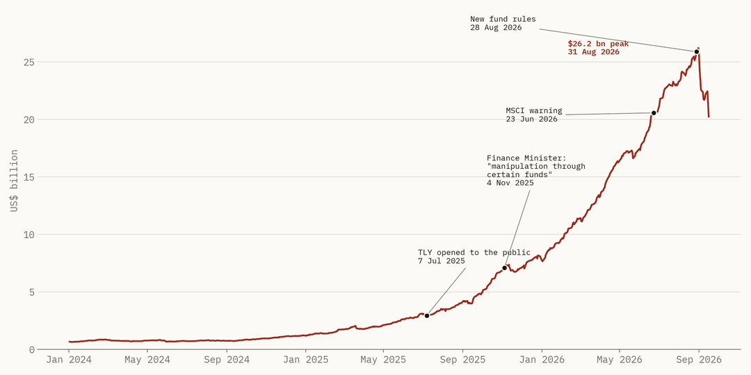
Combined size of the 131 frozen funds in US dollars, January 2024 to 16 September 2026, with the public warnings marked. Source: TEFAS (Takasbank) daily fund data, my calculation.2. Investors ignored the warnings
In November 2025, Turkey’s Finance Minister publicly said that manipulation was happening through certain funds. You would think investors would become cautious after such a warning. The opposite happened. The number of investor accounts in these funds increased from around 1.8 lakh to 6.4 lakh. August 2026 — the same month when new rules were announced — saw the highest number of new accounts. This is something we often see in markets. When returns are very high, warnings start looking less important. Everyone assumes they will exit before everyone else. Usually, not everyone can.
3. The “safe” funds were giving unusually high returns
This part is especially interesting. A money-market fund is supposed to behave somewhat like a savings account. It normally lends money for short periods to banks, government institutions and other relatively safe borrowers. Funds in the same category therefore usually earn similar returns. For the year ended August 2026, normal Turkish money-market funds returned around 46%. The frozen funds returned around 53%. And Tera’s TP2 fund returned around 60%.
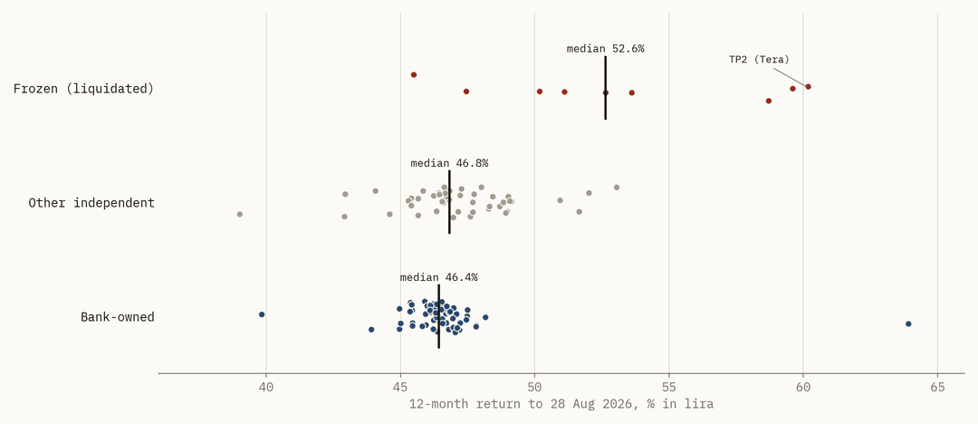
12-month return of Turkish money-market funds to 28-Aug-2026, in lira. One dot per fund; the black line is the median of each group. Source: TEFAS (Takasbank) daily fund data, my calculation.Think about it in Indian terms. Suppose almost every liquid fund gives around 7% in a year. Then suddenly one liquid fund gives 9%. Where did that extra 2% come from? It cannot come from exactly the same safe investments held by everyone else. The fund must be doing something different. And that “something different” normally means additional risk.
In Turkey, the difference was not 1% or 2%. It was around 6 to 14%. That was a major clue that these funds were taking very different risks compared with normal money-market funds.
A simple example
Let us take an imaginary fund. Suppose the fund owns ₹100 crore worth of shares in a small company. But only around ₹50 lakh worth of that company's shares trade every day. The fund obviously cannot dump ₹100 crore into the market in one day. Suppose it can sell around 20% of the normal daily volume without badly affecting the price. That means it can sell only around ₹10 lakh per day. At that speed, selling ₹100 crore would take around 1,000 trading days. That is roughly four years. Of course, this is only an illustration. But it explains the problem. On the fund statement, the holding may be worth ₹100 crore. But if you cannot actually sell it anywhere close to ₹100 crore, what is its real value?
That is liquidity risk.
We have recently seen another version of this problem in India
Indian investors saw a smaller example recently, although the reason was completely different. Motilal Oswal’s Nasdaq Q 50 ETF — MONQ50 — invests in US stocks. Between 4 September and 18 September, its NAV hardly moved. It went from ₹118.74 to ₹118.14. But its market price went from ₹141.93 to ₹396.30. Think about that. Investors were paying more than ₹3 for every ₹1 worth of shares actually held by the ETF. Why?
There was a shortage of ETF units. India has limits on how much mutual funds can invest overseas. Because of these limits, the fund could not freely create new ETF units to meet the demand. So demand kept increasing while supply remained restricted. The ETF's market price moved far above its actual NAV. Then the situation reversed. The ETF hit its 20% lower circuit on 21 September and again on 22 September. It closed at ₹253.64 — still more than double the value of the assets inside the ETF. The fund house asked investors to check the iNAV, which shows the live value of the ETF’s underlying holdings, and to use limit orders while buying. The reason was different from Turkey.
But the lesson was the same: The price on your screen and the actual value of what you own are not always the same thing.
And then there are microcaps
The Turkish situation depended heavily on shares with very low liquidity. In India, that risk is most visible in the microcap segment — broadly, companies below the top 500 by market capitalisation. Many microcap companies are perfectly good businesses. There is nothing wrong with investing in them. But liquidity works both ways. Buying may be easy when everybody is excited. Selling can become very difficult when everybody wants to exit together.
A few recent numbers are worth looking at. In the month ending 1 October 2026, the Nifty Microcap 250 index was roughly flat. Looking only at the index, you might think nothing much happened. But inside the index, 48 stocks fell more than 10%. Ten stocks fell between 15% and 32%, according to the Economic Times. An index has 250 stocks. An investor may own only five. So the index can look completely normal while someone's personal portfolio looks very different.
Microcap corrections can also be severe. The Nifty Microcap 250 fell around 82% between January 2008 and March 2009. The Nifty 50's worst fall during the same crash was around 60%. The Microcap 250 also fell around 71% from January 2018 to March 2020. Even during the much smaller correction ending in March 2025, it fell around 27% from its peak, compared with around 16% for the Nifty 50. NSE launched the index only in May 2021, so the older numbers are based on back-calculated index history.
There is one more interesting example. Motilal Oswal's Nifty Microcap 250 Index Fund stopped accepting new investments from 8 January 2026. Existing SIPs were also paused. The fund house said this was done “in consultation with SEBI as microcap is not defined as category based on market capitalization.” This was a regulatory issue, not a problem with the underlying companies. Still, it reminds us that this part of the market is relatively new and still evolving. Nobody knows exactly when liquidity will disappear. And nobody knows how far a thinly traded stock can fall once buyers step away.
Depending on your own risk tolerance and portfolio allocation, it may make sense to keep microcaps as a smaller part of the portfolio, diversify across several companies or use a fund. Most importantly, do not judge an investment only by last year's return. A stock giving 60% return looks wonderful on your screen. But if hardly anybody trades that stock, part of that return remains only on paper until someone is willing to buy it from you.
Four simple checks before investing in any fund
1. Look at what the fund owns, not only at its return
Check the fund's monthly factsheet. Look at the top holdings. If a large part of the portfolio is invested in small companies that you have never heard of, ask a simple question: If the fund had to sell these shares tomorrow, how easily could it do so?
2. Compare a “safe” fund with other funds in the same category
If most liquid or money-market funds are giving similar returns but one fund is giving significantly more, do not immediately assume it is a better fund. Ask where the extra return is coming from. Higher returns normally require taking some additional risk. Your job is to understand what that risk is.
3. Check whether the fund owns companies connected to its own group
If a fund's major holdings include companies connected to the fund house, its promoters or related entities, understand why. Read the factsheet and scheme documents. Related-party holdings do not automatically mean something is wrong. But they deserve additional attention.
4. Do not treat regulatory approval as a guarantee
One Turkish investor told Bloomberg:
“These were all regulator-approved funds.”
That is an important point. A regulator can create rules, disclosures and safeguards. But regulatory approval does not mean an investment cannot lose money. It also does not remove our responsibility as investors to understand what we are buying.
Should Indian mutual fund investors worry?
There is an important difference between Turkey and India. Indian mutual funds operate under tighter diversification rules. For example, SEBI does not allow a normal mutual fund scheme to invest more than 10% of its assets in shares of one company. Hedge-fund-style products in India, such as Category III AIFs, also have a minimum investment requirement of ₹1 crore. So for an ordinary Indian SIP investor investing in diversified mutual funds, the risk of something exactly like the Turkish episode is much lower. But the broader lesson is still useful.
Whenever returns look unusually good, ask: What risk am I taking to earn this return?
Whenever you invest in something illiquid, ask: If I want to exit tomorrow, who will buy it from me?
And whenever market price moves far away from underlying value, ask: Am I buying an asset, or am I buying somebody else's excitement?
NISM's investor guide gives perhaps the simplest advice:
“If you do not understand or are not sure, do not invest in a hurry.”
SEBI says something similar in Hindi:
Jagruk Niveshak, Surakshit Niveshak. | An alert investor is a safer investor.
Sometimes the best investment decision is not finding the next big winner. It is simply understanding what you own.
Happy to answer questions below.
Educational research based on publicly available information. This is not a recommendation to buy or sell any security. Investigations in Turkey are ongoing and nobody has been convicted yet. Fund data is from TEFAS (Takasbank), which does not guarantee its accuracy.Investment in securities market are subject to market risks, read all the related documents carefully before investing.
-
Nifty just broke its 200-week average. What happens next?
The Nifty has finally slipped below a critical line it defended fiercely for more than six years. If history is any guide, we should brace ourselves for some short-term pain. But there is a fascinating plot twist this time—the broader market is refusing to script the same horror story.
On Tuesday, September 29, 2026. The Economic Times reported a major technical breakdown: the Nifty cracked below its key 200-week moving average (WMA) for the first time since the 2020 Covid crash. By the close of the trading week on Thursday, the Nifty finished at 22,421.95, sitting below the average line which was hovering around 22,607.
To make matters worse, this marked eight consecutive weeks of losses—a painful losing streak we haven't witnessed since all the way back in 2001.
Now, I don't usually rearrange my entire portfolio just because an index crosses a random line on a chart. But a 200-week moving average isn't something you can easily ignore. Think of it as the ultimate long-term baseline—the mathematical average of the last 200 weekly closes, or roughly four years of market action. In plain English? The Nifty is officially trading below its average price level of the last four years.
The "Khaya-Piya Kuch Nahi" Phase of Investing
Let’s look at what this actually means for your hard-earned money.
Imagine you started a disciplined ₹10,000 monthly SIP in the Nifty back in October 2022. Fast forward to today, and you would have painstakingly deployed ₹4.8 lakh out of your pocket. Even if we count all the accumulated dividends, your portfolio value would stand at roughly ₹5.03 lakh today.
That works out to a meager 2.3% annualized XIRR.
After four years of diligently automating your investments every single month, it honestly feels like:
"Khaya piya kuch nahi, glass toda barah aana!"
[Literally: 'Ate or drank nothing, but still paid for the broken glass' — a classic cultural idiom used when you get absolutely no benefits but bear all the underlying costs and frustration.]This week's headlines have already told us what went wrong. But what got me really curious was the bigger picture: What historically happens after the Nifty snaps this 4-year floor? More importantly, how should a regular investor react?
To find out, I dug into the data and analyzed first breaks since 1995. Here is what the numbers reveal.
A. What happened the last five times?
A recent article by Business Today pointed out that the Nifty has decisively broken this line only twice before—during the 2008 Global Financial Crisis and the 2020 Covid panic. While those are certainly the two nightmares freshest in everyone's minds, they aren't the full picture. If we look all the way back to 1995, I count five distinct, meaningful breakdowns.
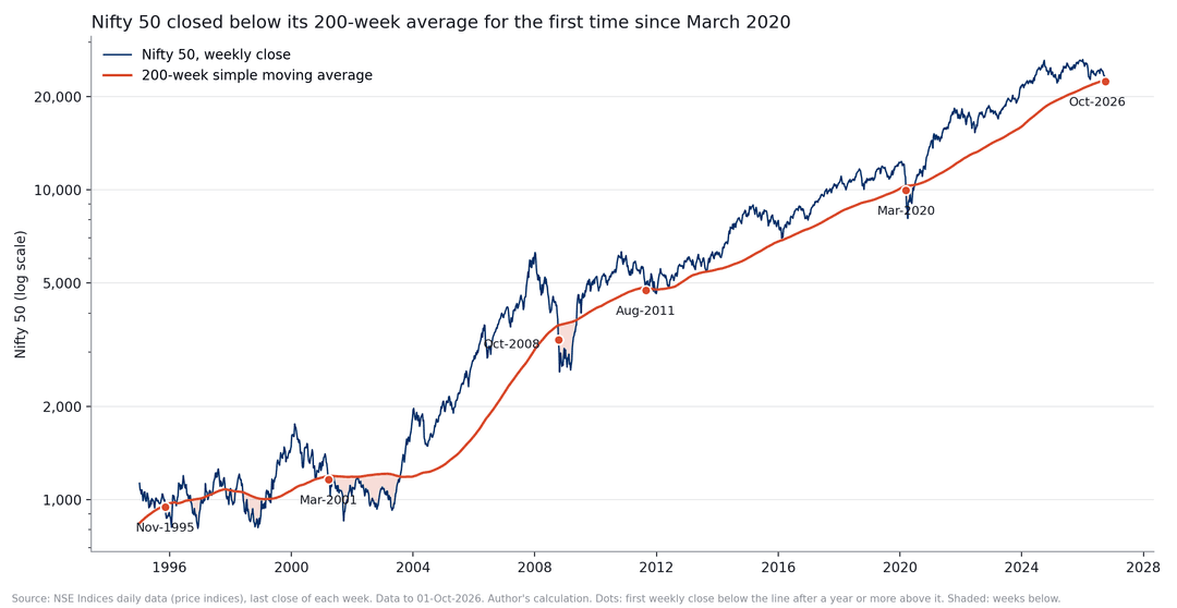
Nifty 50 weekly closes vs. the 200-week simple moving average (1995 to 1 October 2026). Dots mark first breaks; shaded areas show weeks spent below the average. Source: NSE Indices daily data; author's calculation.Interestingly, three of those historical episodes look a lot more like our current market than the vertical crashes of 2008 or 2020.
For this study, I defined a "break" strictly: it has to be the very first weekly close below the 200-week average after the Nifty has spent at least one full year safely above it. This helps filter out random, minor dips where the index briefly blips below the line and pops right back up a couple of weeks later.
Here is how the data looks across history:
Break week Close 200-week avg Weeks above before Below peak Weeks since peak Weekly RSI 10-Nov-1995 948.82 961.95 74 −31.2% 59 39.3 23-Mar-2001 1,161.30 1,193.65 98 −33.9% 58 35.6 10-Oct-2008 3,279.95 3,654.04 271 −47.7% 40 24.6 26-Aug-2011 4,747.80 4,830.86 118 −24.8% 42 28.0 13-Mar-2020 9,955.20 10,301.71 426 −19.4% 8 22.5 1-Oct-2026 22,421.95 22,606.97 327 −14.8% 39 30.9 First breaks of the Nifty 50 200-week average since 1995. "Below peak" is relative to the highest weekly close up to the break week.
Looking closely at the numbers, these five historical precedents clearly split into two very different regimes:
- The Sudden Crash (2008 and 2020): This is the violent kind of market correction. The Nifty fell hard and fast, completely blindsiding investors. By the time it actually broke through the 4-year moving average floor, it was already sitting on massive peak-to-trough losses of 19% to 48%, dragging the weekly RSI deep into the oversold 20s. In 2020, this entire destruction unfolded in a breathtakingly fast eight weeks.
- The Slow Bleed (1995, 2001, and 2011): This environment feels entirely different—and it mirrors exactly what we are experiencing today. Instead of a sudden cliff, the market simply drifted lower, exhausting investors over 10 to 14 months. The index eventually shed 25% to 34% from its highs, but because the decline was so gradual, the long-term moving average had plenty of time to catch up to the falling price.
The million-dollar question, of course, is: What happens to your money after the break happens?
Let’s look at the forward-looking returns from the exact week the line snapped:
Break week Kind Nifty below its peak Further fall within a year Nifty 1 year later Nifty 2 years later Nov-1995 slow fall −31% −14.1% −6.8% +13.3% Mar-2001 slow fall −34% −26.4% −2.0% −11.3% Oct-2008 crash −48% −21.2% +50.8% +86.1% Aug-2011 slow fall −25% −2.6% +13.5% +15.2% Mar-2020 crash −19% −18.8% +51.0% +67.1% Oct-2026 ? −15% ? ? ? "Further fall" indicates the absolute lowest weekly close during the subsequent 52 weeks relative to the break-week close. Returns are calculated using the raw price index (excluding dividends).
B. A few things immediately stood out to me:
1. Usually, the pain doesn’t stop here
In four out of the last five historical cases, the Nifty didn’t just bounce back immediately. It went on to drop another 14% to 26% at some point over the next 12 months.
The lone exception was 2011, where the extra downside was just a minor 3%.
To put this into perspective, a drop this steep isn't something that happens in a normal, random year. If you picked any random week on the calendar since 1995, the odds of the Nifty falling another 14% or more over the next year were only about 3 out of 10.
Translation: When the Nifty cracks its 4-year floor, it is a clear warning sign that the near-term risk of losing money is much higher than usual.
2. Spectacular recoveries happen after sudden crashes (Not slow bleeds)
There is a massive psychological difference between how a market recovers based on how it fell:
- After the Crash Breaks (2008 & 2020): If you had the guts to stay invested and keep your SIPs running through the panic, the rewards were massive. One year later, the Nifty shot up by nearly 51%.
- After the Slow Bleeds (1995, 2001, & 2011): The recovery was frustratingly ordinary. One year later, your returns would have hovered anywhere between a dull −7% and a modest +14%.
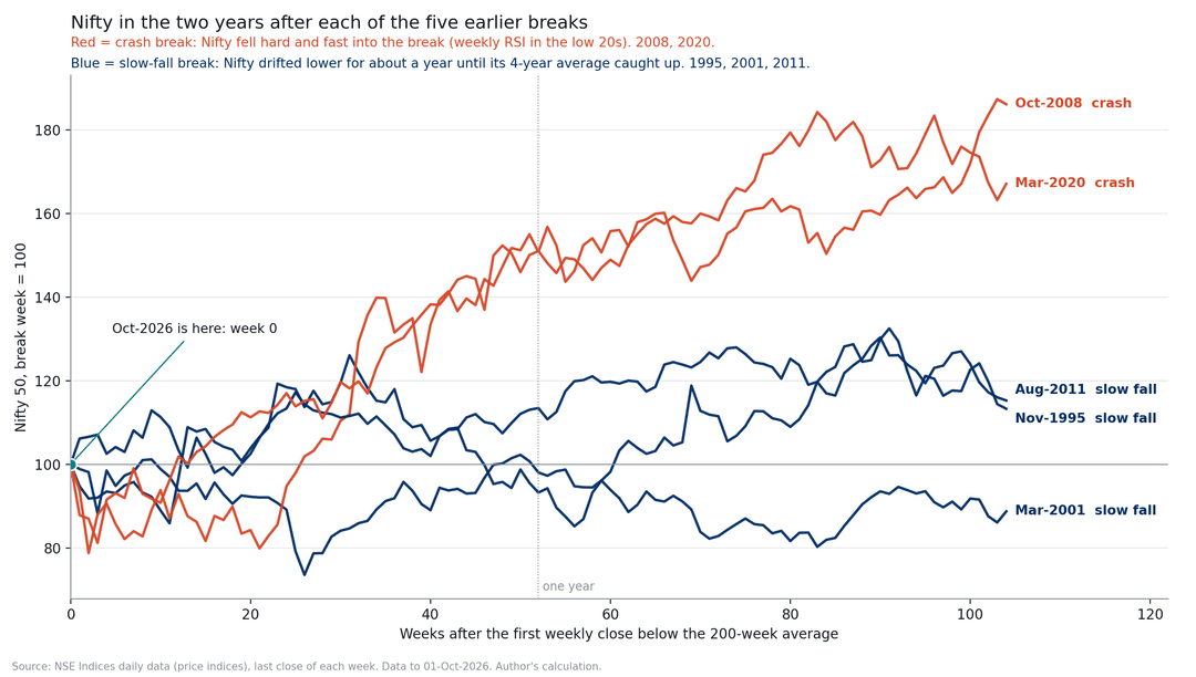
Nifty in the two years after each break, with the break week set to 100. Source: NSE Indices daily data, author's calculation.Right now, our market looks much more like a slow, exhausting bleed than a sudden panic crash. It has taken the Nifty a long 39 weeks to slide 14.8% from its January 2nd peak. In fact, compared to every historical correction we analyzed, this is actually the shallowest drop of the lot.
Our weekly RSI is sitting at 30.9. Compare that to 2008 and 2020, where the RSI was already deep in the painful low 20s.
Look at this as a key pattern to monitor—not a magical crystal ball predicting the future.
3. Nifty toota hai par market nahi!
(The Nifty has broken, but the broader market hasn't!)
This is by far the most fascinating takeaway of this entire study.
The recent Economic Times headlines warned that mid-caps and small-caps have been under immense pressure over the last few days. While that short-term volatility is true, the long-term, 4-year picture tells a completely different story.
In past crises (like 2011 and 2020), when the Nifty broke its 4-year baseline, small-caps and micro-caps were already absolutely crushed—trading way deeper in the red than the Nifty. Today, the exact opposite is happening!
Look at the stark difference in the data:
Distance from its own 200-week average Nifty 50 Midcap 150 Smallcap 250 Microcap 250 Aug-2011 break −1.7% +0.5% −4.0% −17.3% Mar-2020 break −3.4% −8.8% −25.6% −40.4% 1 Oct 2026 −0.8% +15.3% +17.6% +27.7% (Note: Reliable small-cap index data from the NSE starts in 2005, meaning we can only track this specific 200-week average comparison from 2009 onwards).
Here is the kicker: In all the weeks since 2009 where the Nifty was trading below its 200-week average, the Smallcap 250 was never trading above its own line. The closest it ever got was in August 2011, when it was still 4% below its average floor. Today? It is sitting comfortably 17.6% above its baseline!
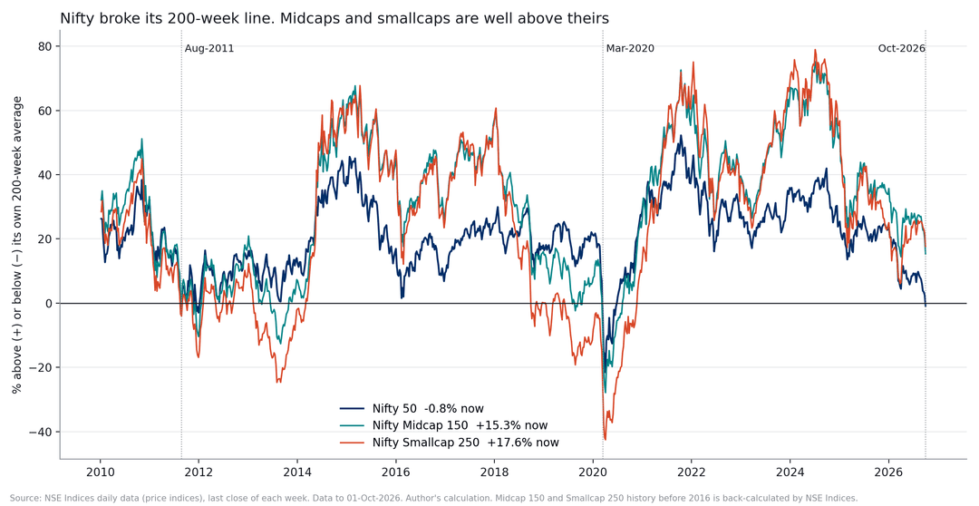
How far the Nifty 50, Midcap 150, and Smallcap 250 sit above or below their own 200-week averages. Source: NSE Indices daily data, author's calculation. Small and midcap history before 2016 is back-calculated by NSE Indices.So, at least for now, this isn't a whole-market meltdown. This is primarily a large-cap problem.
If the bulk of your money is parked in Nifty 50 index funds or top large-cap stocks, this breakdown signal applies directly to you. But if your portfolio is packed with small-caps, your charts look completely different right now.
This doesn’t guarantee that small-caps will keep soaring, nor does it mean large-caps are guaranteed to shoot up and catch up. The data is simply showing us that the two halves of the Indian stock market are living in two entirely different worlds.
As smart investors, the very least we should know is: which of these two markets do we actually own?
C. So what can investors do?
Nobody can call the bottom. Definitely not me.
But we don't necessarily need to know the exact bottom. What historical data can help us do is understand the possible risk and decide beforehand how we want to react if that risk actually comes.
Let's talk about the risk first.
In four out of the last five times the Nifty broke this line, it didn’t just stop there. It went on to slide another 14% to 26% over the next year. To put that into perspective, let’s look at your actual portfolio. If you currently have ₹10 lakh invested in Nifty index funds or large-cap stocks, a drop like that means your screen will temporarily show your portfolio shrinking to somewhere between ₹7.4 lakh and ₹8.6 lakh.
Be honest with yourself: how would you feel seeing that red on your screen? More importantly, how would you react?
This is exactly what you need to figure out before you deploy fresh cash. If your honest, gut-level answer is, "If my ₹10 lakh drops to ₹7.5 lakh, I will panic and pull all my money out," it is much better to acknowledge that fear right now—before you actually have to see it happen.
1. Accumulate slowly
When nobody knows the bottom, one very old solution is simply to spread out the buying.
I wanted to see whether that actually helped after earlier 200-week breaks. So I tested a simple approach. Assume an investor puts the same amount into Nifty every month for 12 months, starting from the week in which the 200-week average breaks. Here is what happened.
Break Average buying level vs break week Gain 2 years after starting Gain 3 years after starting Nov-1995 4.2% higher +7.8% −12.2% Mar-2001 7.9% lower −5.2% +58.5% Oct-2008 3.9% higher +80.1% +46.1% Aug-2011 5.9% higher +8.9% +57.2% Mar-2020 13.9% higher +48.8% +51.3% A 12-month SIP started in any month since 1995 (median) +18.7% +33.6% Gain on the total money invested, using the price index and excluding dividends and costs.
If you look at how things played out over a two-year horizon, the results were a bit of a mixed bag. In three out of the five past instances, starting an SIP right when the market broke its 200-week moving average actually gave poorer returns than an SIP started at any random, ordinary time.
But if you had the patience to hold on for three years, the picture completely flipped. Suddenly, four out of those five "break-period" SIPs comfortably beat a regular SIP. In fact, the median gains were a stellar 51% compared to just 34%. The only painful exception was 1995, a time when the Nifty practically went into a deep coma and refused to move for years.
So, what’s the real-world takeaway here? It’s not a fancy trading signal like "the 200-week break means buy everything right now." It is much simpler: historically, these rough patches have been excellent windows to accumulate assets patiently—as long as you don't touch that money for at least three to five years.
Another fascinating trend popped up in the data. If you had deployed a lump sum the exact week the market broke, you would have actually beaten a 12-month staggered SIP in four out of five cases! So, spreading out your money didn't really boost your returns most of the time. What it did do was act as an insurance policy during the brutal 2001 dot-com crash, cushioning the blow while the market kept bleeding.
And that brings us to a massive, often misunderstood distinction: An SIP isn't designed to maximize your returns; it is designed to manage your behavior.
For 95% of investors, the best strategy is also the most mind-numbingly boring one: just keep your monthly SIP running in a low-cost Nifty 50 Index Fund or ETF. You own India's top 50 companies, you don't have to stress over picking individual stocks, and when the market falls, your fixed monthly budget automatically buys you more units at a discount.
In personal finance, being boring isn't a bad thing. In fact, boring is what keeps most people invested.
2. A rule-based route: The MAUKA Strategy
If you prefer a strictly rule-based, objective approach over gut feelings, Definedge's MAUKA strategy is tailor-made for this exact kind of market.
The underlying logic is brilliant yet simple. The strategy patiently waits for the Nifty's weekly RSI to dip into technically oversold territory (below 30). Once that trigger hits, it scans for a basket of the strongest, most resilient momentum stocks that are still trading above their 200-day moving average and above DSmart Walking Line. Prashant Shah thoroughly breaks down the data-backed core of this framework in this video and latest one.
What really jumps out from the historical charts is how beautifully the MAUKA trigger aligns with a 200-week moving average breakdown. They almost always arrive hand-in-hand. In four out of the last five market corrections, a MAUKA signal flashed within just three weeks of the 200-week break. During the brutal drops of 2008 and 2020, both signals flashed in the exact same week.
As of this week, the Nifty's weekly RSI closed at 30.9. We are knocking right on the door, but the green light has not officially triggered yet. If you are planning to add this strategy to your playbook, history leaves us with two invaluable lessons:
a. The signal can drop early (Watch the drawdown)
Catching an oversold market can test your nerves. Back in 2008, if you had deployed ₹10 lakh into the Nifty the exact week the MAUKA signal flashed, that portfolio would have shrunk to around ₹7.9 lakh just fourteen days later. That is a staggering short-term drawdown. To combat this psychological trap, Prashant suggests a staged entry: deploy half your capital the moment the signal enters the oversold zone, and the remaining half only when the weekly RSI recovers and crosses back above 30.
b. Different market cycles crown different leaders
How a market falls dictates how it recovers. Take a look at the stark contrast between a slow burn and a vertical crash:
- The 2011 Slow Decline: After the market dragged its feet, smart momentum plays ruled. The Nifty200 Momentum 30 index gained 11.7% in the year following the RSI recovery, easily beating the Nifty's modest 4.3%. On the flip side, high-risk stocks crumbled, with the High Beta 50 shedding 16.1%.
- The 2008 & 2020 Sharp Crashes: When the market collapsed overnight and recovered violently, the tables turned completely. Momentum took a backseat while the battered High Beta 50 index more than doubled in value.
If our current environment keeps behaving like a slow, bleeding decline rather than a sudden panic crash, the 2011 playbook might be our closest historical guide. But remember, that is still just a sample size of one.
Your next steps: Large-Caps vs. The Broader Market
MAUKA comes in two distinct flavors: a large-cap version and a mid-small cap version.
Because of the massive price divergence we are seeing between large-cap stocks and the broader market today, these two variants are starting from completely different launchpads. Before risking real money, a highly practical approach is to import these pre-saved models as a virtual watchlist on Momentify. Paper-trade them, observe how they handle the upcoming volatility, and build your conviction before going live.
3. For stock pickers: hunt for the "Lions"
If you prefer picking individual stocks instead of passive indexing, there is a brilliant strategy that works remarkably well in a dull or falling market.
It comes from Prashant Shah’s fantastic book, Outperforming the Markets using Relative Strength and Breadth Analysis (2021). He actually dedicated an entire chapter to this exact kind of environment, which you can also read online on the Definedge Shelf chapter on relative strength patterns.
The logic behind this is incredibly simple. You compare an individual stock against the Nifty using a "ratio chart"—which is literally just the stock's price divided by the Nifty's price. If the resulting line goes up, the stock is beating the market; if it goes down, the market is beating the stock.
When the Nifty is sliding, two specific patterns on this chart become very interesting:
- The Lion: The Nifty is falling, but this stock is stubbornly rising anyway. Because it defies the market gravity, the ratio line shoots up. As Prashant beautifully puts it: "The bulls of those stocks are like lions, they are dominant."
- The Bullish Star: The Nifty is falling, and this stock is falling too—but it’s falling way less than the broader market. As a result, its ratio line still moves upward. Prashant calls these "silent performers" because they quietly hold their ground while the financial media ignores them.
The catch? Don't blindly hit "Buy" just yet.
The biggest mistake investors make here is jumping into these stocks immediately while the market is still bleeding. The goal right now is not to buy them today, but to build a high-quality watchlist.
Once the broader market finally stabilises and finds a floor, that's when you check if these stocks are still showing that same resilience. Prashant is very clear about waiting for confirmation: "Wait for the market to reverse before buying bullish lion stocks." If you catch a falling knife during a sharp, aggressive market crash, even a "lion" can turn on you.
Zooming out: The Index Level Lion
Interestingly, you can apply this exact same concept to entire indices.
Look at what has happened since April: the Nifty dropped 5.3%, but the Smallcap 250 index actually shot up 13.4%. If you plot a Smallcap-to-Nifty ratio chart, it looks like a massive Lion pattern at an index level. This perfectly captures the stark divide between struggling heavyweights and a booming broader market that we discussed earlier.
If you want to scan for these setups yourself, Definedge has a brilliant built-in scanner. My colleague @Brijesh-Bhatia has written a highly practical guide explaining exactly how to use it over at Multi-Timeframe RS Patterns.
Just remember the golden rule: use the scanner to build a watchlist, not a blind shopping list!
Two important levels to watch next week
For the coming week, there are two key levels worth keeping an eye on.
First, a weekly close above roughly 22,628 would push the Nifty back above its 200-week moving average. But don't pop the champagne just yet—that alone doesn't mean we're out of the woods. Back in 2011, Nifty climbed back above this average after just one week, only to break down below it twice more over the next four months.
On the flip side, a weekly close at or below roughly 22,307 would drag the weekly RSI below 30 and trigger our MAUKA condition. Remember, these aren't permanent lines drawn in stone. Both numbers will change every single week because moving averages and RSI dynamically shift with price action.
"Girta hua market darr nahi, plan maangta hai."
(A falling market demands a solid plan, not fear.)At the end of the day, I am not trying to predict the future here. For me, this entire exercise is simply about understanding where we stand today, learning how the market behaved in similar historical setups, and keeping our playbook ready if things get uncomfortable from here.
Over to you: How are you handling this current market phase? Let’s chat in the comments below—I'd love to hear your take or discuss these numbers with you!
Educational research only, not a recommendation to buy or sell any security, fund or ETF. Historical figures were calculated on 2 October 2026 from NSE Indices data. Past performance does not guarantee future results. Please consult a SEBI-registered adviser before investing. Investment in securities market are subject to market risks, read all the related documents carefully before investing.
-
The U.S. 10-year Treasury yield recently hit a 19-year high of around 5.24% to 5.28%.
The surge is a major headwind for Indian markets. A spike in risk-free U.S. yields triggers a domino effect that dampens investor sentiment in India:
-
FII Outflows: Global investors pull capital out of riskier emerging assets like India to lock in safer, guaranteed returns in the U.S treasury bonds.
-
Currency Depreciation: Continuous selling by foreign institutions pressures the INR, pushing it toward further lows against the USD. This creates pressure on equity markets.
-
Valuation Pressure: 10 year yield is considered as global risk free rate in any valuation model. When the global risk-free rate rises, equity valuations compress, making highly valued Indian stocks look expensive.
-
Higher Domestic Borrowing Costs: Indian bond yields typically rise in sync with global yields, increasing the cost of capital for Indian corporates thus putting more pressure on earning.
Interesting times ahead...
-
-
Notes from my Finding Edge YouTube episode
On 9 Sept 2026, Definedge published an episode of its Finding Edge series in which Abhijit Phatak (AP) Sir and I talked through how I trade index options. Many viewers asked for the slides. This article is the written version of that conversation, with the presentation material in article format. You can watch the full episode on Definedge's YouTube channel.
Nothing here is a recommendation. It is how I built a process around my own constraints, and you should test every part of it yourself before you deploy capital.
The problem I was solving
My situation will be familiar to a lot of readers. I have savings built over 15 to 20 years, spread across mutual funds, bonds, gold and shares. I also have other interest and personal commitments to my family specially my twin boys who deserve my time.
That gave me three constraints. I could not sit in front of a screen for six hours a day. Most of my savings were invested, not lying in cash, so I could not put ₹50 lakh of cash into a trading account. And because those savings are my retirement money, I could not afford a blow-up.
So the question was narrow. Can I earn a meaningful income from the savings I already have, without watching screens and without risking the savings themselves?
Pledging
The answer started with pledging. When you pledge approved holdings, your broker gives you collateral margin against them after a haircut. The holdings stay invested and keep earning, and the same money now does a second job. Definedge explains the steps in its guide to the pledging process, and the approved list shows which securities qualify.
For derivatives positions you carry overnight, the margin comes in two halves:
- Up to 50% can come from pledged equity shares or mutual funds, ETFs or SGBs.
- At least 50% has to be cash or cash equivalents (which include liquid fund, liquid ETFs, SGBs and some approved debt funds / ETFs).
If you don't have the cash for the second half (cash), Definedge can now fund it as margin, with interest on positions carried overnight.
I should know my worst day in advance!
What pledging does not change is the need to know my worst case in advance. With retirement savings behind the trading account, I wanted a structure where the maximum loss is fixed on the day I enter, and a credit spread gives me that structure, When i combine max loss of a risk defined option payoff structure, i know my worst loss in advance.
Five things the market kept showing me:
Before building anything, I wrote down what I was actually observing. They are simple observations that any trader can check.
- Theta is the one certainty. An option loses time value every day. Nobody knows where delta will take the price or what implied volatility will do, but time decay can be calculated in advance. As a seller, I want to collect it inside a structure where the loss is capped. If you are new to options or want to learn more about them you take this Learn Options from basic course.
- Only four indices really have liquidity: Nifty, Bank Nifty, Nifty Mid Select (symbol MIDCPNIFTY) and Sensex. Stock options are often a liquidity trap: a stock can move 4% to 6% in a day and leave you stuck in an ITM / OTM strike nobody trades with no liquidity. Four instruments is a small enough universe that one person can study it properly.
- The index makes its money overnight. Nifty went from about 8,285 in January 2015 to about 24,288 in mid-August 2026, up roughly 16,000 points. Underneath, it gained roughly 40,000 points overnight (close to next open) and lost roughly 24,000 during market hours (open to close). You can read more about it here Why Does an Index Move More Overnight Than All Day?. For me it means two things: hold trades overnight, and give bullish trades more room than bearish ones, because falls tend to recover in a sharp V trend.
- Each index has its own rhythm. Nifty and Sensex have weekly expiries (Tuesday on NSE, Thursday on BSE). Bank Nifty and Nifty Mid Select have only monthly expiries.
- Expiry week changes the risk. In the last two or three days before expiry, option prices race towards zero and gamma is at its highest. A small move against you can take a spread straight to its maximum loss. Some traders try to exploit this. I avoid those days altogether. By staying out or moving to next week / month expiry, I try to mitigate one of the unknowns which is expiry calendar risk. BTW you can watch this Fun video on Delta & Gamma to know more.
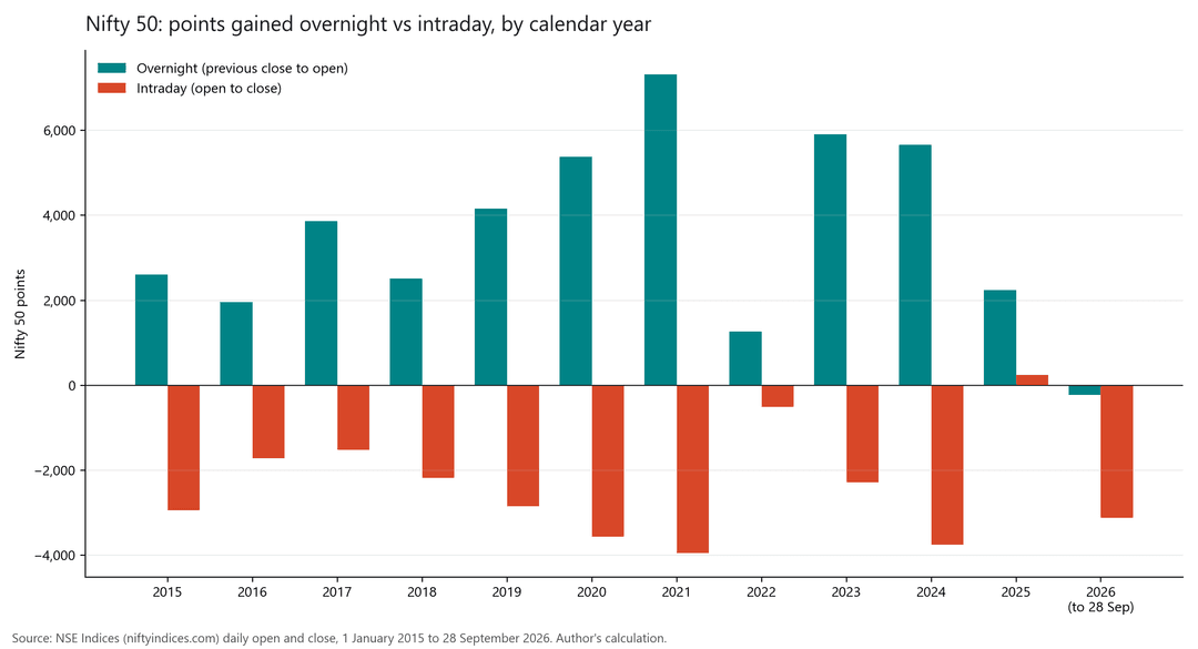
Nifty 50 points gained overnight vs during market hours, by year. Source: NSE Indices daily data, 1-Jan-2015 to 28-Sep-2026, my calculation.
The structure: a credit spread
A credit spread has two legs. For a bullish view I sell the ATM put and buy a put 200 to 300 points further out as the hedge. For a bearish view, the same with calls. The point is that max profit, max loss and margin are all known on the day you enter.
Real example from the Opstra strategy builder, 30 July 2026, Nifty Mid Select, 25 August expiry, lot size 120:
- Sell 14,700 PE at ₹223.10, buy 14,400 PE at ₹113.85
- Net credit: 109.25 points = ₹13,110
- Max loss: 300 − 109.25 = 190.75 points = ₹22,890
- Margin shown after hedge benefit: ₹58,051
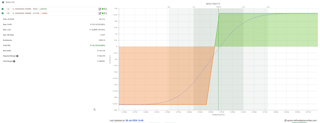
Likewise bearish structure for Nifty.
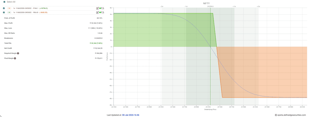
Illustration only, not a recommendation.
A bull put spread makes money if the index rises, and it usually makes money if the index goes sideways, because the sold option loses time value. It loses money only if the index falls far enough. Likewise, a bear call spread makes money if index falls, and it usually makes money if the index goes sideways, because the sold option loses time value. It loses money only if the index rises far enough.
It is tempting to call that a 66% chance of winning. It is not a statistic. The wins are small and frequent and the occasional loss is larger, so the structure on its own gives you no edge. The edge has to come from when you enter and how you exit.
My rules
These rules came out of my research, and I follow them on every trade.
- No fresh positions in the last 2/3 days before expiry. Trade next week or next month expiry based on liquidity. On Nifty I always trade next week's expiry.
- Book bullish spreads at about 75% of max profit or net credit. What does this mean --> example: sold ATM option at 200 and bought hedge at 100 means net credit received of 100 points, so book at 75 points. If you are trading this manually you can see it in Opstra Positions by selecting positions and clicking Analyze. Further suggestion: If on any given day just before close, if you see 72% dont wait, take profits and close position, who knows next day trend reverses and profits turns to losses.
- Book bearish spreads earlier, 40 to 60% (below 50% on Nifty) of Max profit or net credit. Falls recover too fast to wait.
- Exit when the main trend indicator/oscillator flips or reverses. The trend that makes you enter the trade also is the one that takes you out.
- Round strikes only: 100s on Nifty, Sensex and Nifty Mid Select, 500s on Bank Nifty. The 50 and 25 strikes are where you get stuck.
- Size from max loss, not available margin. If every open spread hit its maximum loss on the same day, could you take that loss and still trade the next morning? If not, the size is too large!.
Rules only help if they are followed every time, including on the day you feel the market will go further. So I let the system execute them. My strategies run on Algostra, which places the entry, books the target on the spread value and exits on the trend flip. I only check that the orders went through, because in a fast market a limit order with market protection can sometimes stay unfilled. The Algostra manual shows how to set up a strategy.
How I size a position
At the time of recording video (August 2026), one spread on any of the four indices needed roughly ₹40,000 to ₹80,000 of margin. I keep about ₹1.5 lakh aside for each lot. About two thirds of that (or ₹1 lakh) comes from pledged holdings and about ₹50,000 is my own cash. That is nearly double the requirement, and it is deliberate. Two or three maximum losses in a row should not force me to stop trading. The aim is to stay in the game, and few good trade a month on each index is enough to do the job.
Index Expiry Lot size Typical spread width Margin per lot (Aug 2026) Nifty Weekly 65 200 to 300 points ₹40,000 to ₹80,000 Sensex Weekly 20 500 to 700 points ₹40,000 to ₹80,000 Bank Nifty Monthly 30 500 to 700 points ₹55,000 to ₹80,000 Nifty Mid Select Monthly 120 200 to 300 points ₹55,000 to ₹80,000 Lot sizes as on 29-Sep-2026, Definedge contract master. Margins are indicative and change with volatility and exchange rules; check the current figures before you trade.
Why I read trends on Renko and Point & Figure
A candlestick chart prints a new bar every minute whether or not anything happened. When the market goes sideways for an hour, a 10-period moving average on candles flattens out and tells you nothing.
Renko and P&F charts print a new brick or box only when price moves by a fixed percentage. The sideways hour becomes a single brick, and a moving average on the chart reflects the last ten bricks of real movement. The trend becomes much easier to read.
For the indices I use a 0.02% or 0.03% box on P&F and a 0.04% or 0.05% brick on Renko, all built from 1-minute closing prices. A brick or box forms only on a closed 1-minute price, so once it is printed it does not change. Signals therefore do not repaint. You can learn more about noiseless charts on Definedge Shelf. Want to go deeper? Here are a few courses we highly recommend - Trade the Markets the Point & Figure way and Profitable Trading with Renko.
Renko and Point & Figure (P&F) charts excel at filtering out market noise, but that does not mean standard Open-High-Low-Close (OHLC) or candlestick charts are bad or not useful. For certain type of trades which require precise entry timing, volume analysis, and understanding immediate market reaction to news, i still use OHLC. Every charting method is just a tool to visualize human behavior. Finding the one that aligns with your psychology is what matters most.
Strategy Set-up: Trend first, then a trigger
Keep it simple. Put one indicator or oscillator on a Renko or P&F chart to tell you the trend, then wait for a pattern to trigger the entry.
- Trend: a moving-average stack, or RSI above/below 50, price above/below DSmart WL, price above/below MAST.
- Trigger: a pattern in the same direction, like Swing Breakout on Renko or Turtle Follow-Through on P&F. Trend indicators flip back and forth in a sideways market, and the pattern confirmation prevents false signals.
- Trade: sell the spread in the trend's direction; exit at target or when the trend flips (or reverses), whichever comes first.
I use 0.02 to 0.03% boxes on P&F and 0.04 to 0.05% bricks on Renko, built on 1-minute closes, so nothing repaints. Definedge's patterns and indicators library explains each of these for Renko and P&F charts.
What a backtest must show before I believe it
I backtest the signal on the index and then trade it through options. Option backtests on 1-minute data are not realistic, First of all, 1-minute Option prices are in LTP whereas real trades as per bid-ask spreads, secondly option prices move a lot within a minute and real orders go in with market protection at worse prices. The index test tells me whether the signal holds up. The spread then decides how much of that move I can keep.
Before I trust a result, I look for four things.
- It covers several market phases: rallies, falls and sideways stretches. A strategy tested only in a bull run tells you very little.
- It has hundreds of trades and not a small sample size.
- The average holding period is about two to five days. The spread needs at least one night to decay; remember in a credit spread we are short main leg and it pays off when there is time decay.
- It has a good profit factor and a tolerable worst month. An average hides the month that makes you abandon the system.
If you are new to backtesting, Definedge's articles on why backtesting is the foundation of systematic trading and on backtesting for trading system development cover the basics.
Sample strategy 1: Nifty Mid Select, Renko, stop and reverse
This is a pure stop-and-reverse system. It takes bullish and bearish trades with the same rules mirrored, so the margin is almost always in use.
The chart is Nifty Mid Select on a 0.05% Renko brick, built from 1-minute closes. The trend state is a triple moving-average stack using exponential moving averages (EMA) of 20, 30 and 40 bricks. You can read more about Triple Moving Averages but note the parameters below.
- Go long (sell bull put spread) when the 20 EMA is above the 30 EMA, the 30 EMA is above the 40 EMA, and a Swing Breakout Bullish appears.
- Go short (sell bear call spread) when the indicators are inverted and a Swing Breakout Bearish appears.
- Exit either side when the indicator flips which is for bullish side when EMA 20>30>40 becomes EMA 20<30<40 and likewise for bearish side.
Public strategy names:
Bullish Entry: 'Triple MA Bull AND SWB Bull' with exit on 'Triple MA Bear'.
Bearish Entry: 'Triple MA Bear AND SWB Bear' with exit on 'Triple MA Bull'.
Backtest on the index, 1-Jun-2022 to Jul-2026, index points before costs, not option P&L. Source: Definedge Zone System Builder, five yearly exports consolidated by the author.
Long Short Combined Trades 559 542 1,101 Profit factor 2.0 1.7 1.8 Net points +14,658 +9,971 +24,628 Months positive 80% 76% 82% Max drawdown 703 points. Worst streak: 12 losers in a row, about a fortnight at this trade frequency, so size for it.
The rules also held up when I changed the brick to 0.04% and when I used a double instead of a triple moving average, which gives me some comfort that the result is not an overfitting of one setting.Sample strategy 2: Nifty, Point & Figure, long only
On Nifty I use a different setup and take only bullish trades. The chart is a 0.02% P&F with a three-box reversal, built from 1-minute closes. The trend state is Triple Moving Averages (TMA) of SMA 10, 15 and 20.
- Enter a bull put spread when 10 SMA is above 15 SMA, 15 SMA is above 20 SMA, and a Strike Back Bullish pattern appears.
- Exit when the TMA inverts. No pattern is needed to get out.
Strike Back Bullish is a six-column pattern, an extended form of a bear trap. The market pulls back, draws in sellers, then turns and gives a double top buy. So this is a pullback entry within an uptrend, where the Midcap system chases a breakout.
Public strategy names:
'Triple MA Bull And Strike back bullish' with exit on 'Triple MA Bearish OR Target'.Backtest on the index, 1-Jun-2022 to Jul-2026, index points before costs, not option P&L. Source: Definedge Zone System Builder, five yearly exports consolidated by the author.
Long only Trades 238 (about 5 a month) Profit factor 1.9 Net points +8,765 (about +175 a month) Months positive 64% Max drawdown 698 points It trades about five times a month and holds for about a day and a half, so it needs very little screen time. Its drawdown and worst month were the shallowest of everything I tested.
Both are backtested in Zone Web's System Builder (how to use it), June 2022 to July 2026, five yearly runs joined together. These are index points before costs, not option P&L.
Why no bearish trades on Nifty
I did test the mirror image of the Nifty system for bearish trades. As an index trade, it showed no edge at all.
Then I measured how far each trade moved in my favour before the exit, known as maximum favourable excursion (MFE). Bullish trades went an average of 164 points my way and booked 23 points at the exit. Bearish trades went 154 points my way, almost the same distance, but booked only 8.
The falls on Nifty are real. The problem is that the index recovers so fast that by the time the trend shows exit, 95% of the move is gone. An Index backtest will hold each trade until the indicator flip exit trigger (because those are the rules to test). It cannot see that large move, but a credit spread booked early can certainly collect some of move gains.
So on Nifty you can leave bearish trades out altogether; the bullish side works as a complete strategy on its own. If you do take a bear call spread, do not wait for the trend to flip. Book it early, below 50% of the maximum profit (the net credit you collected), because the fall you are trading is usually recovered with aggressive reversals. When trading options, it is just as important to know what NOT to do as it is to know what to do. Discover a new way to trade options objectively in Trading Options Based on Options Charts course by AP Sir.What 18,000+ backtests taught me
Over the past year I ran more than 18,000 backtests on about 11 years of 1-minute data for the four indices, on both Renko and P&F, in both directions. I will not share the exact pairings, but the broad findings may save you time.
- Bullish systems beat bearish ones almost everywhere, even with the Covid crash inside the backtesting data range. Bearish side only really paid well on Nifty Mid Select, point to be aware of is that Midcap index is relatively a new index and does not cover full range of market conditions. If doing bearish side options trade on other indices then data suggest taking profits early.
- Trend indicators that kept showing up near the top: on P&F, RSI vs 50 line, moving-average pairs (Triple, Double MA), MACD above zero, MAST (Supertrend). On Renko, DSmart WL showed promise, moving-average pairs and the Ichimoku group of indicators.
- The same confirmation patterns kept showing up next to the winners: Strike Back, Turtle Breakout and Turtle Follow-Through, Swing Breakout, different Trap set-ups, Rounding Bottom, Anchor Follow throughs all on default settings.
- Simple set up won. Two conditions beat five. The survivors held 1 to 2 days, traded a handful of times a month, and had win rates under 45%. A win rate under 45% should not worry you in a trend-following system. If a trend system shows a 65% or 75% hit rate, treat it as a red flag and check the test.
Which indicator goes with which pattern, on which index and box size, is the treasure hunt I'll leave to you.
Key takeaways
- Decide what you can lose before you decide what you want to earn.
- Pledged holdings can back a derivatives position while they stay invested, and a credit spread keeps the risk to those savings fixed and known.
- Trade the four liquid indices, use round strikes and stay out of the last two/three days before expiry.
- Read the trend first, then wait for a pattern to confirm it.
- Book bullish spreads near 75% and bearish spreads between 40% and 60%.
- Size from the maximum loss of all open spreads together.
- Judge the results by the quarter, because any single month can be a loss.
- Markets change. Weekly expiries, lot sizes and rules have changed before and will change again, so keep testing.
The full conversation, including the live chart walkthroughs, is on Definedge's YouTube channel.
Happy to answer questions below.
Educational only, not a recommendation. All strategy figures are index backtests in points, before costs, and past performance doesn't guarantee future results. SEBI's August 2026 study found 87.7% of individual F&O traders made net losses in FY2025-26. I trade index option spreads in my personal account. Please consult a SEBI-registered adviser before trading.
Investment in securities market are subject to market risks, read all the related documents carefully before investing.
-
For Bullish --> Last Column is X at 0 AND Not Double Top Buy (another one ---> Last Column is X at 0 AND X at same level)
For Bearish --> Last Column is O at 0 AND Not Double Bottom Sell (likewise, Last Column is O at 0 AND O at same level) -
Navigating the Perfect Storm: 5% Yields, $100 Crude, and Midterm Volatility
We are currently navigating one of the trickiest macro environments we have seen in years. Between the US 10-year Treasury yield testing 5%, crude oil surging past $100 due to Middle East tensions, and the upcoming US Midterm elections, the market is digesting a massive wall of worry.
I wanted to put together a comprehensive, data-driven framework on how these three forces are colliding, how they specifically impact Indian corporate profitability, and how we should position our portfolios right now.
1. The Gravity of a 5% US Yield & Multiple Compression
In global finance, the US 10-year Treasury yield is the absolute baseline "risk-free rate." As it approaches the 5% threshold, it acts as a gravitational pull that drags down global asset valuations.
Here is why this mathematical threshold matters:
- The Equity Risk Premium (ERP) Collapse: The ERP is the extra return investors demand for taking on the risk of stocks over safe government bonds. Right now, the ERP is sitting at multi-decade lows. When the US government offers a guaranteed ~5% return for a decade, the mathematical hurdle rate for institutional capital to invest in emerging markets spikes.
- Multiple Compression: Even if a company's earnings remain strong, higher bond yields mathematically force a stock's price-to-earnings (P/E) multiple to shrink. Analysts refer to a sustained 5% yield as the "line in the sand" where the valuation math starts to work heavily against equities.
2. The $100 Crude Shock & Indian Corporate Margins
Adding fuel to the fire is the ongoing geopolitical conflict in the Middle East, which has pushed Brent crude back above $100 a barrel. For an emerging market like India, this is the ultimate macro headwind.
- The Macro Drag: India imports roughly 85% to 90% of its crude oil requirements. According to brokerage estimates from Motilal Oswal, every $10-per-barrel increase in crude oil can shave 30 to 40 basis points off India’s GDP growth.
- The Twin Deficits & The Rupee: Sustained $100 oil drastically inflates our import bill, widening the Current Account Deficit (CAD). This puts immense pressure on the Rupee, which in turn forces the RBI to keep domestic interest rates and liquidity tight to defend the currency.
- Sector-Specific Margin Destruction: Higher energy costs directly feed into input inflation and freight expenses. We are going to see severe margin compression in sectors with high crude dependency:
- Oil Marketing Companies (OMCs): Forced to absorb losses if retail fuel prices aren't hiked.
- Paints & Specialty Chemicals: Their primary raw material costs are skyrocketing.
- Aviation & Auto: Jet fuel and logistics costs will eat into operational profits.
3. US Midterm Election Seasonality
We are also colliding with a major historical volatility event: the November US Midterm elections. Markets absolutely despise political uncertainty, and midterm cycles are infamous for generating severe pre-election chop.
- The Pre-Election Drag: Historical data shows that the months leading up to a midterm election are typically frustrating. During the last 13 midterm election years, the S&P 500 has averaged less than a 2% gain from August 1 through Election Day.
- The Post-Election Rally: The silver lining is what happens once the political uncertainty clears. Historically, markets rally incredibly well after the results are in, with the S&P 500 averaging more than a 12% gain in the six months immediately following those same midterm elections. Furthermore, the S&P 500 has historically averaged a 6.6% gain in the fourth quarter of midterm years.
The Tactical Playbook: How We Should Position
We don't need a blanket "go to cash and hide" approach, but we absolutely need to segment our strategies based on our risk tolerance and timelines.
- For Ultra-Conservative Investors: If you have zero tolerance for near-term drawdowns, it makes total sense to hit pause on fresh equity deployments right now. With crude threatening inflation and US yields at 5%, diverting new capital into liquid funds, short-term debt, or arbitrage funds is a highly rational move to preserve capital while earning a safe return.
- For the "Normal" Investor (Core Portfolios): Stay invested. Do not liquidate fundamentally sound, long-term holdings. If you have automated monthly SIPs running, keep them going—this volatility is exactly what SIPs are designed to average through. However, postpone any fresh lump-sum deployments or new equity SIPs. Build up your cash buffer ("dry powder") so you can deploy it when valuations compress.
- For Tactical/Momentum Traders: We can still pursue alpha, but the filter must be merciless. Only hunt where genuine relative strength (RS) exists against the Nifty 50. Ensure the stocks are comfortably holding above their 200 DMA. Most importantly, strictly respect your 10/20 rank buffers and mechanical stop-losses. Do not try to catch falling knives in sectors heavily exposed to crude oil.
Final Thoughts
The combination of a 5% risk-free rate, $100 crude, and midterm election uncertainty means the broader index is going to be a tough, choppy place to swing big until late November.
Continue with existing investments, protect your capital from risky bets, stick only to your strongest charts or perfect set-ups, and wait for the post-election clarity. We will likely get much better, lower-risk valuation entry points in Q4 once the market digests these macro shocks.
Stay disciplined and trade safe,
Dushyant Thakker
Ichimoku on Renko Charts: The Ultimate Noise-Free Trading System!
Ichimoku on Renko Charts: The Ultimate Noise-Free Trading System!
Ichimoku on Renko Charts: The Ultimate Noise-Free Trading System!
Ichimoku on Renko Charts: The Ultimate Noise-Free Trading System!
Ichimoku on Renko Charts: The Ultimate Noise-Free Trading System!
System Builder- Need help to create logic in system builder for P&F
IVP Cheatsheet
Smart Indicator: D Smart line
Can a fund's price lie? What Turkey's frozen funds teach Indian investors
Nifty Toota Hai Par Market Nahi: What History Tells Us About the 200-Week Breakdown
Nifty McClellan Breadth
Can options trading generate income?
is there any p&f scanner to find near DTB or near DBS
Navigating the Perfect Storm!