Hi, you will get an email and notification. You don't need to track it manually.
Regards,
Prashant
Hi, you will get an email and notification. You don't need to track it manually.
Regards,
Prashant
Currently, Momentify and RZone are separate platforms. We have integrated RZone with Momentify for strategy execution. We are working on backtesting integration as well.
For Momentum Investing backtesting:
Go to - >RZone -> Momentum Investing Scanner. You can see the strategies saved in Momentify in that scanner. You just need to select the strategy and simulate. There is video available explaining this in Momentify learn section.
For Momentum trading backtesting,
Go to RZone -> Backtesting -> Momentum Trading Backtesting. You need to create the strategy here and backtest. We are working on linking it directly with Momentify trading section.
Master scanner is a complex piece to backtest.
Yes, we are working on it. It will be made available in next 8 - 10 days.
This is a very interesting suggestion, thank you. Gives me more ideas of breadth in intraday. Will get that done.
Btw - you can cheque intraday X% breadth in Ready Reports and Dashboard. It is one of my fav intraday tool.
Radar is a platform for Fundamental analysis. F&O margin can't be added there. Where do you want to use it? We can provide it in RZone.
In addition, TradePoint charts patterns indicators are completely free.
In TradePoint and RZone - all market segments real-time charts are free.
Scanners and Backtesting are in the paid version.
Nice suggestion. Will get it done asap.
Noted. You can click on the check box to sync symbol on the charts.
Namaskar sir,
i - Always on LTP (Closing price at end of the day)
ii - Yes. Same box size for continuation and multiplied by reversal value for the reversal.
Regards,
Prashant
Noted both. Will get that done soon.
Nifty 500 is adjusted. All groups except F&O are historically adjusted.
I am checking with Rajesh. I'll get back on this.
This is addressed. You will see the data for a longer period in the next release. Planned on coming weekend.
Almost all groups are not historically adjusted except F&O. We'll share the list. You can use Nifty 200 instead of F&O.
How will you define Swing high or Swing low here? Fractal? Can get that done.
Yes sir, its a complete book. Aur kitna likhun 
Brilliant. I liked the charts you shared. Please keep them coming.
Yes, you are correct.
Hi, the last column is not the SUM. It shows yearly return. Return of the stock on 31st December of each year compared to previous year. There is no bug. Standard deviation is calculated on monthly returns.
Brilliant. Happy to know.
I see no difference. Please check at your end and share the screenshot if you still see the difference. Try repairing your desktop data. Please let me know.
This is the chart on my screen right now
Web
Desktop
Hi,
Momentum investing simulator and Momentify rebalance - both are performing properly.
When you run Momemtum investing simulator for the same period - it calculates EOD data. For example the entry date is 1st. It will consider closing price of 1st for the calculation. While actual execution, Momentify calculates the entry price when you execute the basket. So, there will be a difference in backtested data and the actual execution. Even the number stocks will change. For closer to backtesting, you can execute the basket at around 3 pm on the selected date.
I have mentioned this in the book and several times - the backtesting gives us the idea. There will be a difference in the performance while execution. Read this chapter.
https://shelf.definedgesecurities.com/master-momentum-investing-trading-strategies/chapter-10-backtesting/
In the long run, the result will be close to the backtesting and it can even be better. There is no reason to doubt the backtesting or Momentum investing because of this. You can always crossoverify the backtesting data with the excel file and Momentify stocks with the strategy fields. You wouldn't find the discrepancy.
Let me know agar abhi bhi doubt hai.
Hello everyone,
I am looking into it.
There are three types of backtesting in RZone:
Normal Backtesting
Momentum Trading Backtesting
Momentum Investing Simulator
The above issue raised seems with normal backtesting or momentum trading backtesting - I'll check with the team. I'll get back on the quantity issue raised. I will also have to analyse the conditions used. I'll check the logs.
I myself runs backtesting almost everyday in RZone. Momentum investing simulator is accurate and you can always cross verify with the data. Like @Alpha-Trader did here. I will soon get back on what went wrong here and get it fixed asap.
Sorry for the delay in reply. I will check the Forum on daily basis from now.
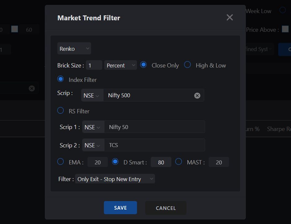
Good work in a short time. The drawdown in your strategy is already under control. You may also explore using a Market Trend Filter to further manage drawdowns.
Please test the strategy results across multiple periods and on different groups. It is acceptable if the CAGR reduces slightly, but ensure you check it during bearish market phases as well as on a broader universe like the Nifty 500 index.
For deeper understanding, you can refer to my book on Momentum Investing or watch the videos available in the Learn section of Momentify.
Regards,
Prashant
Are you guys still facing the issue? Please let me know.
Regards,
Prashant
Ranking is currently as per FIFO method. We will soon provide ranking option in backtesting. We are working on it. We will also provide box-value in market trend filter window for backtesting.
We will soon do something about it.
There is no issue. Please check your strategy. Support team can help or you can share your strategy here.
Try higher periods for ranking. You can also try momentum indicators in the entry setup.
Hi, we will get that option added to backtesting.
For the Momentum trading strategy in Momentify, you can select the "Fresh" option to view stocks that qualify for the setup on that day only.
Pls share expression the system builder as well. Is it 1 and 2?
What are you looking for? Green dot and Anchor column follow-through in the same column?
Will get it fixed. While backtesting, you can simply change the exit strategy and backtest.
We are glad to introduce Momentum Trading Backtesting.
You can perform backtesting on any kind of technical strategy—whether momentum-based or reversal setups.
The Definedge Momentum Backtesting platform offers a powerful environment with:
• Multi-timeframe strategy support
• Relative strength and momentum frameworks
• Historical constituents (no survivorship bias)
• Lightning-fast backtesting
• Complete portfolio testing with detailed insights
Explore the full potential of technical strategy testing—systematic and insightful.
We have built a simulator for Momentum Investing strategies, where periodic rebalancing works well. However, the same simulator approach doesn’t suit momentum trading strategies. This is because rebalancing is optional in trading, and the system needs to scan the portfolio daily for exit and entry conditions—making the simulation process extremely slow.
That is why we have adopted a backtesting approach for momentum trading strategies. We have significantly optimized its performance and will continue to enhance it further.
We hope you find this feature useful.
Did you save strategy in Momentify and selected that strategy in RZone Momentum trading backtesting ?
The spike in returns occurred because most trades were exited in May, as the backtesting period was ending. I’ll check the formula for the highest return trade.
We are working on integrating US market data into TradePoint and RZone. We'll share updates with you soon.
Equity curve is shown as per the total P&L (Realised plus unrealised).
Drawdown is calculated only on realised P&L.
Entry based on patterns, indicators or their combination on P&F or Renko chart. Same way, exit based on technical strategies on P&F and Renko charts.
For example,
Entry based on AFT pattern and exit based on double bottom sell on P&F chart.
Entry based on super bricks and exit based on bearish swing breakout or below D Smart on Renko chart.
You can use other momentum template options available in Momentify.
Unlike momentum investing, trade execution is optional in momentum trading on Momentify. Therefore, we have not provided a virtual option for it.
Exploring possibilities. I'll get back on this.
Regards,
Prashant
Hi, separate P&L will be maintained in Momentify. We will work P&L from taxation point of view as well.
Pls check now
Hi Pritesh, will give that option in system builder soon.
Yes, will arrange the callback.
There is a possibility that the swing breakout brick was formed on 2nd January in you example. Support team will check with you.
For trading strategies, the execution is optional. Hence, there are no virtual strategies.
Yes, we will soon add it back.
Yes, it will be executed in real-time when you click on the rebalance button. Liquidity issues might arise when quantity is huge. You dont need to keep additional cash for that. When that stage arrives (a good problem to have ") ), you can edit the strategy and put volume filter to avoid illiquid stocks.
), you can edit the strategy and put volume filter to avoid illiquid stocks.
Not really. That kind of portfolio option is not available in Momentify.
We can do such things.
But i think people will find it very complicated. Moreover, I dont think that will have major impact on the performance.
Hi,
NSE groups are maintained by NSE data analytics. They include the scrips in their portfolio based on their criteria.
We have created Definedge sector and other thematic indices based on the company profiles.
We will explore this idea of mother group.
Thanks.
noted
Noted. We have that in agenda.
Yes. Pls check Straddle Scanner (Real-time scanners) in TradePoint desktop.
Sure.
For now, bearish conditions can be applied on Options charts for Options selling.
Time tested settings::
One-minute timeframe on Noiseless charts
3% box-value for P&F
3% - 5% brick-value for Renko.
You can use Indicator divergence scanner (Smart Scanner) for positive and negative divergence.
You can easily build RSI 55 crossover condition using system builder in RZone and TradePoint. Refer to below screenshot.
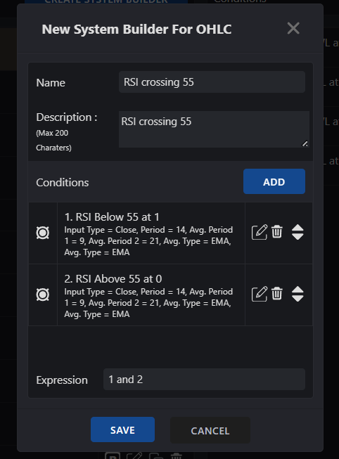
RSI below 55 on candle 1
RSI above 55 on candle 0
Expression: 1 and 2
The additional funds will be distributed in all stocks at next rebalance.
The Market Trend filter condition has not been met, which is why this message appears during scanning. Please remove the Market Trend filter and try scanning again.
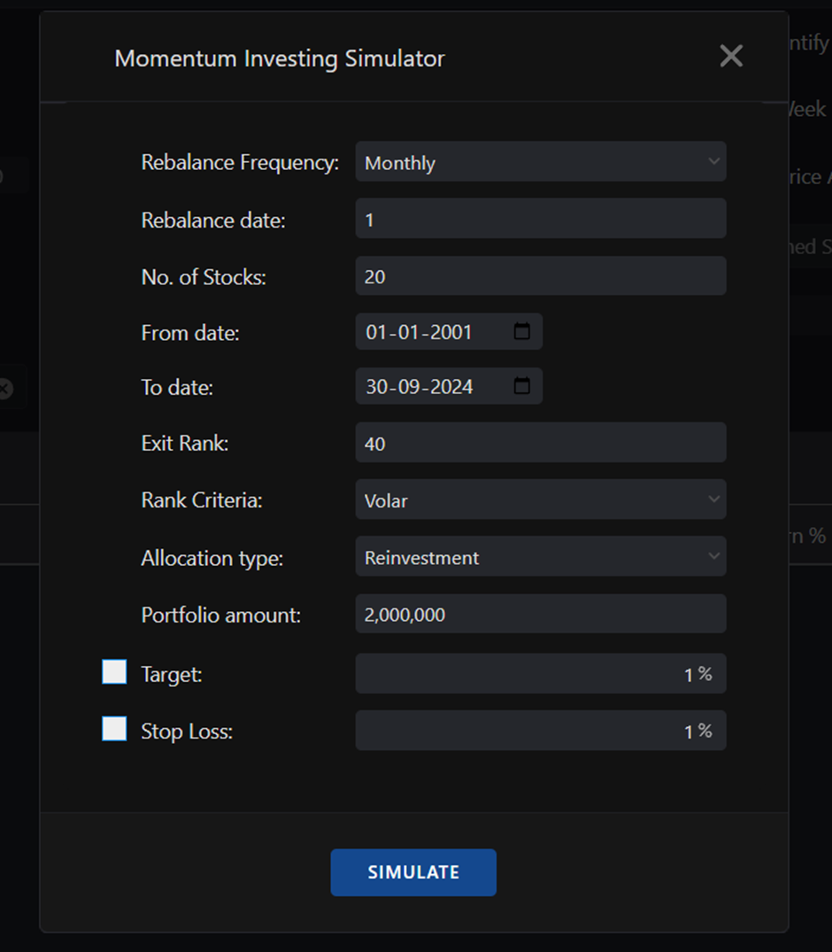
You can follow quarterly rebalance method. Custom period is not available as of now.
Ok, I'll have a look. I'll check with the support team.
EQW charts gets updated at end of the day. Change timeframe to daily - it will work.
Yes, we are working towards that.
Great. Pls send it to [email protected]
Yes, recordings will be shared with all the registered participants.
Hi,
All the suggestions given above are noted. We will soon make Lumpsum and SIP options available in Momentify. (In a day or two).
Most of the suggestions related to trading are already implemented in the Momentum trading section. I'll soon record a video explaining trading strategies.
Noted sir. We will make it available in our Super Algo platform.
Pros and cons of each strategy. You can try D Smart indicator for trailing the trend.
You can also consider the method of re-entry if the initial risk is affordable.
In above chart, all bullish counts are valid and open. Bearish count is not yet activated.
When multiple bullish counts are open - treat is as a roadmap. The first count is the first level you should look at. If there is a count cluster, when multiple counts are indicating some level, it is a good reference level. When stock is in strong momentum, more bullish counts will get opened while achieving the older ones.
Hi.
You can try momentum indicators such as D Smart, MAST, Moving average, Super trend etc on noiseless charts.
Yes, will get that done. thanks.
You can easily do it in Momentify trading strategy section. I'll soon record a video explaining that.
use 252-period King Oscillator. Same as RSI.
Tick charts are very useful with P&F and Renko plotting methods. I have already mentioned it several times in videos and webinars.
Noted
You can plot 'Auto 45-degree trendlines' from tools. Then you can plot double-top buy from pattern section.
DTB after 45-degree trend line can be considered as a follow-through pattern.
Noted.
That's very tricky. We have that in our 'To do list'. Will update.
Select 10 for tail. It basically shows the score and trend of last 10 sessions.
Noted above suggestions.
Yes, recording of the whole program will be shared with all the registered participants.
No changes are done in the Momentify basket. Please share details at [email protected].
You can chose not to buy those stocks while executing baskets.
However, I would suggest to treat Momentify as a separate portfolio.
We are working on it.
Feel free to go with your backtesting results — there’s no harm in that.
In my experience, Volar performed more effectively across different sample sizes and time periods.
That said, it’s very possible that certain studies may work better on specific sample sizes, timeframes, or groups of stocks.
I would be genuinely happy if you discover something even better than what I have shared in the book.
Backtest Nifty 200 index. More or less F&O index only.
noted
We will soon make BSE market available in Momentify.
Yes, Radar - fundamental conditions are not considered while backtesting. We are working on it.
We will make an option available in Momentify basket today - Add more funds in the running strategy. You can use that.
Lump sum amount ka feature aaj available ho jayega.
Momentify is not available on Zone mobile app.
We are making that option available in Momentify today.
Volar is calculated for the period you chose for ranking. If there are multiple periods, average annualised volar is considered.
Ok, we'll add hedge option in Momentify. Will make it available in simulator as well.
Exit condition based on technical indicators - Work in progress. We will soon get it implemented and update.
I'll get that scanner created. I'll recommend it for trading strategies not for investing.
1 . Great to know. Thank you.
2. Noted
3. Will get that done asap
4. Yes, will do that. New features on Momentum trading section will be released next week. I will soon record videos on trading part and upload sample strategies.
Thank you. Yes, I will also record a video series on Momentum trading and Intraday momentum trading strategies.
Isn't it right? 78 days pending for the next quarterly rebalance. Due in August.
We are making a feature of adding the fund to the existing strategy available. It will be made available by next weekend.
You can sell stocks manually and withdraw funds. You can update it on Momentify so that P&L reports wouldn't get affected.
We will provide that option too in a single click but it is very tricky hence taking time.
We can't predict how a strategy will perform in the future. What we can do is learn from historical data and understand the strategy through logical analysis.
We are working on this feature. We will make it available by next weekend. It will be applicable to all the existing and running strategies as well.
Hi,
It can work but bearish strategies need some more tweaking. We will soon add a trading section in Momentify followed by option to run bearish strategies (reverse momentum).
You can use HMA for stock selection using RZone scanner. See below image.
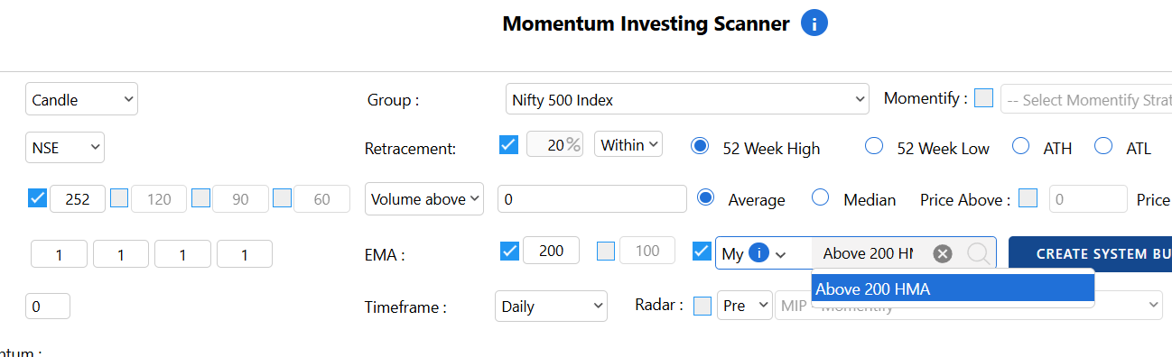
You can also backtest it.
Below link explains how to create systems in RZone. Support team can help you if required.
https://www.definedgesecurities.com/blog/products/how-to-use-system-builder-in-tradepoint-or-rzone/
Will get that option added for Market Trend Filter as well.
Support team can help you how to create system.
Will get that option added for Market Trend Filter as well.
1 - We are working on both.
2 - You can modify strategy conditions. Shifting universe is very tricky. Better to stop the existing strategy and start new strategy with the same funds.
You get it free for 2 months. The subscription fee gets adjusted against the brokerage.
Strange. Something is not right. Can I ask my colleague to call you and check it online?
Great. Let me know in case a query.
Nifty 500 is survivorship bias free. It considers past data as well.
Nifty Multi-cap considers current group for backtesting.
Nifty 500 backtesting data should be considered. You can run live strategy on Nifty Multi-cap group as well.
Will check and get it rectified asap if there is an issue.
Yes - 10, 10, 2 is good.
Work in progress. It will be added in system builder conditions for real-time scanners and Buzzar.
Upcoming 2-day event is Momentum Trading Strategies event. It will cover all momentum strategies including noiseless charts, relative strength, breadth, and price patterns.
If you can manage weekdays, you can attend Pathshala program. Above concepts will be covered in that event too.
Use Multi-chart scanner.
Candlestick chart: 5-EMA > 13-EMA, MACD > 0
P&F Chart: AFT above Moving average
You will get stocks qualifying for all these conditions.
These conditions are easy to build in system builder - support team can help you do that.
Noted this requirement. We will add it in Super Algo platform.
It can't be automated as of now. We will make it available in our Algo trading platform.
You can set Buzzar for these conditions and execute when alert is triggered.
To all - please post your queries separately instead of writing in this thread. It would be easy for me to track. Thanks.
Positions -> Holding analysis
You will find statistics along with index return
@Shubham Mishra Shouldn't happen. Please share details. Will check it asap.
@Parul Mahajan
Bit complicated. I'd recommend separate portfolios for both.
@Suresh Nagaral
1 - We will add some interesting features in momentum trading section and upload video in next 7 - 10 days.
2 - SWP is in our agenda. We will add that option.
@Anshu Prashar
I don't buy this idea and I dont think it will make much difference in the long run. However, we'll give that option in the Momentify section.
@CHITRA V You can manually add it and update in Momentify portfolio.
@CHAITANYA JOSHI
It is sorted now. You dont need to mention allocation amount when selecting SIP.
@CHAITANYA JOSHI
It will allow you to add stocks upto the total portfolio size. You can manually sell stocks from the portfolio and update the sell price in the holding section.
@CHAITANYA JOSHI 1. You will have to accept some drawdown. You can’t save an investment portfolio from market corrections beyond a certain point. Outperformance over a 3- 5 years should be the goal. Try removing 100 EMA and replacing 20-EMA filter with 10-EMA. It’ll come at a cost.
2. That’s fine. Try 30% stop-loss.
3. That’s become more of a trading portfolio. You can explore trading section in Momentify. Trading section with new features will be released by coming Friday.
You can add stocks manually in Momentify portfolio.
@Ram Rama It is available now.
@Zach Santhosh We are adding both options. Adding to the existing portfolio and withdrawal.
@Parul Mahajan That's fine. Don't worry. You dont need to define allocation while selecting SIP option. We will disable allocation option for SIP.
Yes, will get system builder condition check added in the Market trend filter.
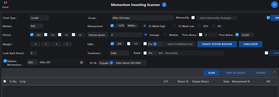
If you are using capital of 10 lac, use Price below 50,000 (less than per stock allocation) rule.
Below is an image.
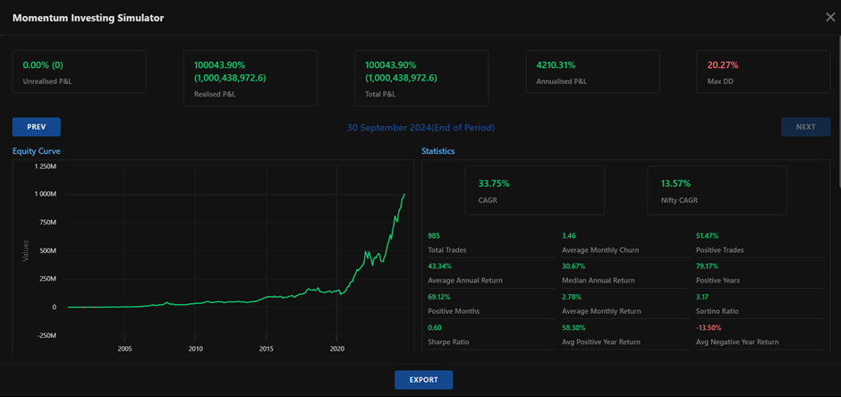
Data in Momentum Simulator is accurate.
Please check below screenshots for MIP-33.
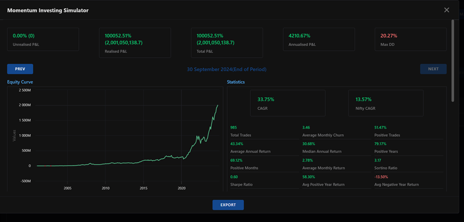
It doesnt include charges and taxes.
It doesnt include dividends and earnings from available cash parked in fixed income instrument.
@RUSHABH VORA Thank you
It will be made available maximum by next weekend.
Both are implemented. The results are with 'and' option. 'Fresh' button is added for the first box-value.
Yes. If you notice, we have given look-back date option in several scanners. We will soon make it available in all scanners.
Both your suggestions are noted. We will work on them.
We will give option to exclude stocks in 2% - 5% circuits.
Currently, you can buy upper circuit stock or lower circuit stock next day and manually add your trade price in the momentum portfolio.
Check below screenshots for the correct strategy inputs
Volume depends on the group you are selecting. Volume is a liquidity criteria and it is more useful for small cap or micro cap stocks. Average volume of 50,000 can be tried.
Ok, thank for you suggestion. We will work on it.
@Bhupen M Stocks that do not meet the scanner conditions will not appear in the output.
@RAJA BABU If there is a specific query, I can help.
@Arvind Sampath Haha.. looking fwd to meeting you in the event.
@Saju Raj Great to know you have completed it. I hope you found it informative. Current 7-RSI column should be above 50%, not all previous 7 columns.
@Umang Gohil Hi, yes book concepts and much more will be discussed in detail in the Pune event. I am excited for the event because I will get opportunity to discuss the subject in the offline event with people.
My full-day offline event after years
Thank you, friends, for your kind and encouraging words.
This book is an honest attempt to share knowledge and contribute meaningfully.
If you liked the book, I’d be grateful if you could leave a review on Amazon.
Thanks again!
Hello everyone,
I am happy to share that my book on Momentum Investing & Trading is now published!
This marks the beginning of a mission — to build a community of sensible momentum investors and traders, and to empower them with powerful tools to become independent investors and their own fund managers.
We will be sharing more about this very soon.
Btw, RZone is free for you if you are a TradePoint desktop user.
Yes, momentum investing and trading scanners are being added in TradePoint desktop as well.
Noted. Will work on it.
A video on this feature will be uploaded next week.
It is added now. Please check. Thanks,
I understand. Trust me, if there is not timeline, you will never complete the course. However, I'll discuss with the team about increasing the time period.
Yes, 0.01 is a positive expectancy. Your system should have positive expectancy, higher the better. Above 0.50 is excellent.
@Aanal Shah There’s no such thing as the best charting method. P&F (Point & Figure) and Renko are noiseless charting techniques that differ from traditional candlestick charts.
P&F charts plot price in a vertical format, while Renko charts use a diagonal format.
If you are looking to learn a method for effective stock picking, P&F offers a clear advantage. For trading a few instruments consistently and riding the trend, Renko can be highly effective.
That said, both are complete systems in themselves. Once you understand one, learning the other becomes easier.
Nicely put. However, I disagree with the statement that no chart works in a bear market. In fact, during a bear market, price analysis becomes even more crucial. It's often the lack of discipline or confusion around the strategy that leads to unfavourable outcomes—not the charts themselves.
Sure, will share a writeup on it.
Work in progress. We are working on a super algo trading platform. I am sure you will like it.
It is available in Table section of RZone and TradePoint. Will provide option to use only T-line. Backtesting is very tricky.
Stick to Volar. We will remove Volar (Conservative option). Volar is better.
regards,
Prashant
Worried About the Downtrend? Could the Market Bottom Be Near?
They say fortunes are made in bear markets. What you can earn in one year of a downtrend might take a decade in a bull market.
If that is true, why do traders panic when markets fall?
Investor portfolios are declining, and sentiments are low. But why should traders be worried?
Because they are not prepared.
A bearish market or a downtrend is a golden opportunity for traders who follow a systematic and process-driven approach. Bull markets can create bad habits that lead to trouble when the trend reverses.
Investors too make the mistake of not ensuring timely exits from stocks, often leading to getting trapped. They constantly search for support levels during a downtrend, hoping their stocks wouldn’t decline further. But hope is not a strategy.
In a bull market, almost everything works, and it’s easy to believe you have mastered trading. But the real test comes when the market trend changes suddenly.
So, how can you stay prepared and adapt to any market condition?
By becoming a disciplined trader with a strong trading system in place.
Will market form a bottom and bounce from current levels since it is extremely oversold?
Your process and system should provide an answer to this question, rather than relying solely on your judgment. If judgment is involved, it should be backed by meaningful and well-grounded analysis and a well-defined process.
There are countless trading systems available.
But here is the catch: while trading systems can be borrowed, conviction cannot.
With countless strategies and trading courses out there, it’s easy to feel overwhelmed. But within this challenge lies an opportunity—the chance to create a system that aligns with your unique approach. That is where your true edge lies.
See below chart.
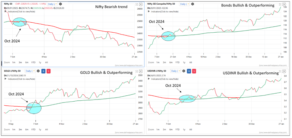
The first chart displays the Nifty line chart. The second chart compares the Bond Index versus the Nifty through a ratio chart. The third chart shows the Gold versus Nifty ratio, and the fourth chart plots the USDINR versus Nifty ratio. A 100-period EMA (Exponential Moving Average) is applied to all these charts as a medium-term trend filter.
When the Nifty chart moves below the moving average, it signifies a bearish trend. If other asset classes remain above their respective moving averages, it indicates Nifty’s underperformance relative to those asset classes, suggesting that money is flowing out of equities.
To simplify analysis, I have used ratio charts with a medium-term moving average, making the concept easy for everyone to grasp. However, for those familiar with P&F (Point & Figure) charts, I recommend plotting this equation on P&F charts for deeper insights.
This template is easy to create on the Zone platform. Here's how:
Visit zone.definedgesecurities.com.
Click on Layout and select four charts.
Configure the charts as follows:
If you don’t have access to the CDS segment, you can use Crude Oil or the Nifty Mid-Small 400 Index as Scrip 1 for Chart 4.
At Definedge, we focus on creating a process that gives you an edge and helping you become a disciplined trader. Our complete ecosystem of proven tools is designed to support your success.
We’ll explore more strategies like these in the Free Webinar I conduct every month, exclusively for Definedge Securities members.
Join us to learn and enhance your trading approach!
Prepare yourself to thrive in any market condition. See you at the webinar!
Regards,
Prashant
Very nice, Shobhhit! I am glad you found Definedge platforms worthy of your contribution. It is great to see your posts, which will help others learn from your studies.
I will write separately about the steps one can follow to achieve certifications and build a career in this industry.
Very soon. Thanks for the suggestion.
Wonderful charts @Shobhit-Acharya
Yes, we are already working on it.
You access it now on Zone Mobile app position page.
Below is a link to know how to read it
https://hooot.ai/Hooot-Your-Personalised-Contextual-Real-Time-Trading-Assistant.html
We will soon create videos and explain more about it.
Yes. Will get that done.
It is already available in all applications. Please let me know if you want me to connect with our customer care team.
Wonderful. We'll work on this. Thanks for the suggestion.
Sure. It will be a great help. Please DM me your contact number. Thanks.
RZone -> Renko Scanner -> Pre-defined scanners- > Bullish Swing breakout
Explained here
https://shelf.definedgesecurities.com/renko-chart/breakout-pattern-renko-chart/patterns/
0.50% and 10-D smart
Sorry for the late reply. Noted. Will get that done.
BETA of momentum portfolio will always high. High Alpha comes with High Beta. 'How much' depends on market conditions.
To achieve a better balance, consider using Volar or running the momentum portfolio on a group of low-beta stocks.
Using a Market Trend Filter is an effective way to manage drawdowns in Momentum investing. However, every approach comes with its trade-offs—reducing drawdowns often means compromising on returns.
To strike the right balance, consider experimenting with different combinations. Some effective options include applying a 20-EMA or 50-EMA on the index, Renko charts with a 0.25% brick size and an 80-D Smart, use Volar for ranking.
Sector Momentum Analysis
Sharing some charts showing sector momentum analysis.
Sector momentum analysis
Using some simple examples to analyze trends and momentum.
RSI above 60
Price above multiple moving averages
Near the 52-week high
Swing analysis
If more stocks in a sector are in a strong trend and momentum, it shows the strength of the sector.
Currently, Nifty 50 index stocks are in momentum. If the reading of the sector is more than the Nifty, we can say that the sector is outperforming.
Below is data.
RSI above 60 can be defined as a strong momentum.
Chart showing sector wise reading of RSI above 60.
54% of Nifty 50 stocks and 41.50% of Nifty 500 stocks are trading above RSI 60.
Sectors with more than Nifty have better performing stocks.
Price above 20-day, 50-day and 100-day moving average shows stocks in strong uptrend and momentum.
Chart showing the percentage of stocks trading above all three averages in each sector.
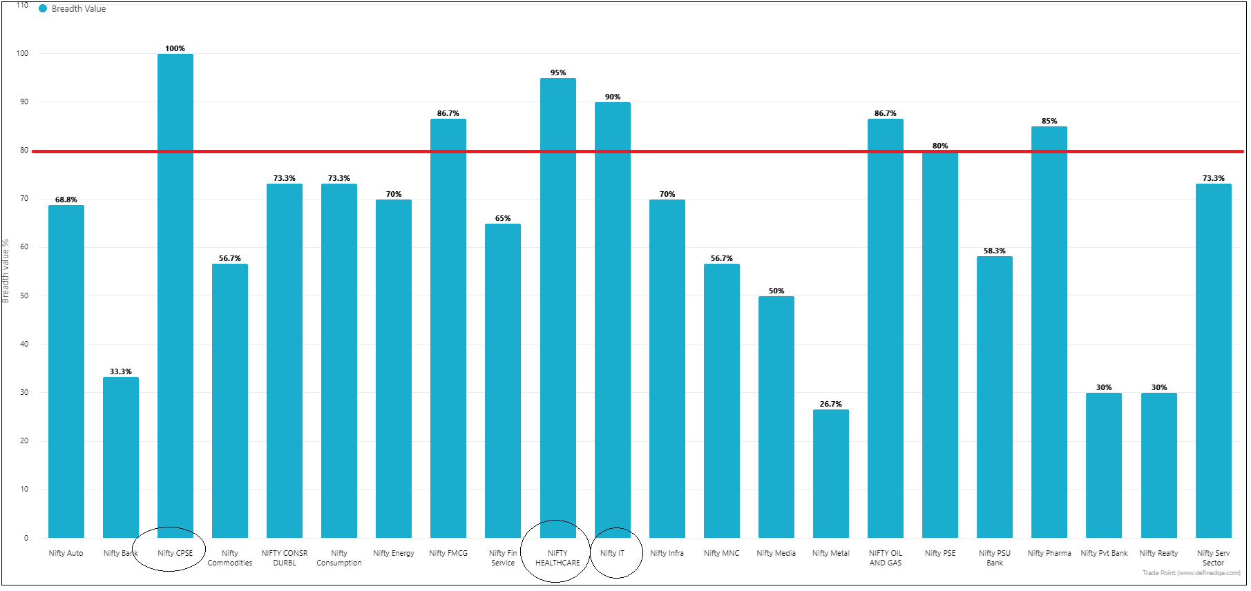
80% of Nifty stocks are trading above all three averages and 59.70% of Nifty 500 stocks are trading above all three averages.
Stocks trading within 5% of their 52-week high shows that the stock is in strong momentum.
Chart showing the percentage of stocks trading within 5% of their 52-week high in each sector.
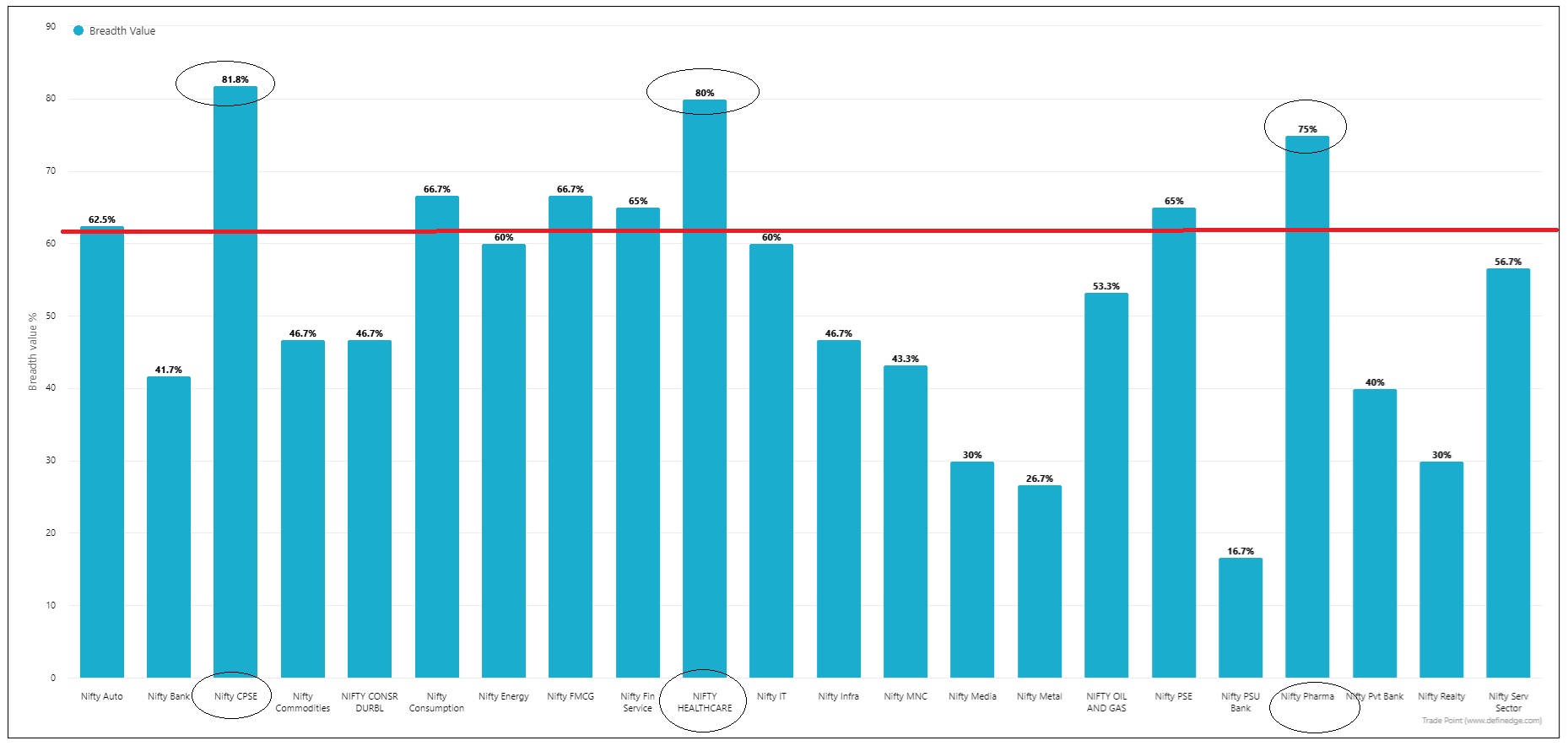
62% of Nifty 50 and 37.70% of Nifty 500 stocks are trading within 5% of their 52-week high.
P&F is a swing chart.
X% = Percentage of stocks in an uptrend
DT% = Percentage of stocks given a breakout
X% = Percentage of stocks with strong upside momentum - the higher the better
O% = Percentage of stocks with strong downside momentum - the lower the better
Nifty 50: 78% in uptrend, 60% breakout, 33% upside momentum, 4% downside momentum.
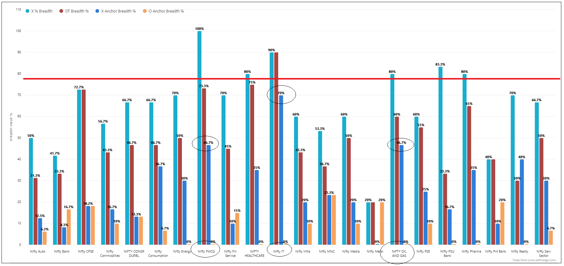
Sectors like CPSE, IT, Oil & Gas, FMCG are in momentum. More stocks in these sectors are in momentum than broader market indices.
These sectors may continue to remain in strong momentum in medium-term.
How about sectors turning to bullish momentum?
When a sector crosses the 50% mark during bullish swings, there is a likelihood that it will gain momentum. Picking the outperforming stocks of those sectors is an effective strategy.
65 Definedge sectors were scanned to check sectors crossing 50 mark. Below is their chart with performing stocks of the sectors based on the ultimate matrix study.
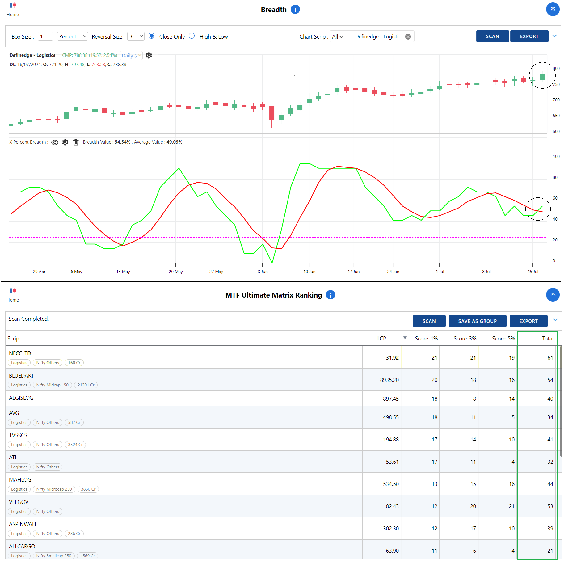
Definedge - Logistics Sector
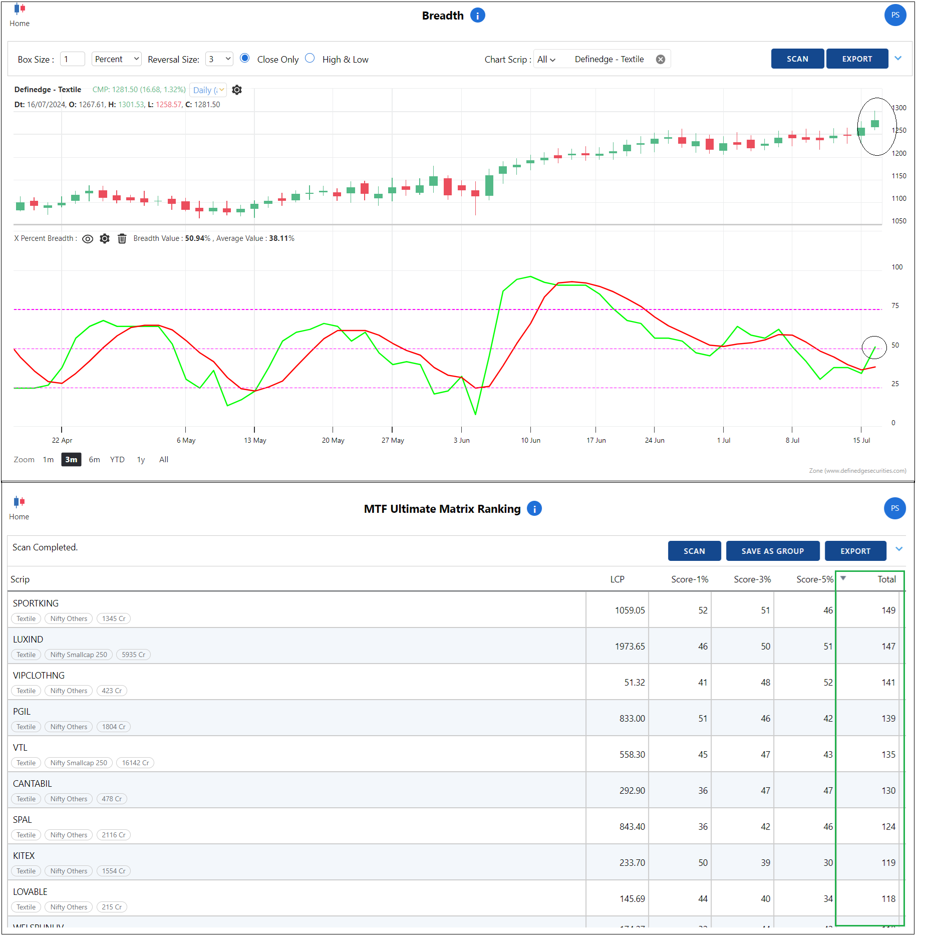
Definedge - Textile sector
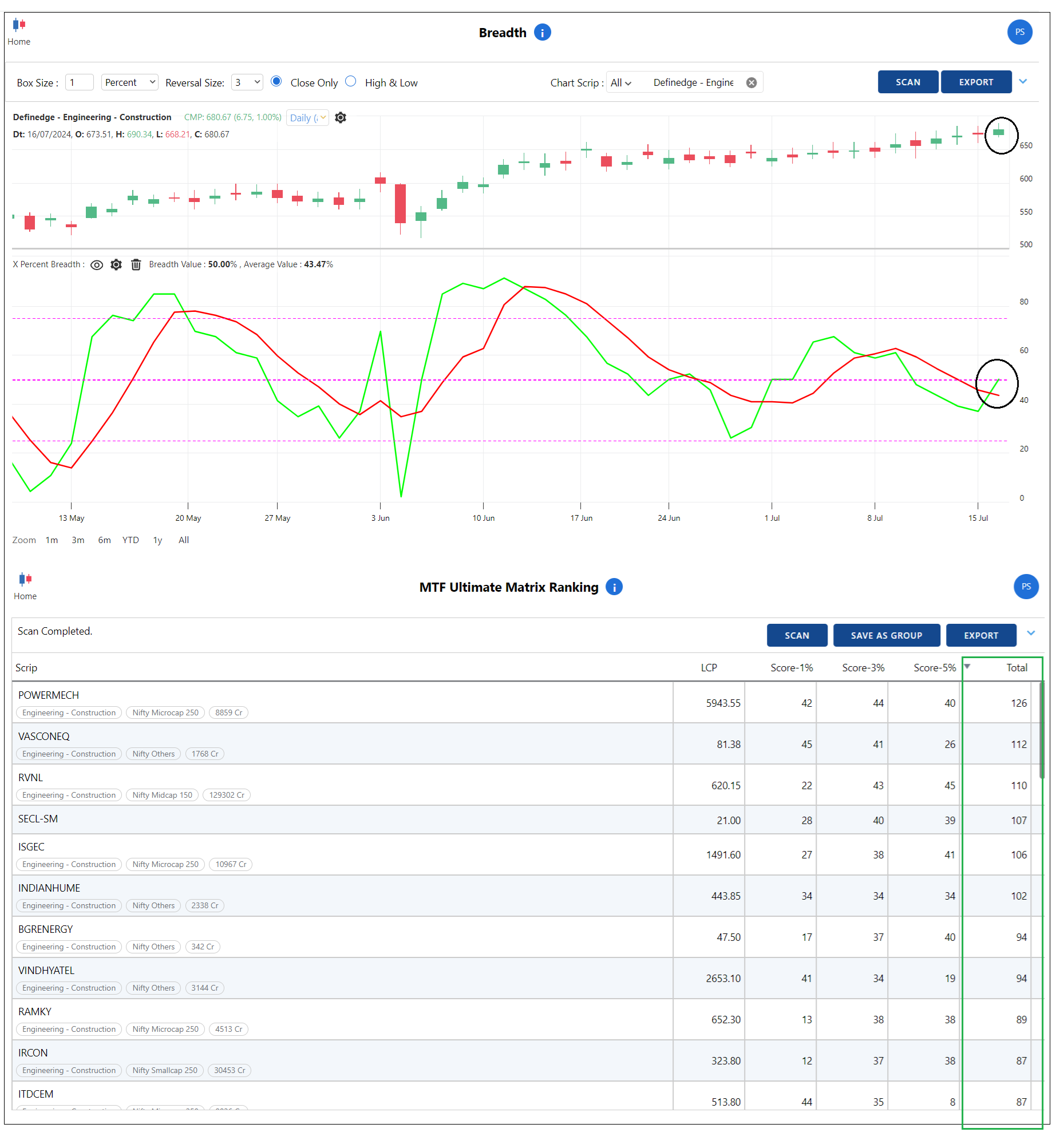
Definedge - Engineering & Construction Sector
Definedge - Pharma Sector
Process:
Step 1: Look for sectors crossing the 50 mark (Breadth chart and Breadth scanner)
Step 2: Run the Ultimate matrix of that sector to find better performing stocks
Step 3: Price analysis of those stocks to determine entry points and stop-loss
Hi,
Thanks.
1 - Now you have the system builder condition box as an option. Select the charting type and select the indicator, pattern, or your own strategy using multiple indicators, patterns etc to filter the stocks.
2 - Relative Momentum is RS only. The strategy you select in the system builder will be applied to RS chart as well. For example, if you have selected the condition 'Above D Smart', it will be calculated both on the price chart and on the RS chart. You can choose the denominator you want.
Regards,
Prashant
@Ashutosh Jain It will be applied on look-back period. For example, if you have selected the look-back period as 5, the scanner will calculate 200-EMA on the 5th candle from the present day.
If the look-back period is 0 (default), the conditions will be applied on the present day.
Yes, that scrip was missing because it was not above D smart.
@BK Thanks.
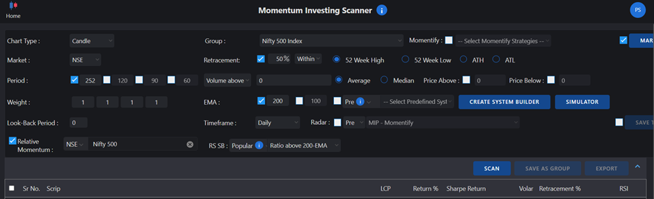
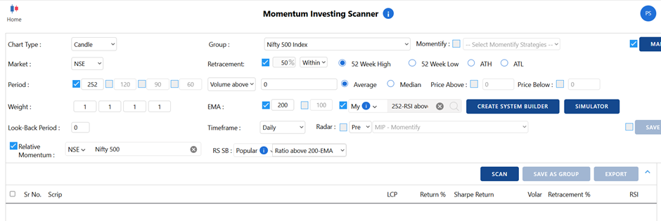
1 - You can create a group of stocks based on quarterly results in the Radar platform and use the same group for momentum investing. Increase the retracement percent from 52-week high. If you select the retracement percent as 50% or 60%, stocks far away from the 52-week high will also appear on the list.
2 - You can do that. It is also a form of rebalancing. Added to winners instead of buying new stocks.
3 - You can always increase investment amount in the running portfolio. SIP is tricky. Many people have asked me about SIP in momentum stocks. I will explain it in my next momentum investing video.
4 - I don't think it will benefit. Let's keep it simple.
5 - We will add a backtesting option to the same scanner. The model you create can be backtested from the same tab. We'll update you soon about this feature.
I recommend separate books for front line stocks and midcaps or small caps.
Hope I could answer your questions.
Regards,
Prashant
There was a question about sector analysis and the top-down approach in the Definedge platform RZone.
There are many scanners and studies available in RZone to perform that. If you are new to the platform and the subject, here is a simple guide to help you get started.
Sector analysis
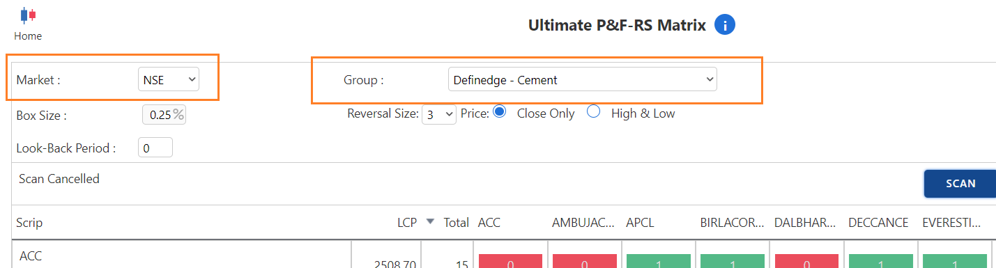
Go to Rzone -> Matrix: Price & RS -> Ultimate P&F – RS Matrix
Select the group 'NSE All Sectors' and scan.
A scanner will compare the performance of each sector with that of all other sectors within the group. The performance is calculated based on the price pattern and momentum, not on the period returns. As a result, it is very unique and useful.
The score will be 1 if there is outperformance and 0 if there is underperformance.
The sector with the better score is outperforming most other sectors. The list of sectors can be sorted according to the total score.
This allows you to gain an understanding of the top three to four performing sectors (with high scores). Underperforming sectors are those with lower scores at the bottom.
These are NSE sectors. A total of 23 NSE sectors are maintained by NSE.
Apart from that, there are 65 other sectors maintained by Definedge. It takes into account almost all stocks in listed in NSE.
In the same scanner, select EQW market and select group 'Definedge all sectors'.
It will take some time for the scanner to calculate the performance of 65 sectors.
Sectors will high score are the outperforming sectors and sectors with low score are underperforming sectors.
This way you will come to know which sectors are doing better than others.
Stock anlaysis
Now that you have identified the outperforming sector, select the sector name from the market group for identifying the top performing stocks in the sector. For the sector name, select the NSE market. Run the ultimate matrix scanner.
Stocks with high scores are outperformers in the sector. Stocks with low scores are underperforming.
Price analysis
Next step is to identify the prominent price patterns and strategies in those stocks and trade based on their risk-reward potential.
My recommendation in this case would be to use major P&F and Renko patterns with manageable risks.
This is a simple yet very useful and time-tested approach to effective stock selection.
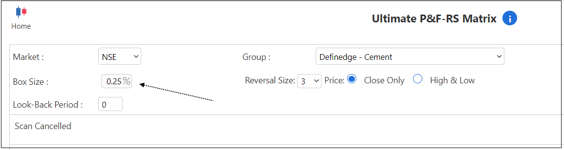
The box size should be 0.25% for short-term, 1% for medium-term, and 3% for long-term.
Regards,
Prashant
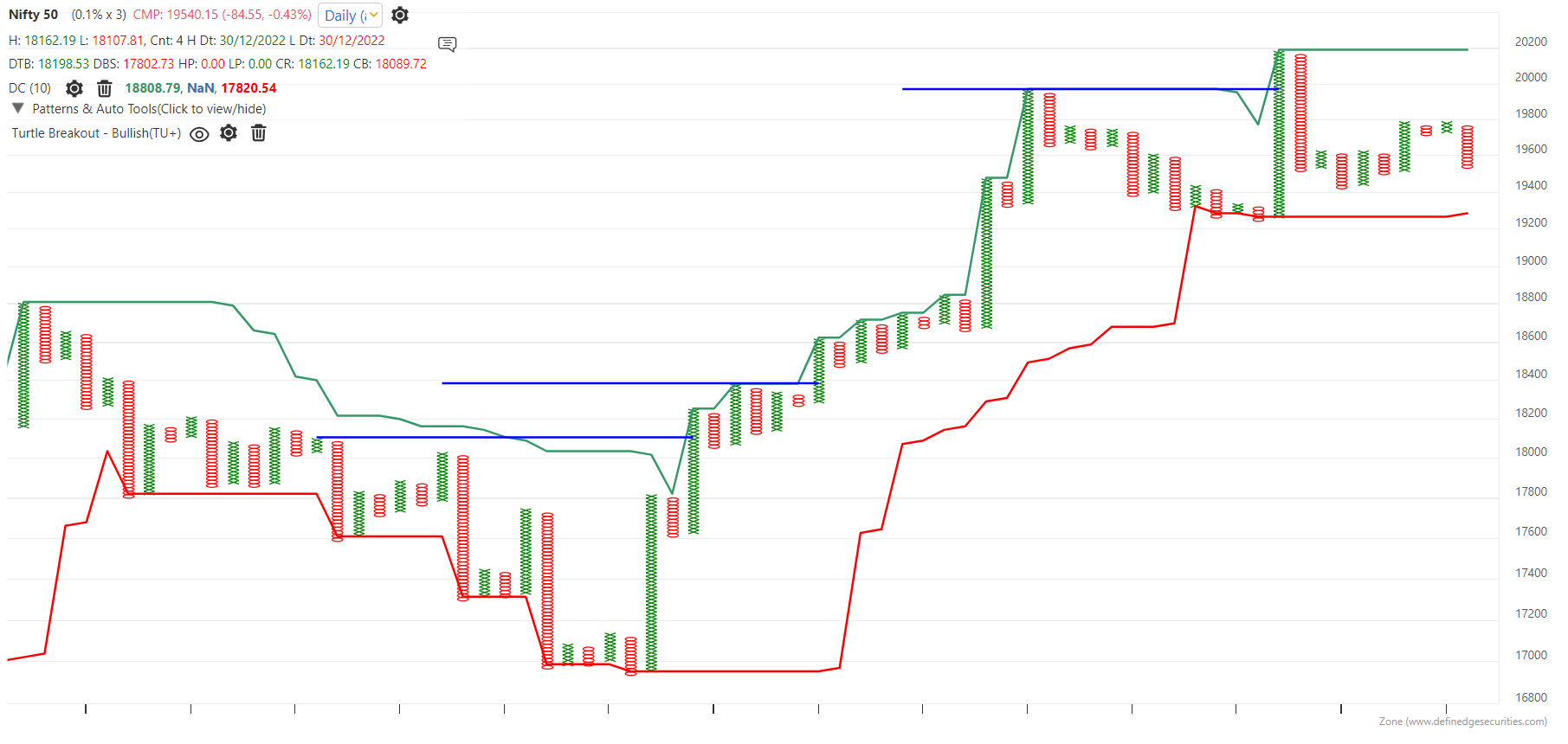
@Sumit Badwani said in Q&A Thread: Donchian Channel:
No, it will be around 50 wk high as it would consider trading days only excluding holidays
Bullish is over upper band and bearish below lower band
3.yes, as we are using in DON 28 brick high
Hi,
Your stock selection process is wonderful. I am happy to read that.
What you are doing is very logical. You can save a group with score of 8 above above and run your breakout and pullback strategies on them. The number of stocks will be relatively high, but since you are following selected patterns, you will be able to handle that.
In any case, there will be some trades or breakouts you might miss. It's fine.
It is nice that you are following Raju's Nifty bees strategy. In the next Gurukul Q&A video, I will discuss Nifty bees in greater detail.
Regards,
Prashant
@Rahulsinh G. Thakore Yes, P&F RS and Renko RS scanners are available in TradePoint and RZone. Trading systems that you have created for P&F or Renko charts can also be applied to P&F and Renko RS charts.
Yes, you can. Try it for 10-column period.
Hi, you can set the timeframe of all four charts and save it as template. You can change symbol of all charts while adding it from the search or chart controller window.
Hi, you can specify exit time in the backtesting. We will explore possibility of entry time.
Nifty has been underperforming. This is a time when it is important to watch out for price breakouts in Gold and USDINR.
I track Gold or USDINR price charts when they starts outperforming.
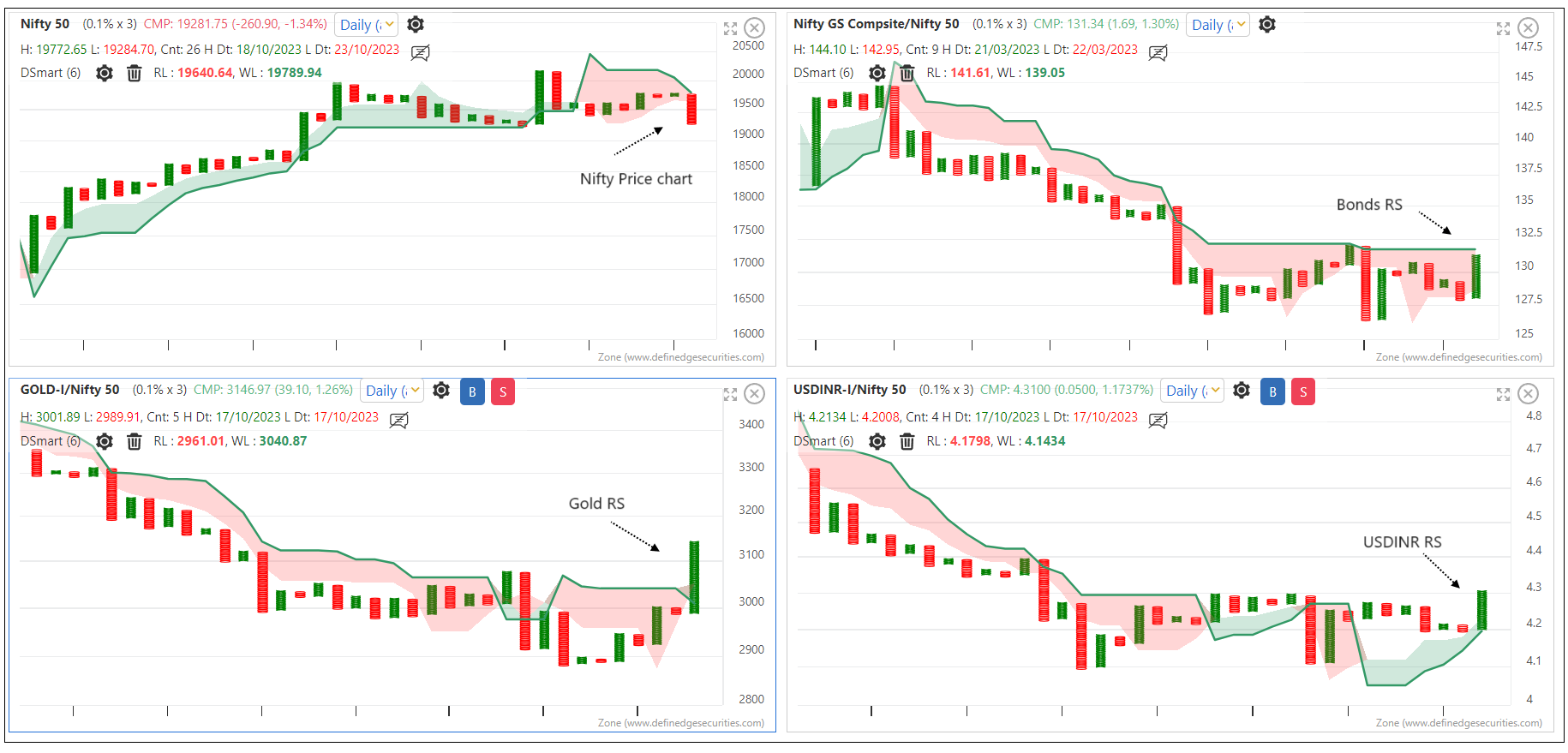
Below is a USDINR chart. The breakout from here (~83.45) will open higher counts.
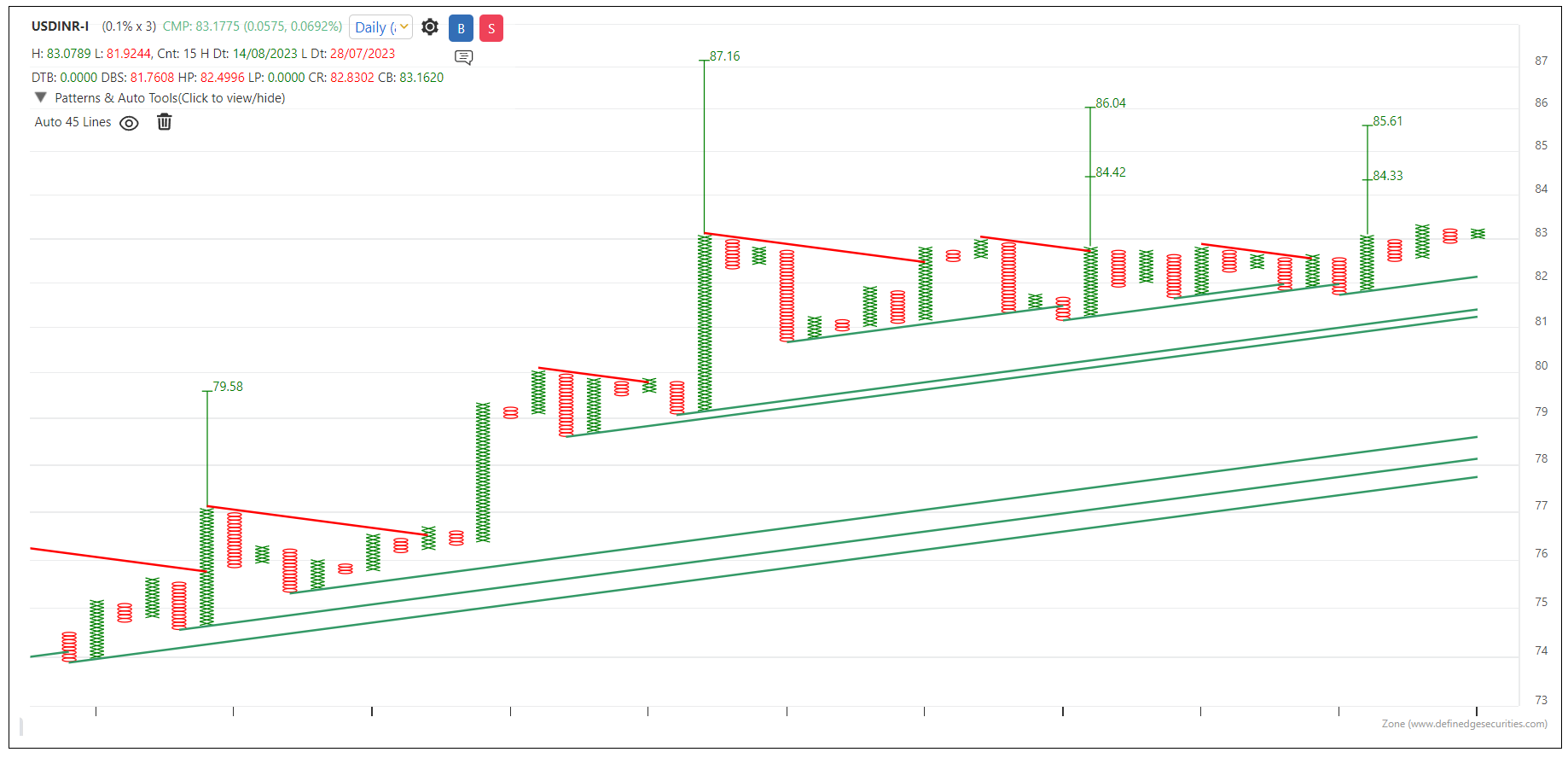
Hope the Nifty bounces back and this pattern fails. However, that hope is for equity and economy.
Trading requires ruthless and emotionless execution. Trade what you see, not what you want.
@Rahulsinh G. Thakore Yes, you can use Donchian on Renko RS as well. Donchian channel has been discussed on Renko charts as well as on RS charts. Combine them and develop the observations on Renko RS charts.
On Renko RS, rising Donchian indicators indicate bullish outperformance and falling bands indicate underperformance.
Breadth will help you decide what not to do.
Hi, first of all thank you for your kind words. It is very encouraging to know you found our work helpful.
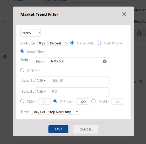
It's a good approach to use 1% and 0.25%. If you find the 0.25% brick size a bit aggressive, you can also consider 0.50% instead of 0.25% on a Renko chart.
Please refer to the link below that answers your question. Please let me know if you need more clarity.
https://shelf.definedgesecurities.com/renko-chart/trading-aspects-renko-chart/which-price-to-use/
You could say that. However, it is a multi-chart scanner. The higher score suggests that the stock is bullish on multiple charts. There are different properties for each of these charts.
You already have that scanner in Zone Web.
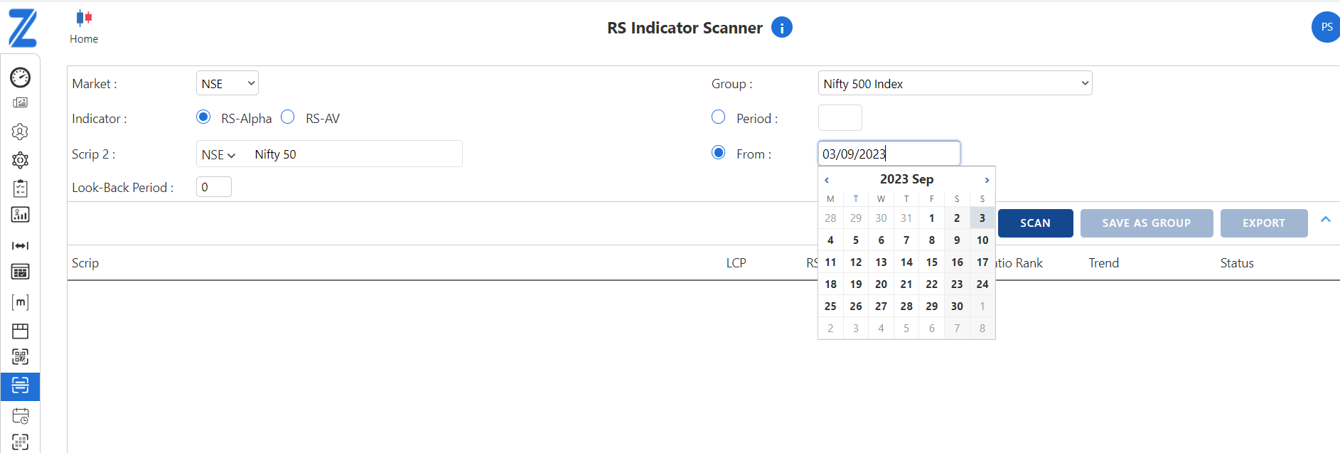
RZone -> RS Scanner -> RS Indicator Scanner
You can select the date from which you want to check relative strength.
Hi, thanks for sharing. I'll study that. It is a small issue to plot the RS indicator in system builder since you need to provide the denominator. We are working on it. We will provide RS indicator in the system builder.
In the meantime, you can create systems with the other indicators you mentioned in the system builder. Save the output in a group and run the Relative strength indicator scanner on that group.
Zone web -> RS scanner -> RS Indicator scanner
It is available as an indicator on the chart. Search 'Typical price - average' indicator. Do you want it in the table format?
Hi, it is because you are running it on one-minute timeframe and the intraday data in desktop exe wouldn't go beyond six months (local memory). I suggest using Zone web or tradepoint web for intraday backtesting. It uses server side data. The intraday data of more than 4 years is available on web.
@Sumit Badwani
All methods of reading the Donchian channel are applicable to P&F charts as well. Remember, the channels are plotted on swings. Rising upper bands show the breakout. Rising upper and lower bands show that swing lows are also increasing.
A rising upper band (bullish) or a falling lower band (bearish) can be scanned.
You can also check the indicator digger of Donchian channel on P&F chart.
As mentioned earlier, the Donchian channel is a running turtle indicator. When you analyze the difference between bands (height of the band), the status of the band and the middle band ratio, you can get a better understanding of the swing range pattern.
Band trend is an important reading.
So, you can apply the Donchian channel to Ratio, P&F RS or Renko RS charts as well.
Rising donchian channel after flat bands indicates a breakout in the relative strength chart meaning numerator has started outperforming the denominator. Rising bands show that Numerator is an outperformer.
The rising bands on a relative strength chart and a price chart is a perfect setup for identifying outperformers.
@Ravi Shinde Wonderful. Perfect
@Sumit Badwani Very nice. Perfect
Donchian Channel and Relative Strength
Ratio charts are plotted using two instruments. Ratio chart rises when numerator is outperforming denominator and it falls when numerator is underperforming.
What does the Donchian channel show on the Ratio chart?
Donchian Channel on P&F chart
Some people asked that we explained a strategy using Donchian channel on Renko chart. Does it not workable on P&F charts?
As I always say, the nature of the indicator changes along with the charting method.
With P&F charts, it is plotted on the columns. Each column represents a price swing.
Have a look at below chart with 10-column Donchian channel plotted on the P&F chart.
Rising upper band (10-column) in case of P&F chart shows that the current swing is higher than the previous 10 swings.
Those who know about turtle pattern, do you find it similar to that pattern?
Have a look at the below chart. A bullish 10-column turtle breakout pattern is shown with a blue horizontal line.
Whenever the Donchian upper band rises after consolidation, it is a bullish turtle breakout pattern. Continuously rising upper band shows continuation breakouts.
Therefore, Donchian bands on P&F is a running turtle pattern bands.
The behaviour of the Bands shows a swing range pattern. Observe wide width, narrow width, and tight consolidation.
Donchian channel is a price-based indicator
The Donchian channel bands are price-based indicators. The upper band represents the higher range of the pattern, while the lower band represents the lower range.
The width and behaviour of the pattern shows the range pattern during the selected period.
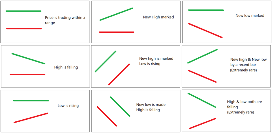
Observe this image again. Plot the Donchian channel on the chart and observe the pattern based on these images.
When bands are rising, price remains in a bullish zone. It is a strong trending and strong momentum scenario.
When bands are narrow, it is a tight range consolidation. When bands are narrow on the Renko or P&F charts, it is a price squeeze pattern.
@Rahulsinh G. Thakore Thanks. I am going to add some more points in this thread.
Now when you know and read about the Donchain channel indicator. Check Donchian channel indicator columns in the Indicator digger.
Observe, Band difference, Middle Band Change percentage, Trend of bands and Price position columns.
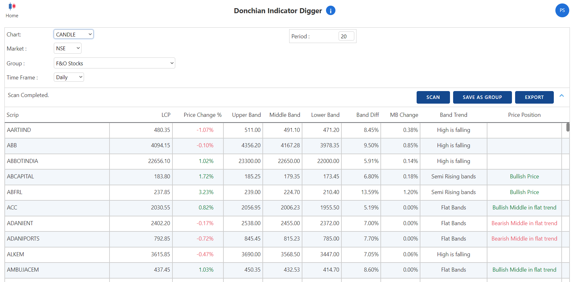
When band difference is high, the range is far. When band difference is low, it is a tight range scenario. When the middle band is rising, the trend is strong.
Let’s not focus only on that strategy otherwise this will become a discussion about strategy.
However, understand that Donchian channels are very useful on Renko chart. The whole logic and dynamics of the indicator changes when we plot it on the Renko chart.
Renko bricks divide price into fixed size boxes (bricks). 20-brick high shows that price is at high of last fixed size 20 boxes. 20 is taken for example. It can be 28 or 40 or any other number.
Answer to your queries:
a) price range break from FLAT DONCHAIN Bands?
Breakout after flat Donchian bands shows Price Consolidation Pattern breakout. Remember, there is no time involved in the Renko charts, hence it is a price consolidation breakout pattern. This element makes the pattern completely different from that plotted on the candlestick charts.
b) price falling and then after that when we see the upper band rising and then the breakout of that in price?
Yes. It shows new bullish range breakout. It is like a bullish reversal breakout.
c) trending price and then we see the breakout of the Upper Band?
Good question. It is a continuation breakout. Price is in an uptrend, new highs are being formed and there is another breakout after a shallow retracement.
d) A new low is marked in price and the upper band is flat and then we see the price breaking the upper band?
The pattern is similar to a bear trap or a bullish reversal pattern.
You can read reversal and continuation patterns on the Renko chart when you follow the Donchian channel breakout pattern.
@Rahulsinh G. Thakore
Great.
Answers:
Yes. When the upper band rises, the stock is making a 240-day high.
Price above the middle band is a bullish zone and price below the middle band is a bearish zone. If it’s a 20-day Donchian channel, the middle band is the average of high and low of the last 20 bars. It is like a moving average.
When price is between a moving average and a 20-day high, it’s a bullish zone. When price is between a moving average and a 20-day low, it’s a bearish zone. It is my theory and I think it is logical.
Yes, it is. When a 20-brick Donchian channel is rising for the first time, it is like a multi-brick breakout pattern. Bricks may not be at a similar level, and it is not necessarily a 20-brick pattern always but it is a multi-brick breakout pattern when a Donchian channel rises for the first time after being flat.
Very nice.
@RAGUNATH_AG Wonderful
Think:
Can we use the 240-period Donchian channel to scan stocks for a 240-day high?
What is the bullish and bearish zone in the Donchian channel?
If we look for an upper band Donchian channel breakout on the Renko chart, is it similar to a multi-brick high pattern?
Converging pattern. Price or time consolidation pattern.
Price consolidation pattern.
Big Range candle. It is interesting to note that this pattern is not possible on P&F or Renko charts with Donchian channels.
20-brick high and 20-brick low. Not a 20-period high - low. A single brick can have multiple sessions or multiple sessions can have a single brick.
@Ravi Shinde Correct. Check 3rd point.
@RAGUNATH_AG Correct. Check 3rd point.
@Sumit Badwani Correct. Check 2nd and 3rd point.
1 - Can I ask my colleague to call you and explain?
2 - Yes, the combined package is available.
Hi, it is nice to know that you liked the RZone. Max feature for indicators will come in the next release (in 10-15 days). Max feature for price is available in the system builder. We are working on the multiplication function, currently it is not available.
regards,
Prashant
Timeframe works as a data frequency in case of P&F charts. If your timeframe is one-minute, the closing price after one-minute will be considered for plotting the X or O. In the case of a 5-minute timeframe, the closing price after five minutes will be considered, and so on.
Hello everyone!
This is a Q&A thread about the Donchian Channel indicator. Let’s discuss the Donchian Channel indicator in this thread.
Donchian channels were invented by Richard Donchian.
You will see three lines on the chart when you plot Donchian indicator on the chart. Upper band, middle band, and lower band. Default parameter is 20.
• The highest high of the last 20 bars is the upper band.
• The lowest low of the last 20 bars is the lower band.
• The average of both is the middle band. (Upper band + lower band) / 2
So, if today’s high is a new 20-day high, you will see the upper band rising.
If today’s low is a new 20-day low, you will see the lower band is falling.
So, on a given bar - there are below mentioned possibilities for both the bands:
I have explained this indicator in detail in the following links.
Video link
https://www.youtube.com/watch?v=oVej2hWWqPQ&t=405s
Writeup on Donchian channel indicator
https://shelf.definedgesecurities.com/indicators-simplified/channel-indicators-simplified/donchian-channels/
Rising bands are bullish, falling bands are bearish. Higher distance between bands indicates higher range and lower distance indicates convergence.
Let’s discuss this indicator in this post. You are welcome to ask questions about the indicator. I will share my learnings and experiences, and I will attempt to add more information. You can also share your observations and learnings related to this indicator.
Could you also try answering the following questions?
It is okay if your answers are incorrect. Try doing it. We are here to discuss and learn from each other.
Yes, one issue with some funds. It will get fixed on the coming Friday.
Hi, great to know you liked the videos.
I will discuss the issues you reported with the team. We'll do something. Thanks for the feedback.
Dear all,
We have finally launched the first version of scanners on the Zone Mobile Application.
There are technical and fundamental scanners in the scanner section of the Zone mobile app.
Technical scanners include the following categories:
Fundamental Scanners
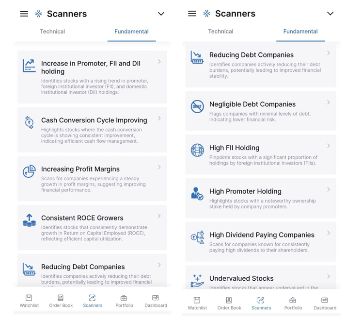
We have added multiple scanners to identify stocks with strong fundamentals. Scanners about improving profit margins, ROCE growth, reducing debt, increasing FII holdings, increasing promoter holdings, improving cash conversion cycle are added to the list. Companies which are undervalued or reducing debt are also shown on the list.
Technical Scanners
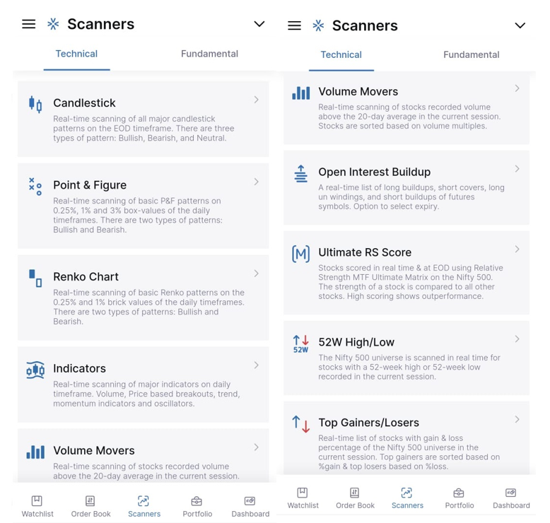
Candlestick patterns
Real-time scanning of all major candlestick patterns on the EOD timeframe. You can select a group of stocks. You can run it on daily, weekly, or monthly timeframes. There are bullish, bearish and neutral patterns.
Point & Figure
Real-time scanning of basic P&F patterns on 0.25%, 1% and 3% box-values of the daily timeframes. You can select a group of stocks. You can run it on daily, weekly or monthly timeframes. There are bullish and bearish patterns in the list.
Renko chart
Real-time scanning of basic Renko patterns on 0.25% and 1% brick-values of the daily timeframes. You can select a group of stocks. You can run it on daily, weekly or monthly timeframes. There are bullish and bearish patterns in the list.
Indicators
Real-time scanning of major indicators on daily timeframe. The scanner includes: Volume, Moving Average, RSI, ADX, D Smart, MFI, MACD, Supertrend, Adaptive RSI, Stochastic and Bollinger band indicator scanners. This scanner also includes a breakout scanner and intraday scanner conditions such as open-low and open-high.
Breakout scanners include 52-week high-low, all-time high-low, 20-day breakout, 5-day breakout, weekly and monthly breakouts, 2-year, 3-year and 5-year breakout scanners.
You can select a group of stocks to run this scanner on. The default group is the Nifty 500 index.
Volume Movers
Real-time scanning of stocks recorded volume above the 20-day moving average in the current session on the Nifty 500 index. Stocks are sorted based on volume multipliers. Stocks with the highest volume compared to 20-day average volume will appear first in the list and so on.
Open Interest Buildup
A real-time list of stocks with long buildups, short-covering, long unwinding and short-buildups of futures symbols. There is an option to select an expiry.
Ultimate RS score
We have developed a method of comparing a stock of the group with other stocks in the group to measure the relative strength of the stock. We run it on multiple timeframes to check the strength of the instrument in short-term, medium-term and long-term. This combined score is derived using the Multi-timeframe Ultimate Matrix Relative Strength score.
Stocks are scored in real-time & EOD using the Matrix on Nifty 500 stocks. Meaning, each stock of Nifty 500 universe is compared with all other stocks of Nifty 500 group on multiple timeframes and scored accordingly.
The score can range from 0 to 1500. The stock outperforming most of the other stocks will appear at the top of the list and so on.
EOD scanner can help you to find stocks for positional trading and an intraday scanner can help you identify stocks for intraday and short-term trading.
52 Week High / Low
The Nifty 500 universe is scanned in real-time for stocks with a 52-week high or 52-week low recorded in the current session in the Nifty 500 universe.
Top Gainers / Losers
Real-time list of stocks with gain and loss percentage of the Nifty 500 universe in the current session. Top gainers are sorted based on percentage gain and top losers based on percentage loss.
FAST Stocks
Real-time list of stocks qualified for the FAST method. The list of stocks in strong momentum and showing outperformance in the current session on the Nifty 500 stock universe are shown in the list. This is an intraday scanner which helps you identify stocks to trade continuation breakout strategies.
Intraday X% Breadth
Intraday breadth chart of the Nifty 500 universe. It shows the percentage of stocks in a bullish swing during the day. The rising breadth line indicates a bullish trend and sentiment. This chart can help you keep a track during the day about the overall performance of the stocks and hence market sentiment. It is a leading indicator of sentiment during the day.
Not only this, the Zone app also has a Fundamental and Technical report when you click on a stock. It provides you with all important fundamental and technical analysis information about the stock.
With this, the Zone app has become an app for trading and smart market analysis.
Please note that all these scanners are REAL-TIME. This makes the app stand apart. And this is just the beginning. We will add some very interesting studies to the app.
Hi,
Nice to know that you have understood the concept of Matrix.
1- A score of 8 indicates that the stock is bullish on multiple timeframes. While there is a possibility that it has run up, that does not mean it cannot go higher. According to my experience, continuation breakouts have a better risk-reward ratio. A trade can be planned in such stocks if there is a pattern with an affordable stop-loss (high pole, double bottom sell, moving average, d smart). I have seen stocks remain in the 7 - 8 score range for months.
2 - You can look for stocks that cross the performance score of 0 - they are turning positive. Stocks crossing the performance score of 4 are the stocks entering into a bullish zone.
Stocks crossing a ranking score of 0 are also potential candidates for reversal.
4- Study sector and segment outperformance along with these scores, your stock selection for continuation and reversal trades will drastically improve.
5 - You can also use the P&F Fusion Matrix table. The score is calculated based on the same method on the relative strength chart as well. It combines both the score and ranks the stocks based on Price & RS multi-timeframe analysis.
regards,
Prashant
Hi, we could create group for NSE all sectors because their averages are trading. Definedge Sector average charts are not available. But we have an idea to solve this problem. We will make it available very soon. We'll update.
Regards,
Prashant
Yes, thanks for the suggestion. We are already working on it.
Regards,
Prashant
Sure, will ask team to check and contact you.
Regards,
Prashant
Hi,
Click on Create System Builder.
Click on Add. In the indicator list, type single moving average. Select condition 'close above moving average'.
Define parameters.
Write 1 in expression.
Give System builder a name and save it.
Now select 'My' in the condition, select your new system and scan.
Here is a link for the writeup that explains System builder in detail:
https://www.definedgesecurities.com/blog/products/how-to-use-system-builder-in-tradepoint-or-rzone/
If you need more explanation, I can ask my team member to call you.
Regards,
Prashant
Hi, thank you for your suggestions. They are very helpful. We will definitely work on them. We are already working on order windows. Just to inform, the desktop order confirmation can be switched off.
Settings -> Trading Prefernces -> Order confirmation -> False
So nice to know about that. Thank you @Nishshkumar-Jaani . All I can say is that this is only the beginning. A number of really useful tools and features will be introduced in the near future.
@Sachchida Nand Gupta Thank you
Pls check this page. Combo packages are mentioned.
https://www.definedgesecurities.com/products-plans-packages/
Hello everyone,
We announce Independence day discount offer today in products. There were several questions related to difference between TradePoint and RZone.
Here is an explanation.
Definedge is primarily a product company. We haven’t created products because we are a stock broker, we became a stock broker because we created products. There is a huge difference between both approaches. We entered into this area to make more people enabled with better tools for trading and investing and as cost effective as possible. In India, I think we are the first and only product company who became a brokerage house.
Earlier, only NSE F&O was a real-time segment of our products.
By becoming a brokerage house, we added NSE & BSE cash, NSE & BSE derivatives, MCX and CDS segments in real-time and EOD in all our products. Many of our features have been made available for free.
Definedge Universe has many products.
Opstra is a popular platform for options trading strategies and analysis.
Our other two flagship products are TradePoint and RZone. TradePoint is a desktop platform whereas RZone is a web platform.
TradePoint
TradePoint desktop is a software for technical charts and analysis – It is completely free if you have a demat & trading account with Definedge Securities.
Apart from the traditional candlestick, bar charts – there are in-depth noiseless charts, relative strength charts, straddle & strangle charts and with unlimited tools, patterns and indicators on each charting type. You can trade directly from the charts as well.
TradePoint has a premium version: TradePoint Pro. It has scanners for all types of charts including relative strength & breadth. Matrix tables, smart scanners, seasonality scanners, multi-timeframe scanners and many other features are available for market analysis. There are some pre-defined patterns and strategies, but you can create as many strategies as you wish for all charting types. This doesn't require any coding knowledge.
Real-time scanners are the major feature of the software. You can scan pre-defined or custom strategies on any chart type in real-time. There is no restriction on the number of symbols – this was our biggest achievement. There is a feature called the Ultra scanner. You can specify entry and exit conditions in the Ultra scanner and track your strategies' performance. Auto trader is another important feature being developed.
We reduced the subscription price significantly and adjusted it against the brokerage.
Zone
There is a web-based platform called Zone. It has all types of charts including in-depth noiseless charts, relative strength, straddle, strangle, multi-leg etc charts with unlimited tools, patterns and indicators on all types of charts. A number of innovative tools and patterns have been added following extensive research. You can trade directly from charts in Zone. Like TradePoint's free version, it is completely free.
RZone
RZone is the paid version of Zone. It is a unique product with a wide range of capabilities. There are many pre-defined systems and strategies. You can develop your own strategy for any charting method without having any knowledge of coding. There are many type of price and volume scanners, smart scanners, Matrix tables, breadth chart, breadth scanners, relative strength scanners, D Sectors, Indicator digger and several other studies available in RZone on all types of charts.
Many unique features for portfolio analysis & identifying instruments. Advanced relative strength & breadth indicators and scanners. Matrix tables, sector analysis, seasonality scanners, multi-timeframe scanners and much more that can help you take better decisions about trading and investment.
In the RZone, all scanners and features are real-time, but they do not auto-refresh.
RZone offers innovative breadth indicators and scanners. Backtesting is one of the most important features of RZone. Practical aspects of trading are considered while designing the backtesting of RZone. You can perform it on any group of stocks with different conditions for positional as well as intraday in minutes.
There is much more to talk about both these products. But this should give you a brief idea.
I anticipate some questions here.
What is the difference between both?
Most features are the same in both versions. TradePoint is a desktop platform, RZone is a web version. The TradePoint system has a real-time scanner and an ultra scanner. TradePoint has a feature called My Market. Data from any instrument and timeframe can be imported and analyzed.
As far as I know, there is no other desktop version available with other stock brokers in India with the level of depth that TradePoint offers.
RZone has real-time scanners, but they don't automatically refresh. Breadth charts, breadth scanners, D Sectors, D Phase etc are available in RZone. RZone backtesting has more capabilities. In terms of scanning and backtesting capabilities, RZone is the most powerful and unique product available today.
TradePoint desktop doesn’t have a Mac version. RZone is a suitable product for Mac users.
Why two versions?
We maintain two different technologies for these products. TradePoint desktop runs locally and RZone on the server. We are developing features for both keeping the advantages of both technologies in mind. Desktop scanners are more feasible for real-time scanning. Calculations that are performed on the server are more suitable for RZone.
Why not free?
There has been a significant reduction in the prices of both products. Due to the fact that subscription charges are adjusted against your brokerage, they are in a way completely free. In order to empower retail traders and investors, we are striving to provide them with better tools and at the best possible price.
Why not both?  Combo packages are available for these products. The combined price of the products is substantially lower than the price of TradePoint alone (earlier) or other similar products.
We are a self-funded company and building business in a traditional manner. Profits are reinvested into improving our product capabilities and infrastructure. We are responsible towards our subscribers and are not willing to run a rat race of growth and numbers.
We provide many products for free. Radar is a complete product for fundamental analysis and scanning. MFZone helps you analyse Mutual Funds. Shelf and Insight are educational portals. Buzzar is a product for price and strategy alerts. All of these products are free.
We are experiencing good growth in our securities business, and with your support, we will be able to offer it on significantly more better terms in the future.
We are doing some very innovative studies. We are excited about the many new features that we will be introducing to these platforms in the near future. Our goal is to innovate, provide extra ordinary tools and educate people.
Best Regards,
Prashant
Hi,
There is no error here. We are taking an approach of exiting the trade if either SL or TSL is triggered first.
In your example, if entry is 100, SL is 10% and TSL is 2%. When should TSL get activated?
At 102? Why? It was your TSL level. How will the user know when his TSL will activate?
The general expectation is that if a trade is profitable, TSL should be activated.
When a trade goes up by 5 paise, the TSL is activated in the autotrader.
We will add a new tab asking users to indicate their level of TSL activation.
Noted, will get that done soon.
@Anil Kumar Pandey You will soon have it in Zone Mobile app.
Templates are now available on Zone.
We have redesigned the Scrip Report segment in RZone. It is a technical report for the scrip you have selected. It also scores the stock based on more than 120 technical indicators and patterns. We call it T score. T score above 25% is bullish.
RZone -> Scrip Report -> Select Scrip
Pls check and let us know if you want more points to be added in it.
Yes, you can do that. It's a multi-timeframe strategy in that case.
Since the turtle pattern is valid on 2% box-values, trading breakouts in 1% box-values is acceptable.
Clearly define the timeframe and exit plan of your trading. You can follow 1% box-value for entry - exit and 2% box-value for pattern reference.
Try this - 5-period bearish brick zone below zero
Dear friends,
I just wanted to share with you how yesterday went for us.
A change in expiry date announced just before one day was a significant event for us. This means that all F&O symbols were going to change. The fact that we are both a brokerage house and a product made it a challenge for us. There are strategies in Opstra, TradePoint and Zone. People perform chart analysis that needs continuity and we manage various F&O groups. All of these platforms are relied upon by people, especially on expiry days. There is also a dependency on the files we receive from exchanges.
You might have seen that continuity of options charts, groups in TradePoint and Zone was not affected today. In Opstra, the symbols in strategies were updated. Everything was as seamless as if the expiry symbols hadn't changed.
In order to achieve this, the team worked late into the night and has been working since the morning today. To ensure that nothing was broken, they tested everything on UAT servers and deployed it on live servers during this time.
Of course, this is part of our job. Other companies would have also done it. Unlike other brokers, we have many products of analysis to manage. Providing a seamless experience with products and brokerage was a small accomplishment of our team today. Furthermore, it indicates that we are capable of handling and that the frameworks we have built are both flexible and scalable.
From a subscriber's perspective, you should expect neither an issue nor an excuse from us. It was our job. I just shared it here as a friend as an expression of how things are at the back at times that you may not even be aware of.
Below is a link to my interview published yesterday morning on Money Control.
Views change with setup, so that's not very important. I have included some observations with views that you may find useful.
I think this needs more explanation.
There are two versions of TradePoint desktop software now. One with Definedge Solutions (TradePoint) and another with Definedge Securities (TradePoint Terminal).
TradePoint has RT and EOD F&O and EOD data for NSE, F&O and MCX markets.
TradePoint terminal has RT and EOD data for NSE, F&O, BSE, MCX and CDS markets.
The groups you save in TradePoint software for NSE markets can't be converted in intraday because Real-time data itself is not available. The groups you create in the F&O market will also be available in intraday.
The groups you create in TradePoint Terminal with Definedge securities in any market segments will be available in both intraday and end-of-day markets.
Hope this helps.
Thanks for your feedback.
Yes. As of now, only intraday trades are permitted. We are working on positional trades.
As of now, it is only available on desktop computers. We will make it available on the web as well, but it will take some time.
I will ask the support team to contact you in order to analyze your log files. In most cases where people reported issues related trades or alerts, the problem was because of the system builder conditions. There were problems with defining expression. In some cases, the entry and exit were triggered in the same candle, which resulted in more trades. However, I will review your files and if there is any issue with the system builder of any kind, we will resolve it as soon as possible.
It is great to hear that you liked the feature. In the coming days, we will add many new features to this engine.
Ok. There may be a difference between the CMP and where the last box or brick is formed in P&F or Renko charts. A new box or brick will not be plotted unless the price meets the criteria for plotting.
Yes, I am planning to make a video on it and explain in detail. We will make it available on web version as well but it will take some time.
When it comes to trading or investing, success is determined by the approach you have taken. The majority of people are not aware of this approach.
Most traders believe success is determined by trading strategy. However, you can trade any strategy with different approaches.
Even while evaluating backtesting strategies, there are so many statistical parameters to analyse. However, there are two basic parameters that can be used to determine your approach to trading strategies.
Let me explain from the beginning.
Analyzing your trades involves two important factors:
The success ratio refers to the number of trades that went in your favor. For example, you took 10 trades during a period and 5 were profitable. Your success ratio is 50 % in that case.
This is relatively simple to understand.
It is generally believed that you can make money in trading if your success ratio is high. Therefore, the most common question regarding trading strategies is - what is the success rate?
But the success ratio alone is not sufficient. Making money does not require a higher success ratio.
When a trade was profitable, how much profit you made and when it turned against you or when it was a losing trade, how much loss you booked. Profitability depends on this equation.
This equation is known as the risk reward ratio or the payoff ratio of the profit factor or by other names. There are different names and versions of it.
Let's call it the risk-reward ratio. It calculates the ratio of loss to profit in the trades you took or the trade you are backtesting.
For example, 5 out of 10 trades you made were profitable. You made 30 points in 5 trades that were profitable. You lost 10 points in 5 trades that were losing trades.
Your average profit is 6 points (30 / 5).
Your average loss is 2 points (10 / 5).
Therefore, your risk-reward ratio is 2 : 6 or 1: 3. Let’s say 3. It shows that you made 3 points for every 1 point you lost.
We use this formula in Definedge platforms for backtesting and trading journals and call it the risk-reward ratio.
So, if your risk reward ratio is 2. It shows that you booked double returns in profitable trades than the average loss you booked in losing trades.
Higher success ratio or higher risk-reward ratio?
Most traders, especially newcomers are unaware of these things. Most experienced traders are also unaware that they have to determine the approach to their trading strategy. They must choose between a higher risk-reward ratio or a better success ratio.
Any trading strategy can have either approach.
Let's call them Hit Man or Marathon approaches (My terms).
After determining your method of entry, your method of exit depends on the approach you have taken.
The Hit Man Approach
Using an aggressive profit booking approach and exiting the trade early in profit will improve your success ratio. Your focus is on hit ratio, so I call it the hit man approach.
With this approach, your strategy will have a better hit ratio. However, your risk-reward ratio may not remain positive. There is a possibility that you will lose more when the trade goes against you, and that you will earn less when the trade goes in your favor. It is possible for this strategy to be profitable, but the total returns may not be substantial.
The approach is suitable for aggressive and very active traders who trade frequently. Their overall returns become substantial due to the significant number of trades they take. Profitability in this approach depends on a high success rate.
The Marathon approach
The second approach is to improve the risk-reward ratio of trades. I call it the marathon approach.
In order to achieve this, you must ensure that the average loss you book is less than the average profit you book. In order to achieve this goal, you will need to determine the maximum risk you are willing to accept in a trade. In order to limit your downside, you will need to cut losing trades on time. You will have to stay longer in profitable trades and improve your average profit numbers.
If you use this approach, your success ratio may be low, but your risk-reward ratio will be high, making you money. There is a possibility that you will generate some good returns with this approach, as the returns are substantial.
However, this approach is difficult to implement and needs practice. Cutting losses on time requires experience and discipline. Taking advantage of a trend and sitting in profitable trades is easier said than done.
If you study the portfolios of well-known investors or the approach of successful traders, you will realise that their success ratio is very low. In some cases it is 20% - 25%. But they have made remarkable returns over a period of time. It is because their average profit is way higher than their losses.
As a matter of fact, professional traders add more to their winning trades. This method is referred to as pyramiding. Adding more quantity to winning trades is not an easy task. We will discuss this more in depth later, but know that it is an extended version of the marathon approach.
It is unfortunate that some traders are unaware of this and keep changing their exit method based on recent trading experiences. The majority of people don't even have a good exit plan. This is primarily due to the fact that everyone is seeking the perfect exit strategy. Accept that it doesn’t exist.
Every approach has its advantages and disadvantages. Identify your style and preferences and determine your approach. Clarity and conviction will result from this process.
This concept applies to all types of traders and investors. Whether you are an active trader or someone who trades or invests occasionally.
The focus of traders is typically on returns and profit and loss. Returns over a period, returns every week and every day – even less than that.
In general, it is believed that if the session was profitable, all that you did during that session was good. A profitable session is good, but if you do not know what exactly went right, the profit may simply be the result of luck, and it cannot be sustained.
In this business, the outcome determines whether you made the right decision. If you made a profit, you did the right thing. No, please. Educate yourself. If you do the right thing, you can lose in some sessions. It is, however, because you wish to remain profitable over the long term, and as a result, your chances of success increase.
I have experienced profitable sessions with a 20% hit rate. However, it is difficult to keep booking losses and watching long losing streaks. Eventually, you gain conviction over a period of time.
In the long run, you will achieve better returns if you treat daily profit and loss or each trade profit and loss as just a number. Easier said than done - this needs practice and experience. However, it is more than that; it is the conviction that it is not necessary to make money in every trade or every day in order to remain profitable over time. Even when you are trading short-term or very short-term, your approach should be long-term.
Middle approach
The beginner finds it difficult to remain in profitable trades while riding the trend. They might have knowledge of riding the trend learned on the historical charts - most of it is hindsight analysis.
Operating at a lower success rate will be morally challenging for them.
It would be more comfortable for them to begin by booking profits after the trade becomes profitable by a certain percentage. Maintain a risk-reward ratio of at least 1.5. As your confidence grows, you can start riding trades.
You can also work on position size. Partitioning your entry and exit can assist you in managing your emotions to some extent. I’ll write more about that later.
Rather than focusing solely on your P&L, you should now consider your success rate and risk-reward ratio.
Expectancy
Success ratio and risk-reward ratio are significant for analysing trading systems.
For this purpose, the formula of Expectancy is very useful. It explains the relationship between the success rate and the risk – reward rate.
There are different versions of the expectancy formula as well.
I follow the Van Tharpe formula of Expectancy. It is used on all Definedge platforms.
The formula of expectancy is:
((Success ratio x Risk-reward Ratio) – Failure Ratio) / 100
If your success rate is 60% and your risk reward is 1:2.
Expectancy would be:
((60 x 2) – 40) / 100 =0.80
In simple terms, you made 120 points in 60 trades and lost 40 points in 40 trades. Average profit deducted from average loss (120 minus 40) is 80 points. Expectancy is 0.80.
Your expectancy should be positive when backtesting the strategy. Then you can look at other ratios.
@Anurag Rathore Wonderful post. It contains a number of valuable takeaways for readers.
You can overcome the issue of emotional trading by creating a strategy objective and converting it into an auto-trade. However, making a strategy completely objective is difficult.
You need to have a clear plan
Tool must be efficient
We are trying to address the second problem. Defining a strategy is extremely simple in TradePoint. We will continue to improve the execution and auto trade engine.
You have provided some excellent insights regarding objective trading. Auto trading using P&F and Renko charts is a wonderful trading technique.
We wish to provide backtesting on tick timeframe. The data is huge, but we are exploring ways to deal with it. The tick timeframe eliminates all problems associated with the impact cost of trading.
Nevertheless, it is possible to execute it in one minute, in which case impact costs are at least minimised.
@Mehul Bosamia
Kya baat hai Mehul bhai. Well said. Market ko reward decide karne do. Hum sirf risk manage karenge. It takes conviction and practice to hold a successful trade. It is great to see that you have worked on it.
@Ravi Shinde Wonderful. I have seen how you have improved in trading and worked on your trade psychology and discipline. Don't let yourself deviate from it.
@Deven Shah It is great that you are aware of this issue and acknowledge it. Nice to know you are working on it.
Saarthi Quote: Tips for Successful trading
It is a common problem for traders to exit a profitable trade early. Ask these questions when you are tempted to exit early while trading a method: What will you do after exiting?
a) Look for another trader: What's wrong with holding your current trade since your trade is still valid & doing well?
b) Feeling concerned about losing the profit: It is possible to lose it in the next trade you enter after booking this profit. What if this trade continues to perform well? If you do not adhere to the rules of the system you studied, it will not materialize.
c) Seeing some signs of reversal? If so, it should be part of your exit strategy.
Trading profit or loss should be calculated over a period of time, not for each trade. Focus on discipline and execution, profits will follow.
D Smart is an exceptional indicator in many ways. It is a chart specific indicator that started with plotting an indicator on the Renko chart.
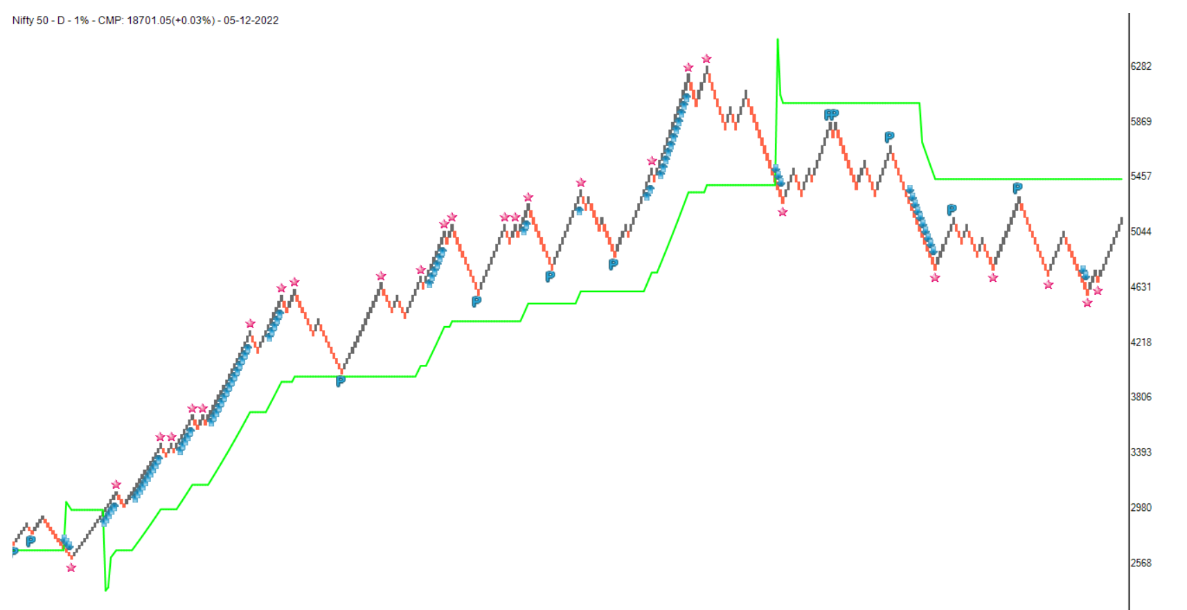
There are many indicators that can be plotted on different charting types such as candlestick Point & Figure, Renko etc. The formulas of the indicators are usually the same regardless of the charting method used. The input in a candlestick chart is the data of a candle. The input in Renko chart becomes the data of bricks and the input in P&F chart becomes the data of columns. In spite of the fact that the formula for the indicator remains the same, the nature of the indicator changes as a result of the change in input.
We can learn when a new 40-brick high or low is marked when we plot the Donchian channel on Renko charts. The disparity index is the distance between a moving average and the price. When the disparity index is high, it indicates that the current trend is a little stretched.
When the disparity index is at high in bar or candlestick chart, it can be followed by a consolidation. This will result in a reduced distance between the average line and the price. However, only corrective bricks can reduce disparity in Renko charts. That means the price has to be corrected. This makes the disparity index on the Renko chart very interesting.
On Renko charts, trend following indicators such as moving average and super trend are also very effective.
As I studied the indicators on the Renko charts, I discovered that they have many properties that can be used to generate a variety of indicators. The Renko chart divides the price data into a fixed number of boxes called bricks and plots them diagonally. I have created indicators such as Brick Zone using this property of the Renko charts. The brick zone indicator shows the strength and weakness of the trend. It works beautifully on Renko charts and provide us with significant information. How about plotting all these information together on a chart?
That can be helpful but the major problem occurs when an indicator whipsaws during sideways or consolidating markets. Although whipsaws cannot be completely eliminated from any indicator otherwise the market won't exist. However, we can reduce this pain.
Therefore, I believe we can let the indicator change its behavior based on price action data by using Renko chart properties. When the trend is clear, it is a little aggressive, and when it is sideways, it is a little slow. D SMART lines can be used in many ways to accomplish that.
When you plot a D Smart line on a Renko chart, you get a single line with some starts, arrows, and ‘P’ signals.
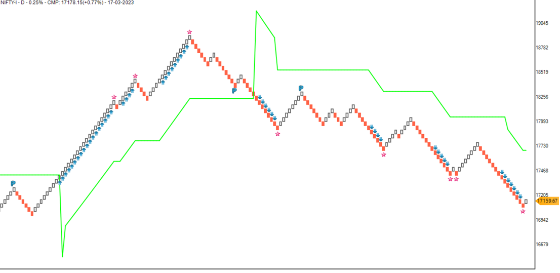
Renko bricks above the D Smart line indicate a strong bullish trend. Renko bricks below the D Smart line indicate a strong bearish trend. In addition to acting as a stop-loss line, it may also act as a trend-following line. In this case, the trend is not determined by the criteria assigned by the user; instead, it is determined by the nature of the swing move. In this manner, it can be viewed as a dynamic indicator.
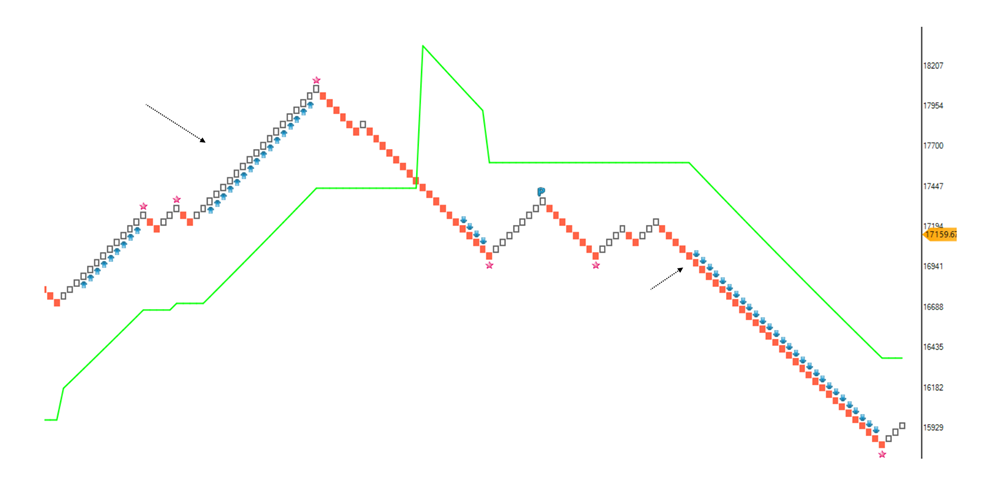
The bullish arrow will appear below the brick when the chart crosses above the significant high or the upper band of the donchian channel is rising. In the same way, when the lower band of the donchian channel falls, the bearish arrow will appear above the brick. As shown by the arrows, this is a continuation trade opportunity.
When there is a low-risk bullish pullback in the uptrend, the ‘P’ symbol will appear below the bearish brick after the next bullish brick shows up. In the downtrend, when there is a low-risk bearish pullback, the ‘P’ symbol will appear above the bullish brick when the next bearish brick occurs.
A bullish trade opportunity is when the ‘P’ appears above the D Smart line. D Smart line is a stop-loss line in that case. In the event that the ‘P’ appears below the D Smart line, a bearish trade opportunity with a stop-loss at the D Smart line appears.
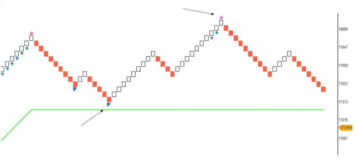
On Renko charts, the disparity index is a very useful indicator. The star will appear above the brick when the brick changes direction from up to down indicates exhaustion in the uptrend. The star will appear below the brick when the brick changes direction from up to down when the disparity index suggests exhaustion in the downtrend.
It is just an indication that exhaustion is causing the star to appear. After a star pattern, look for a major reversal. Keep an eye out for important support and resistance areas. It is also important to look at the breakout of a star pattern. Price rising above the star and above the brick is a bullish breakout and price falling below the bottom of the brick where star appeared is a bearish breakout.
There are more than seven indicators on the D Smart line, making it a very creative indicator.
As well as helping in risk management, this indicator identifies trends, rides them, identifies pullbacks in the direction of the trend, and indicates when there is a possible exhaustion of the trend.
Therefore, the D Smart indicator shows when there is a strong trend. It also shows when there is a pullback opportunity, when there is a continuation trade breakout opportunity, and when there is an exhaustion opportunity.
Version 2
This indicator was further explored with a new concept. When indicator line of any trend following indicator is very aggressive, it results in more number of trades there by reducing the productivity of trades. When it is too slow, it results in a lag. D Smart line addresses these issues in two ways.
Running Line and Walking Line
Another line is introduced in the D Smart line. Earlier line is a walking line and new line is a Running line.
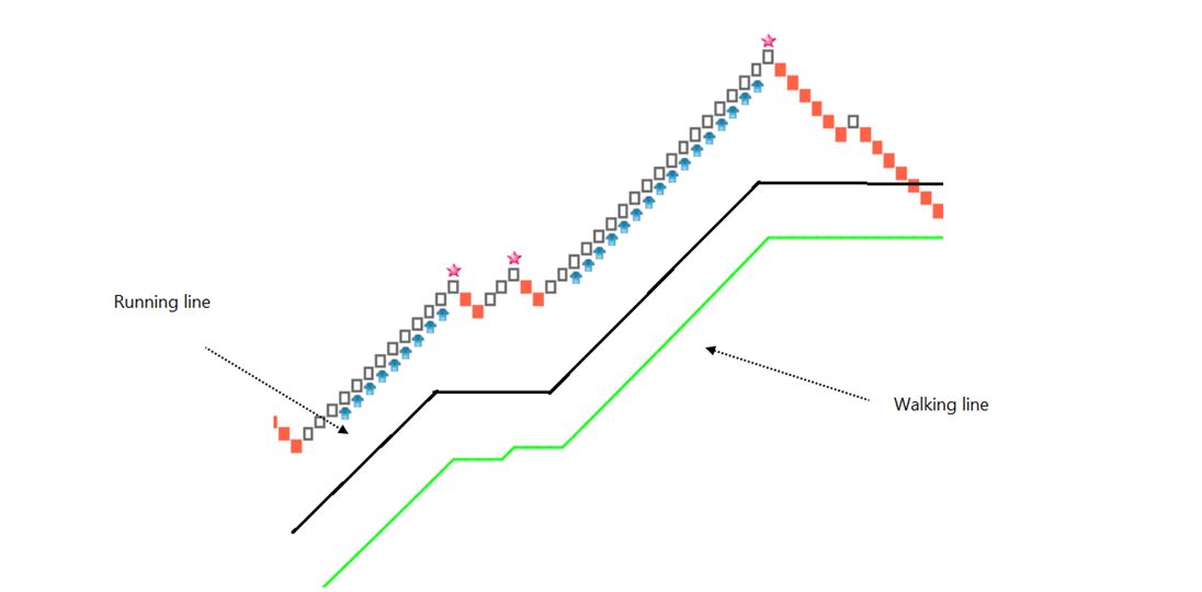
Walking line is a steady line that adjusted its pace based on the market situation but it is a relatively steady line. Running line is an aggressive line, it wants to change its direction early but that aggression is also controlled by market trends. The combination of Running line and Waling line creates a cloud.
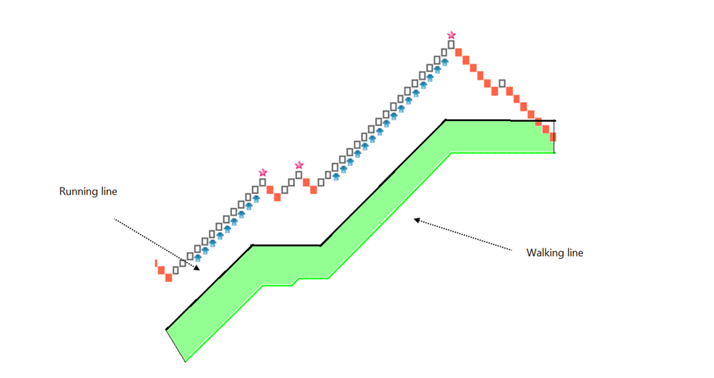
Instead of a signal line, there are two lines and a cloud on the chart in the new version of D Smart line. You have an option to select a single line or two lines.
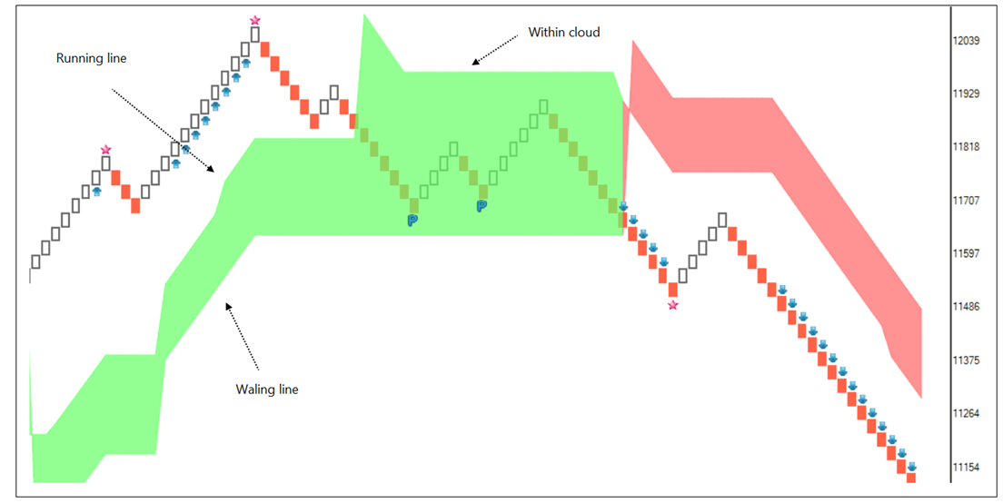
When price is above the walking line, the clouds are bullish. When price is below the walking line the clouds are bearish. Running line is an aggressive line it is an upper line of the bullish cloud and lower line of the bearish cloud. When price is above Walking line, but falls below the Running line, it enters the bullish cloud. When price is below the Walking line but goes above the Running line, it enters the bearish cloud. When price is above the bullish clouds, it indicates strong bullish trend.
Bullish patterns are nice trading opportunities in such cases. Likewise, when price is below the bearish cloud, it indicates strong bearish trends. Bearish patterns are trading opportunities. When price is within the clouds, it shows a possibility of consolidation or correction.
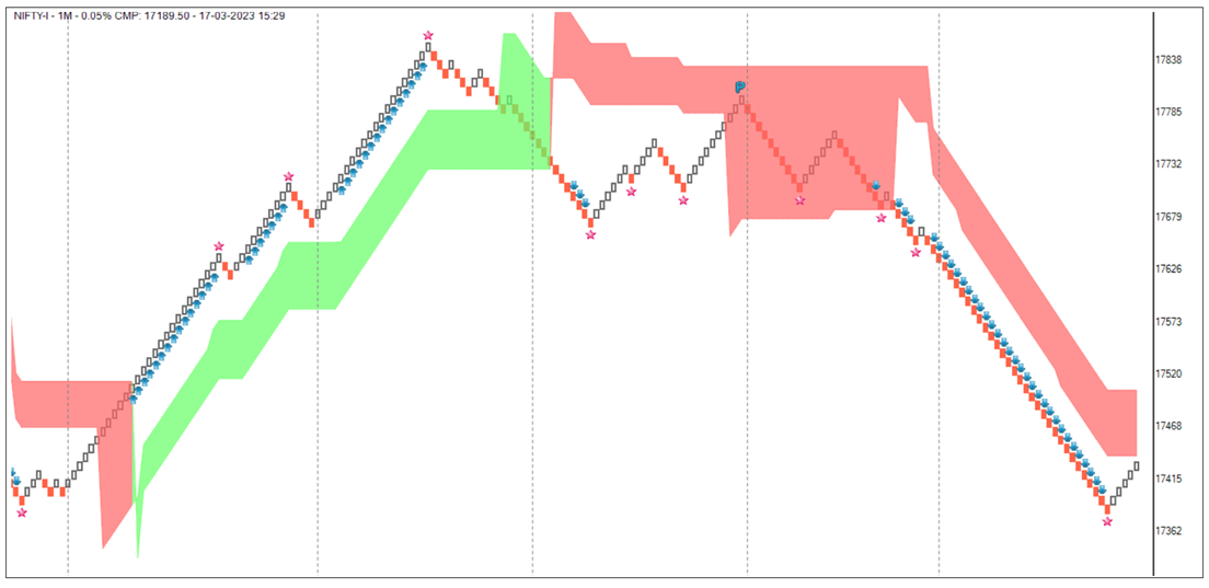
D Smart line on P&F charts
D Smart line is also plotted on P&F charts now. The concept remains same but formula are different. The construction is changed taking P&F chart properties into account.
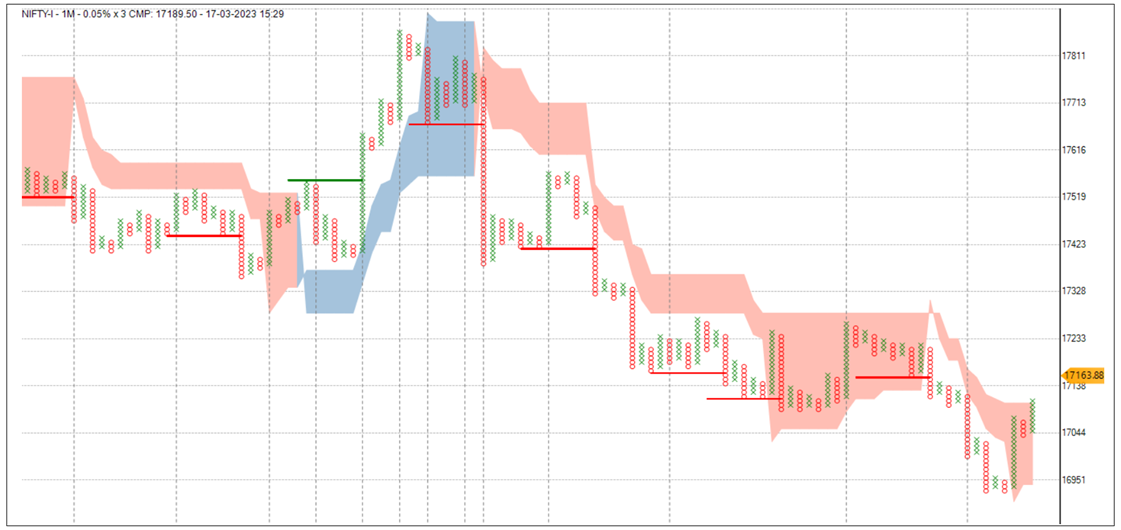
Instead of Donchian channel, bullish turtle breakout above the cloud and bearish turtle breakout below the cloud is plotted along with this indicator.
D Smart line on Candlestick charts
D Smart line is also plotted on candlestick charts now. The concept remains same but formula are different. The construction is changed taking candlestick chart properties into account.
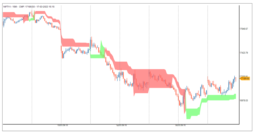
When price is outside cloud, breakout trade signals are more logical. When price is within the cloud, there is a possibility of sideways or a corrective trend.
To summarise,
The indicator table value in TradePoint & RZone also provides you with a list of all values of this indicator for any group of stocks. This will allow you to compare the readings of this indicator across different stocks.
This indicator is also available in the System Builder of RZone & TradePoint. Using the system builder, you can develop various strategies based on the different conditions already present in this indicator. Additionally, it can be used with other indicators or price patterns to develop effective trading strategies. For any group of stocks and market segments, you can scan and backtest stocks based on those strategies.
A new way to look at RSI.
RSI is a very popular strength and momentum indicator.
14 is a widely followed period for RSI. If you plot 14-period RSI, it calculates a ratio of bullish prices in the last 14 candles. As a result, a higher RSI indicates a higher ratio of average bullish prices.
Click here to know about how RSI indicator is calculated.
There are many ways to use the RSI indicator. RSI above 50, overbought-oversold zone, positive – negative divergences, RSI and signal line crossover etc.
How about reducing the noise of the RSI indicator?
See the chart. Move A is an uptrend. It’s a bullish swing.
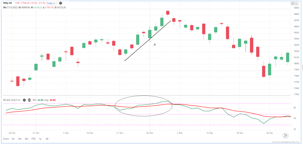
Instead of calculating RSI in every candle, how if we calculate it just once for the entire swing? Since the price is up only.
See move B in the below chart. It’s a bearish swing.
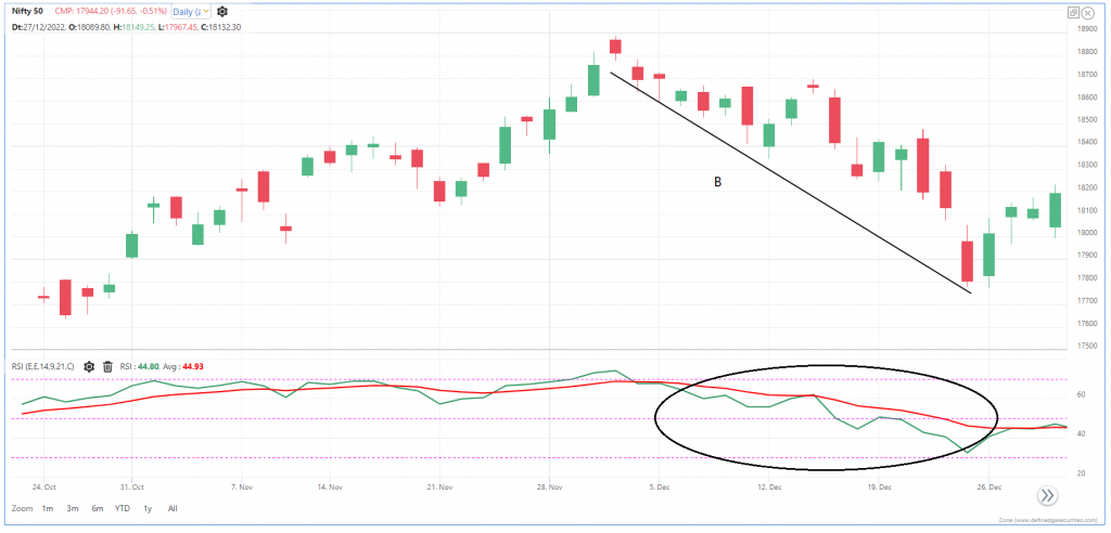
We can calculate one RSI for this swing.
The idea is to calculate RSI for the entire swing rather than for every candle.
This way, we can reduce the fluctuation in the RSI indicator and make it very productive.
We can easily achieve that using P&F charts.
P&F chart plots the entire swing as a column. Price will remain in column X as long as the trend is bullish. Price remains in column O if the trend is bearish.
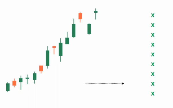
Therefore, a single column can have multiple sessions in it.
A column in the P&F chart represents one swing or one trend.
When we plot 14-period RSI on the P&F chart, it calculates RSI on the last 14 columns. That is, the last 14 swings, the last 14 trends. How many sessions? Price trends will decide that.
There will be a single RSI reading for the entire column – that means a single RSI for the entire trend.
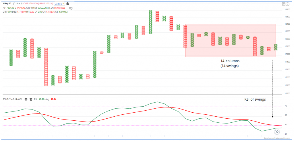
Have a look at the chart below for the same instrument (Nifty) and timeframe.
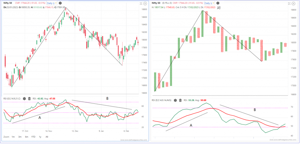
Observe the RSI on both charts.
RSI calculated on swings (P&F) eliminates the noise of the RSI indicator. Makes it smoother.
We can call it Noiseless RSI
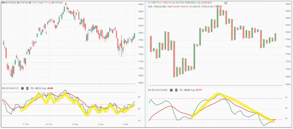
All methods of RSI indicator analysis can be applied to RSI on P&F charts as well.
This results in a different version of RSI. While the formula remains the same, the nature changes. RSI of swing instead of candles.
RSI above 50 can be a very effective bullish signal on P&F charts. Even if you know basic P&F signals, they can be filtered with RSI and many decent trading systems can be designed using a combination of them.
You can also use a combination of RSI on candlestick charts and RSI on P&F charts.
RSI is an example. You can remove the noise of any indicator by plotting it on the P&F chart. In that way, you can take advantage of the nature of P&F charting.
The concept is fascinating. If you spend some time thinking about this concept, you’ll realize how different and effective it is.