D Smart is an exceptional indicator in many ways. It is a chart specific indicator that started with plotting an indicator on the Renko chart.
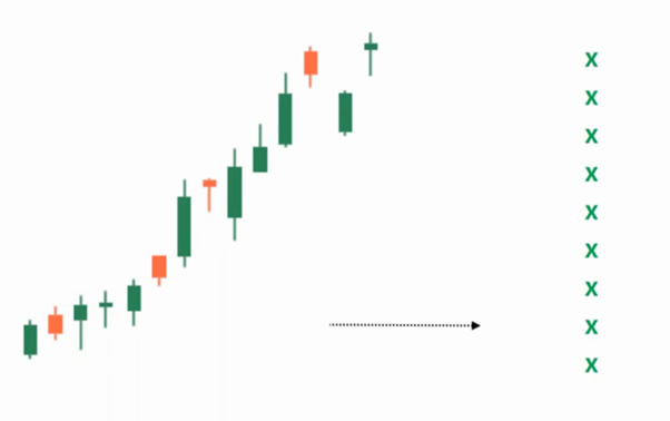
There are many indicators that can be plotted on different charting types such as candlestick Point & Figure, Renko etc. The formulas of the indicators are usually the same regardless of the charting method used. The input in a candlestick chart is the data of a candle. The input in Renko chart becomes the data of bricks and the input in P&F chart becomes the data of columns. In spite of the fact that the formula for the indicator remains the same, the nature of the indicator changes as a result of the change in input.
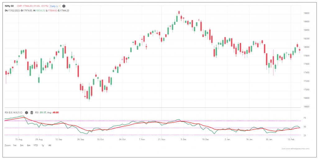
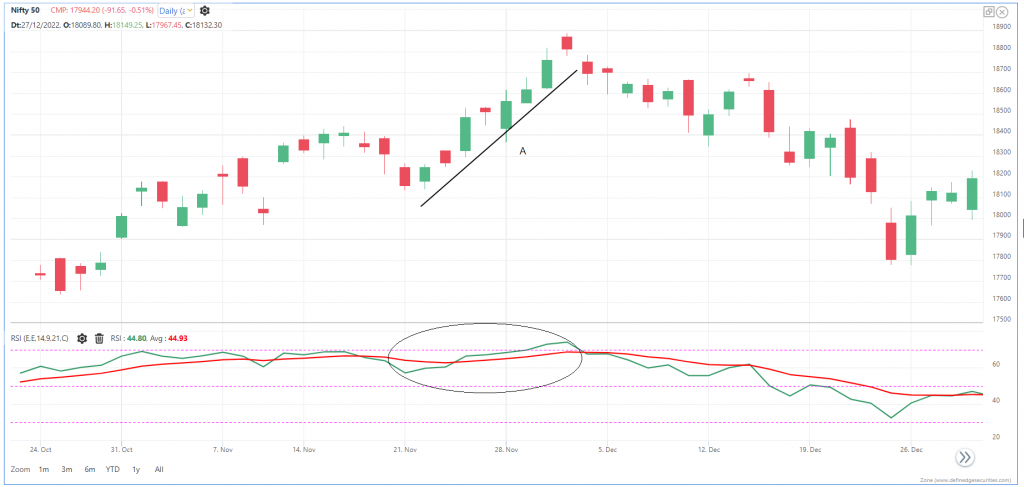
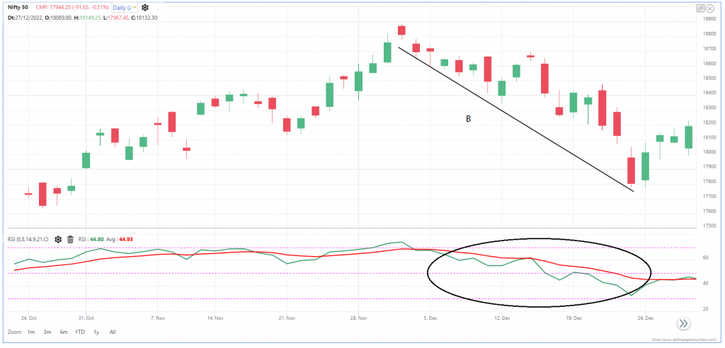
We can learn when a new 40-brick high or low is marked when we plot the Donchian channel on Renko charts. The disparity index is the distance between a moving average and the price. When the disparity index is high, it indicates that the current trend is a little stretched.
When the disparity index is at high in bar or candlestick chart, it can be followed by a consolidation. This will result in a reduced distance between the average line and the price. However, only corrective bricks can reduce disparity in Renko charts. That means the price has to be corrected. This makes the disparity index on the Renko chart very interesting.
On Renko charts, trend following indicators such as moving average and super trend are also very effective.
As I studied the indicators on the Renko charts, I discovered that they have many properties that can be used to generate a variety of indicators. The Renko chart divides the price data into a fixed number of boxes called bricks and plots them diagonally. I have created indicators such as Brick Zone using this property of the Renko charts. The brick zone indicator shows the strength and weakness of the trend. It works beautifully on Renko charts and provide us with significant information. How about plotting all these information together on a chart?
That can be helpful but the major problem occurs when an indicator whipsaws during sideways or consolidating markets. Although whipsaws cannot be completely eliminated from any indicator otherwise the market won't exist. However, we can reduce this pain.
Therefore, I believe we can let the indicator change its behavior based on price action data by using Renko chart properties. When the trend is clear, it is a little aggressive, and when it is sideways, it is a little slow. D SMART lines can be used in many ways to accomplish that.
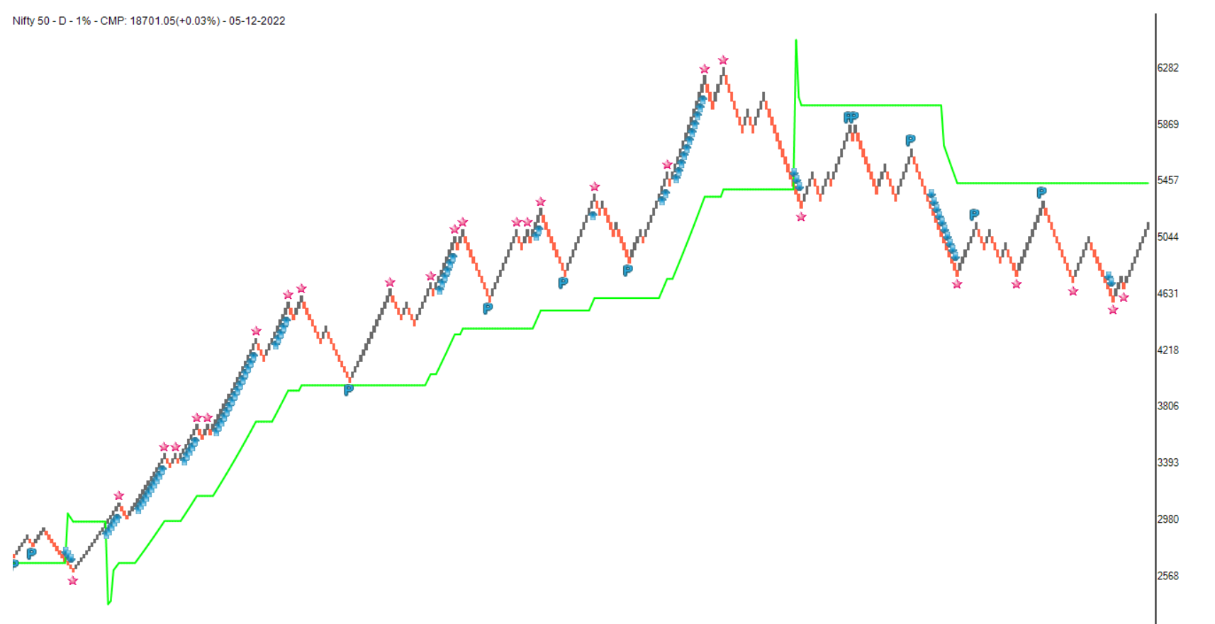
When you plot a D Smart line on a Renko chart, you get a single line with some starts, arrows, and ‘P’ signals.
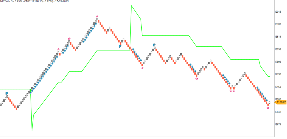
Renko bricks above the D Smart line indicate a strong bullish trend. Renko bricks below the D Smart line indicate a strong bearish trend. In addition to acting as a stop-loss line, it may also act as a trend-following line. In this case, the trend is not determined by the criteria assigned by the user; instead, it is determined by the nature of the swing move. In this manner, it can be viewed as a dynamic indicator.
The bullish arrow will appear below the brick when the chart crosses above the significant high or the upper band of the donchian channel is rising. In the same way, when the lower band of the donchian channel falls, the bearish arrow will appear above the brick. As shown by the arrows, this is a continuation trade opportunity.
When there is a low-risk bullish pullback in the uptrend, the ‘P’ symbol will appear below the bearish brick after the next bullish brick shows up. In the downtrend, when there is a low-risk bearish pullback, the ‘P’ symbol will appear above the bullish brick when the next bearish brick occurs.
A bullish trade opportunity is when the ‘P’ appears above the D Smart line. D Smart line is a stop-loss line in that case. In the event that the ‘P’ appears below the D Smart line, a bearish trade opportunity with a stop-loss at the D Smart line appears.
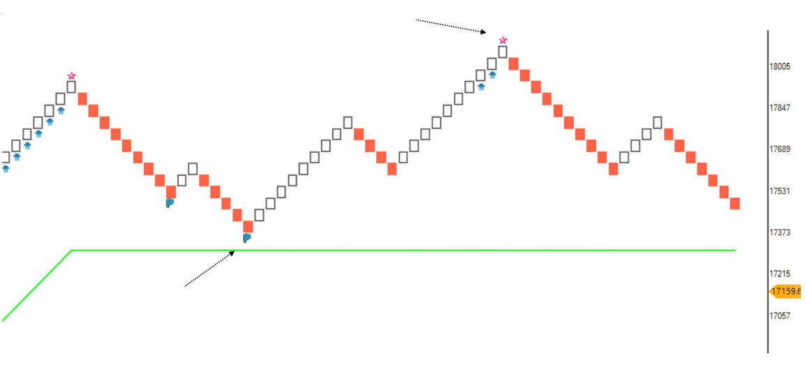
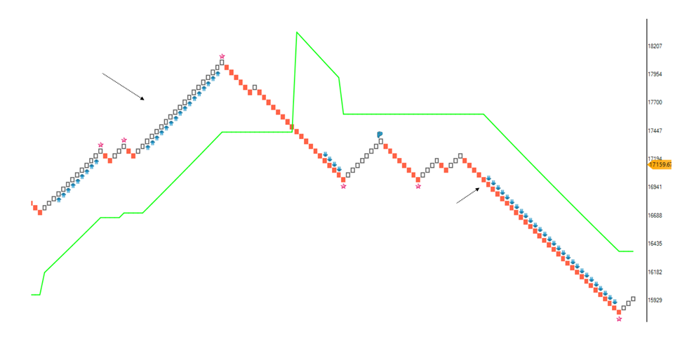
On Renko charts, the disparity index is a very useful indicator. The star will appear above the brick when the brick changes direction from up to down indicates exhaustion in the uptrend. The star will appear below the brick when the brick changes direction from up to down when the disparity index suggests exhaustion in the downtrend.
It is just an indication that exhaustion is causing the star to appear. After a star pattern, look for a major reversal. Keep an eye out for important support and resistance areas. It is also important to look at the breakout of a star pattern. Price rising above the star and above the brick is a bullish breakout and price falling below the bottom of the brick where star appeared is a bearish breakout.
There are more than seven indicators on the D Smart line, making it a very creative indicator.
As well as helping in risk management, this indicator identifies trends, rides them, identifies pullbacks in the direction of the trend, and indicates when there is a possible exhaustion of the trend.
Therefore, the D Smart indicator shows when there is a strong trend. It also shows when there is a pullback opportunity, when there is a continuation trade breakout opportunity, and when there is an exhaustion opportunity.
Version 2
This indicator was further explored with a new concept. When indicator line of any trend following indicator is very aggressive, it results in more number of trades there by reducing the productivity of trades. When it is too slow, it results in a lag. D Smart line addresses these issues in two ways.
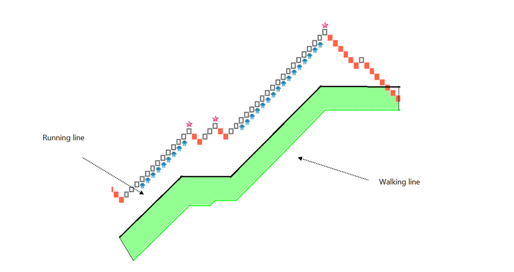
Running Line and Walking Line
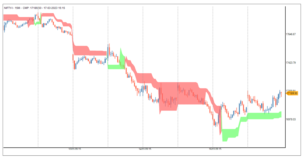
Another line is introduced in the D Smart line. Earlier line is a walking line and new line is a Running line.
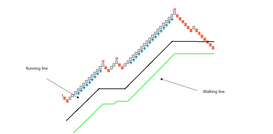
Walking line is a steady line that adjusted its pace based on the market situation but it is a relatively steady line. Running line is an aggressive line, it wants to change its direction early but that aggression is also controlled by market trends. The combination of Running line and Waling line creates a cloud.
Instead of a signal line, there are two lines and a cloud on the chart in the new version of D Smart line. You have an option to select a single line or two lines.
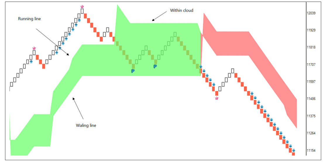
When price is above the walking line, the clouds are bullish. When price is below the walking line the clouds are bearish. Running line is an aggressive line it is an upper line of the bullish cloud and lower line of the bearish cloud. When price is above Walking line, but falls below the Running line, it enters the bullish cloud. When price is below the Walking line but goes above the Running line, it enters the bearish cloud. When price is above the bullish clouds, it indicates strong bullish trend.
Bullish patterns are nice trading opportunities in such cases. Likewise, when price is below the bearish cloud, it indicates strong bearish trends. Bearish patterns are trading opportunities. When price is within the clouds, it shows a possibility of consolidation or correction.
D Smart line on P&F charts
D Smart line is also plotted on P&F charts now. The concept remains same but formula are different. The construction is changed taking P&F chart properties into account.
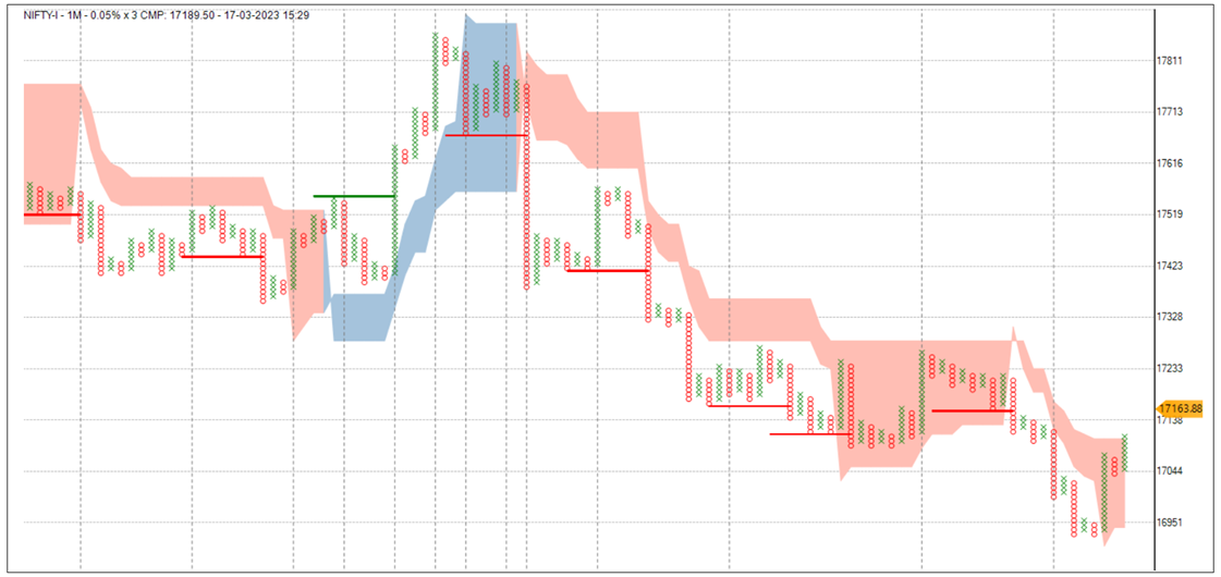
Instead of Donchian channel, bullish turtle breakout above the cloud and bearish turtle breakout below the cloud is plotted along with this indicator.
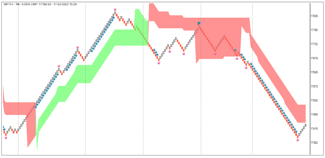
D Smart line on Candlestick charts
D Smart line is also plotted on candlestick charts now. The concept remains same but formula are different. The construction is changed taking candlestick chart properties into account.
When price is outside cloud, breakout trade signals are more logical. When price is within the cloud, there is a possibility of sideways or a corrective trend.
To summarise,
- Trend is bullish when the cloud is bullish, trend is bearish when the cloud is bearish
- Pullbacks (P) offer affordable risk trade opportunities in the direction of the trend. Star is an indication of exhaustion.
- Arrows or turtle breakouts can help in pyramiding (Adding to the positions)
- Identifying strong trends is the purpose of the D Smart clouds. When prices are outside bullish clouds, bullish breakout patterns are effective, and when prices are below the clouds, bullish breakout patterns are effective.
- Price within the cloud indicates the possibility of consolidation or correction
- When the distance between the running line and the walking line is large (the cloud size is large), this indicates a major consolidation area.
The indicator table value in TradePoint & RZone also provides you with a list of all values of this indicator for any group of stocks. This will allow you to compare the readings of this indicator across different stocks.
This indicator is also available in the System Builder of RZone & TradePoint. Using the system builder, you can develop various strategies based on the different conditions already present in this indicator. Additionally, it can be used with other indicators or price patterns to develop effective trading strategies. For any group of stocks and market segments, you can scan and backtest stocks based on those strategies.