Q&A Thread: Donchian Channel
-
Hello everyone!
This is a Q&A thread about the Donchian Channel indicator. Let’s discuss the Donchian Channel indicator in this thread.
Donchian channels were invented by Richard Donchian.
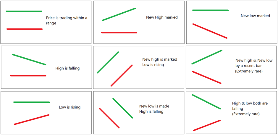
You will see three lines on the chart when you plot Donchian indicator on the chart. Upper band, middle band, and lower band. Default parameter is 20.
• The highest high of the last 20 bars is the upper band.
• The lowest low of the last 20 bars is the lower band.
• The average of both is the middle band. (Upper band + lower band) / 2So, if today’s high is a new 20-day high, you will see the upper band rising.
If today’s low is a new 20-day low, you will see the lower band is falling.So, on a given bar - there are below mentioned possibilities for both the bands:
I have explained this indicator in detail in the following links.
Video link
https://www.youtube.com/watch?v=oVej2hWWqPQ&t=405sWriteup on Donchian channel indicator
https://shelf.definedgesecurities.com/indicators-simplified/channel-indicators-simplified/donchian-channels/Rising bands are bullish, falling bands are bearish. Higher distance between bands indicates higher range and lower distance indicates convergence.
Let’s discuss this indicator in this post. You are welcome to ask questions about the indicator. I will share my learnings and experiences, and I will attempt to add more information. You can also share your observations and learnings related to this indicator.
Could you also try answering the following questions?
- What does it mean when the upper band is falling and the lower band is rising on the candlestick chart?
- What does it mean when the distance between the donchian channel bands is reducing on the Renko chart?
- What does it mean when Donchian channel bands are expanding on candlestick charts?
- 20-period on the candlestick chart means 20-day high. What does it show when we plot the 20-period Donchian channel on the Renko chart?
It is okay if your answers are incorrect. Try doing it. We are here to discuss and learn from each other.
-
- Gap between 20 day high low is reducing and consolidating, formation of nr4 and nr7 may be there. May be volatility about to expand
- Depends on brick size, short term long consolidation. Not sure
- Range expansion, high volatility, w7 formations
- 20 brick high and 20 brick low
-
1.Range shrinking (Lower High Higher low )
2.Consolidation
3.Brodaning pattern
4.20 Brick High & Low -
- The range is shrinking similar to triangle formation , inside bars formation.
2.Consolidation in a tight range
3.high volatility. Broadening patterns. - Last 20 brick Price high low
- The range is shrinking similar to triangle formation , inside bars formation.
-
@Sumit Badwani Correct. Check 2nd and 3rd point.
-
@RAGUNATH_AG Correct. Check 3rd point.
-
@Ravi Shinde Correct. Check 3rd point.
-
-
Converging pattern. Price or time consolidation pattern.
-
Price consolidation pattern.
-
Big Range candle. It is interesting to note that this pattern is not possible on P&F or Renko charts with Donchian channels.
-
20-brick high and 20-brick low. Not a 20-period high - low. A single brick can have multiple sessions or multiple sessions can have a single brick.
-
-
Think:
-
Can we use the 240-period Donchian channel to scan stocks for a 240-day high?
-
What is the bullish and bearish zone in the Donchian channel?
-
If we look for an upper band Donchian channel breakout on the Renko chart, is it similar to a multi-brick high pattern?
-
-
- Yes
- Above the Middle band below the upper band called bullish zone vice versa.
- Yes
-
- No, it will be around 50 wk high as it would consider trading days only excluding holidays
- Bullish is over upper band and bearish below lower band
3.yes, as we are using in DON 28 brick high
-
- no, 240 PERIOD means 240 bricks
- Price is in bullish zone if Both Bands are Rising and Price remains above the middle band. Exact Opposite for Bearish Zone.
- Upper Band Breakout will not be exactly similar to a Multi brick High more of a bear trap. For multi brick high precondition is flat bands.
-
- No. The price can be anywhere between the upper and lower bands. Not necessarily showing 240 day high at the last candle.
- Price is bullish if it is above middle band and vice versa.
- No as it will be a breakout above mentioned no of bricks which can be below previous top.
-
Q - What does it mean when the upper band is falling and the lower band is rising on the candlestick chart?
A - Low RisingQ - What does it mean when the distance between the Donchian channel bands is reduced on the Renko chart?
A - Range ContractionQ - What does it mean when Donchian channel bands are expanding on candlestick charts?
A - Range ExpansionQ - 20-period on the candlestick chart means 20-day high. What does it show when we plot the 20-period Donchian channel on the Renko chart?
A - Does not make any difference as RENKO has nothing to do with time; price is only the factor where the Brick is painted. -
One question regarding the parameter of DON 28; why 28 was chosen and when is the option or the asset more effective;
a) price range break from FLAT DONCHAIN Bands?
b) price falling and then after that when we see the upper band rising and then the breakout of that in price?
c) trending price and then we see the breakout of the Upper Band?
d) A new low is marked in price and the upper band is flat and then we see the price breaking the upper band?If the logic behind and concept is made clear then I guess taking trades would be more effective as option pricing is more dicey and not like any other asset.
kindly share your experience in trading with the Donchain (DON Strategy) and your input on which scenario is much better to trade.
RST666
-
@RAGUNATH_AG Wonderful
-
Very nice.
- That's why I said 240-period. Trading holidays are fine. You can use 260 period Donchian channel. If you want to scan stocks at 52-week high, you can plot 52-period Donchian channel on Weekly candlestick chart. Stock is making a 52-week high when the 52-period Donchian channel is rising on the weekly chart.
-
- My question was on candlestick chart. Sorry, I did not mention it.
- Nice. Breakout after flat bands can be a multi-brick pattern breakout, right?
-
- Right. When 240-period Donchian channel is rising, that means price is making 240-period high. So, Donchian channels cannel can be used for identifying stocks for that condition.
- Right, breakout can be below previous top, but when upper band starts rising after flat bands, it is a kind of multi-brick formation.
-
Answers:
- Can we use the 240-period Donchian channel to scan stocks for a 240-day high?
Yes. When the upper band rises, the stock is making a 240-day high.
- What is the bullish and bearish zone in the Donchian channel?
Price above the middle band is a bullish zone and price below the middle band is a bearish zone. If it’s a 20-day Donchian channel, the middle band is the average of high and low of the last 20 bars. It is like a moving average.
When price is between a moving average and a 20-day high, it’s a bullish zone. When price is between a moving average and a 20-day low, it’s a bearish zone. It is my theory and I think it is logical.
- If we look for an upper band Donchian channel breakout on the Renko chart, is it similar to a multi-brick high pattern?
Yes, it is. When a 20-brick Donchian channel is rising for the first time, it is like a multi-brick breakout pattern. Bricks may not be at a similar level, and it is not necessarily a 20-brick pattern always but it is a multi-brick breakout pattern when a Donchian channel rises for the first time after being flat.
-
@Rahulsinh G. Thakore
Great.- Low rising and high is falling.
- There is a significant difference. Price is at a 20-brick high, not 20-day high.
-
Let’s not focus only on that strategy otherwise this will become a discussion about strategy.
However, understand that Donchian channels are very useful on Renko chart. The whole logic and dynamics of the indicator changes when we plot it on the Renko chart.
Renko bricks divide price into fixed size boxes (bricks). 20-brick high shows that price is at high of last fixed size 20 boxes. 20 is taken for example. It can be 28 or 40 or any other number.
Answer to your queries:
a) price range break from FLAT DONCHAIN Bands?
Breakout after flat Donchian bands shows Price Consolidation Pattern breakout. Remember, there is no time involved in the Renko charts, hence it is a price consolidation breakout pattern. This element makes the pattern completely different from that plotted on the candlestick charts.
b) price falling and then after that when we see the upper band rising and then the breakout of that in price?
Yes. It shows new bullish range breakout. It is like a bullish reversal breakout.
c) trending price and then we see the breakout of the Upper Band?
Good question. It is a continuation breakout. Price is in an uptrend, new highs are being formed and there is another breakout after a shallow retracement.
d) A new low is marked in price and the upper band is flat and then we see the price breaking the upper band?
The pattern is similar to a bear trap or a bullish reversal pattern.
You can read reversal and continuation patterns on the Renko chart when you follow the Donchian channel breakout pattern.
-
Now when you know and read about the Donchain channel indicator. Check Donchian channel indicator columns in the Indicator digger.
Observe, Band difference, Middle Band Change percentage, Trend of bands and Price position columns.
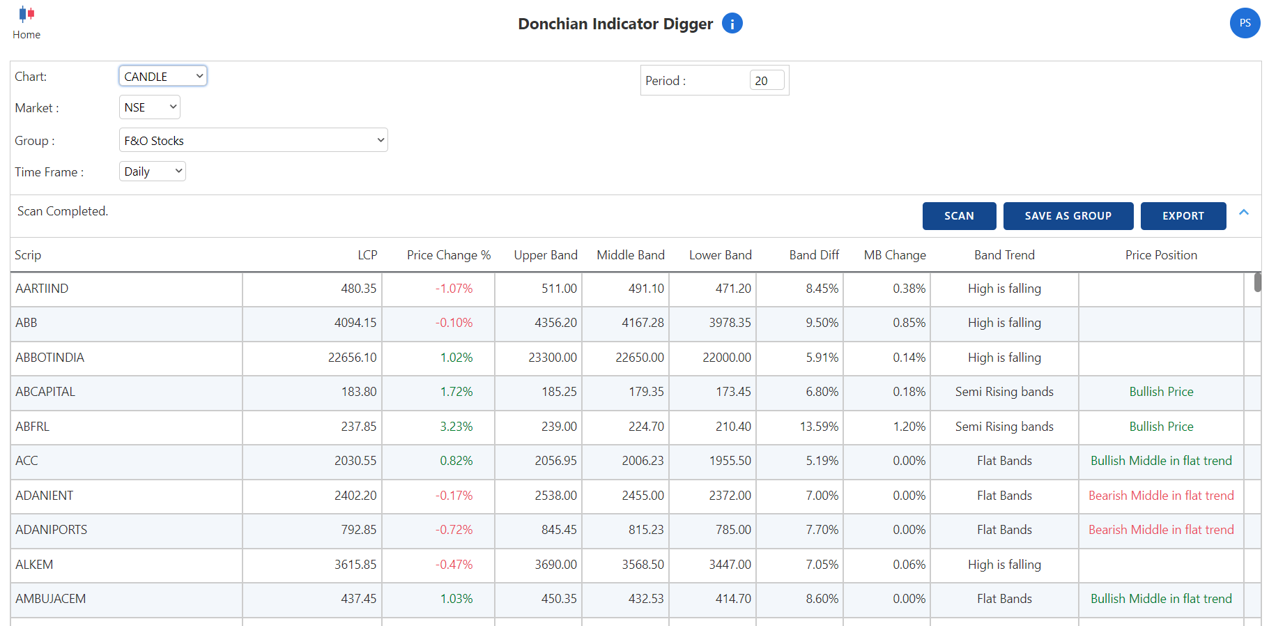
When band difference is high, the range is far. When band difference is low, it is a tight range scenario. When the middle band is rising, the trend is strong.
-
thanks for enlightening me on the indicator and good explanation, I will follow this and dig deep into it.
god bless you -
@Rahulsinh G. Thakore Thanks. I am going to add some more points in this thread.
-
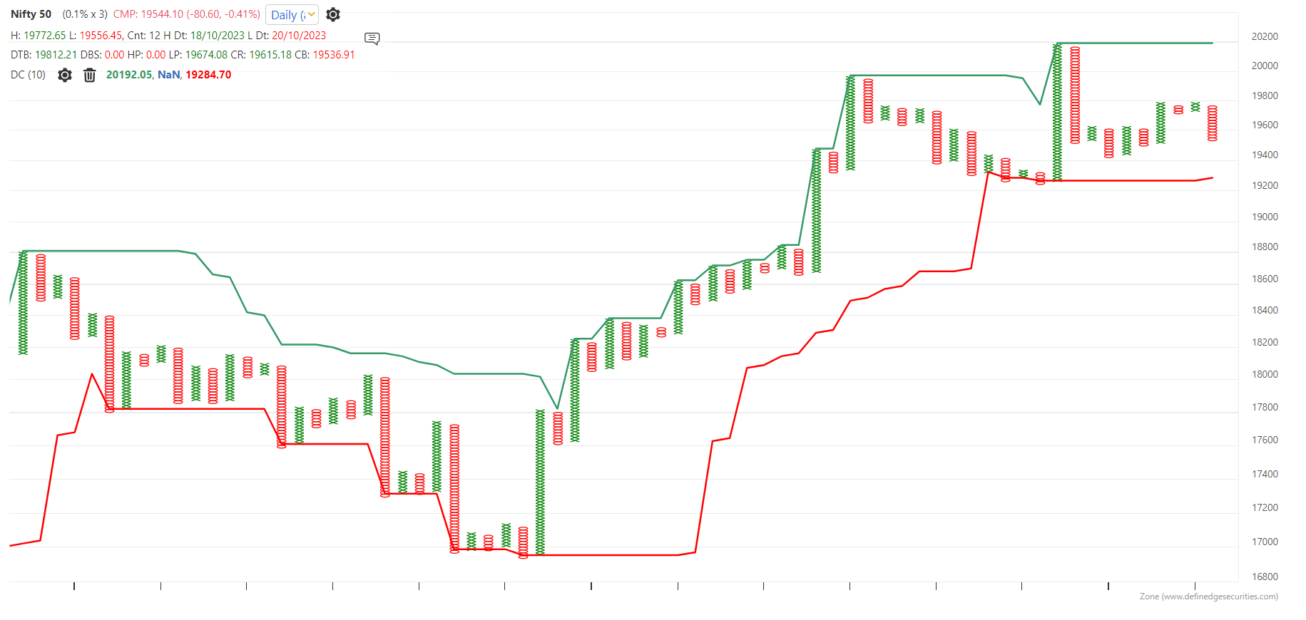
Donchian channel is a price-based indicator
The Donchian channel bands are price-based indicators. The upper band represents the higher range of the pattern, while the lower band represents the lower range.
The width and behaviour of the pattern shows the range pattern during the selected period.
Observe this image again. Plot the Donchian channel on the chart and observe the pattern based on these images.When bands are rising, price remains in a bullish zone. It is a strong trending and strong momentum scenario.
When bands are narrow, it is a tight range consolidation. When bands are narrow on the Renko or P&F charts, it is a price squeeze pattern. -
Donchian Channel on P&F chart
Some people asked that we explained a strategy using Donchian channel on Renko chart. Does it not workable on P&F charts?
As I always say, the nature of the indicator changes along with the charting method.
With P&F charts, it is plotted on the columns. Each column represents a price swing.
Have a look at below chart with 10-column Donchian channel plotted on the P&F chart.
Rising upper band (10-column) in case of P&F chart shows that the current swing is higher than the previous 10 swings.
Those who know about turtle pattern, do you find it similar to that pattern?
Have a look at the below chart. A bullish 10-column turtle breakout pattern is shown with a blue horizontal line.
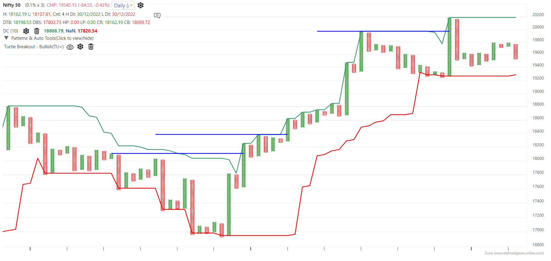
Whenever the Donchian upper band rises after consolidation, it is a bullish turtle breakout pattern. Continuously rising upper band shows continuation breakouts.
Therefore, Donchian bands on P&F is a running turtle pattern bands.
The behaviour of the Bands shows a swing range pattern. Observe wide width, narrow width, and tight consolidation.
-
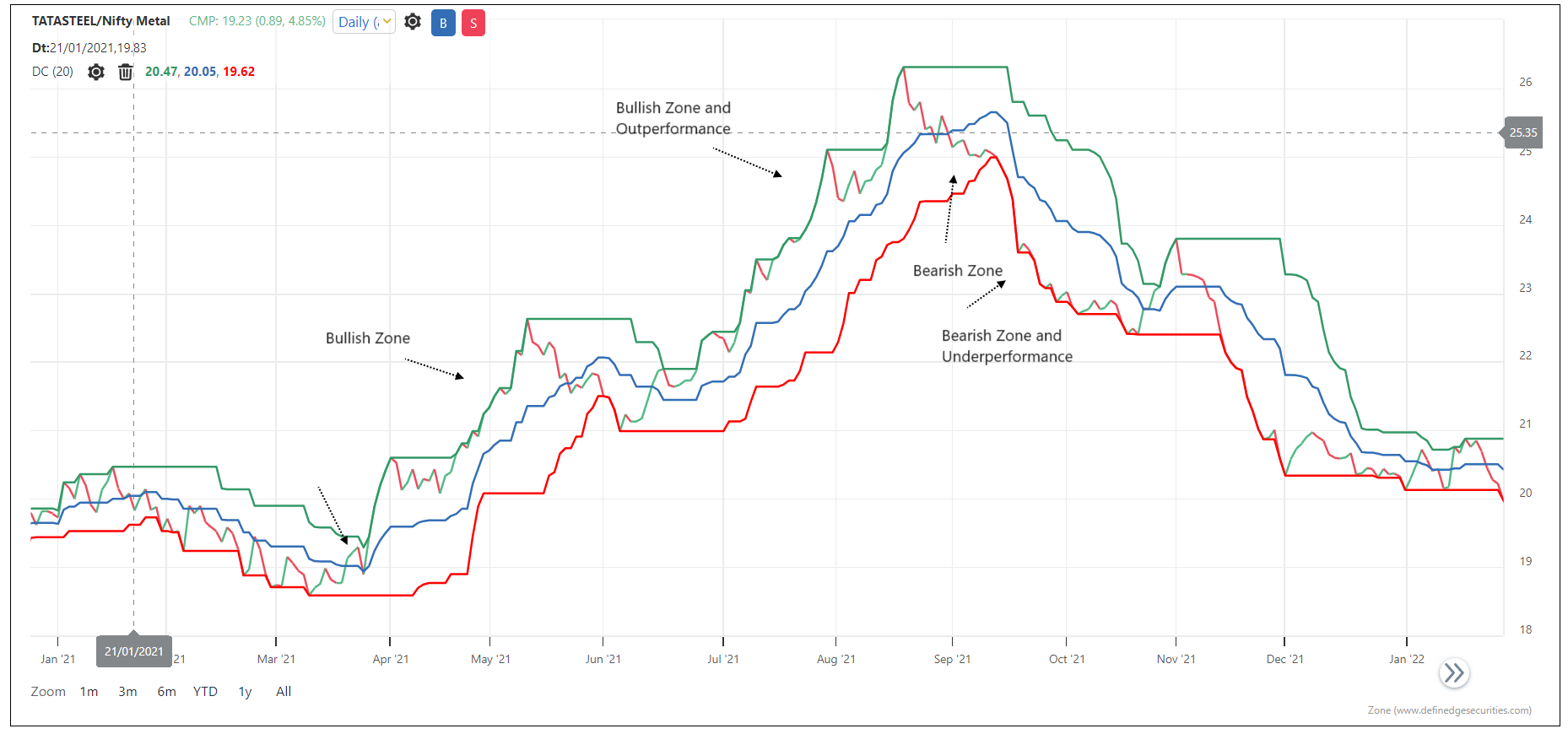
Donchian Channel and Relative Strength
Ratio charts are plotted using two instruments. Ratio chart rises when numerator is outperforming denominator and it falls when numerator is underperforming.
What does the Donchian channel show on the Ratio chart?
-
Flat bands will show that both numerator and denominator are equally performing or underperforming
Rising bands- numerator is outperforming
Falling bands- denominator is outperforming -
When the upper band is rising, numerator is outperforming the denominator. When the lower band is falling, the numerator is underperforming the denominator. When the ratio chart is moving between the flat bands , it means that the relative performance is at par.
-
Does plotting on PF charts has any specific use i any strategy or scanner?
-
@Sumit Badwani Very nice. Perfect

-
@Ravi Shinde Wonderful. Perfect
-
So, you can apply the Donchian channel to Ratio, P&F RS or Renko RS charts as well.
Rising donchian channel after flat bands indicates a breakout in the relative strength chart meaning numerator has started outperforming the denominator. Rising bands show that Numerator is an outperformer.
The rising bands on a relative strength chart and a price chart is a perfect setup for identifying outperformers.
-
@Sumit Badwani
All methods of reading the Donchian channel are applicable to P&F charts as well. Remember, the channels are plotted on swings. Rising upper bands show the breakout. Rising upper and lower bands show that swing lows are also increasing.A rising upper band (bullish) or a falling lower band (bearish) can be scanned.
You can also check the indicator digger of Donchian channel on P&F chart.
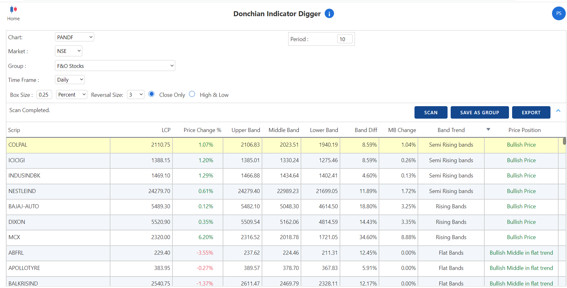
As mentioned earlier, the Donchian channel is a running turtle indicator. When you analyze the difference between bands (height of the band), the status of the band and the middle band ratio, you can get a better understanding of the swing range pattern.
Band trend is an important reading.
-
@Prashant-Shah thanks for the inputs, as you mentioned the Donchain is applicable in all types of charting methods, can we build the scanner in RENKO RS to see if the asset has given a trend confirmation on either side if so yes then can you show the same in RZONE (Snapshot) and how more reliable or powerful would be the trend as per your experience.
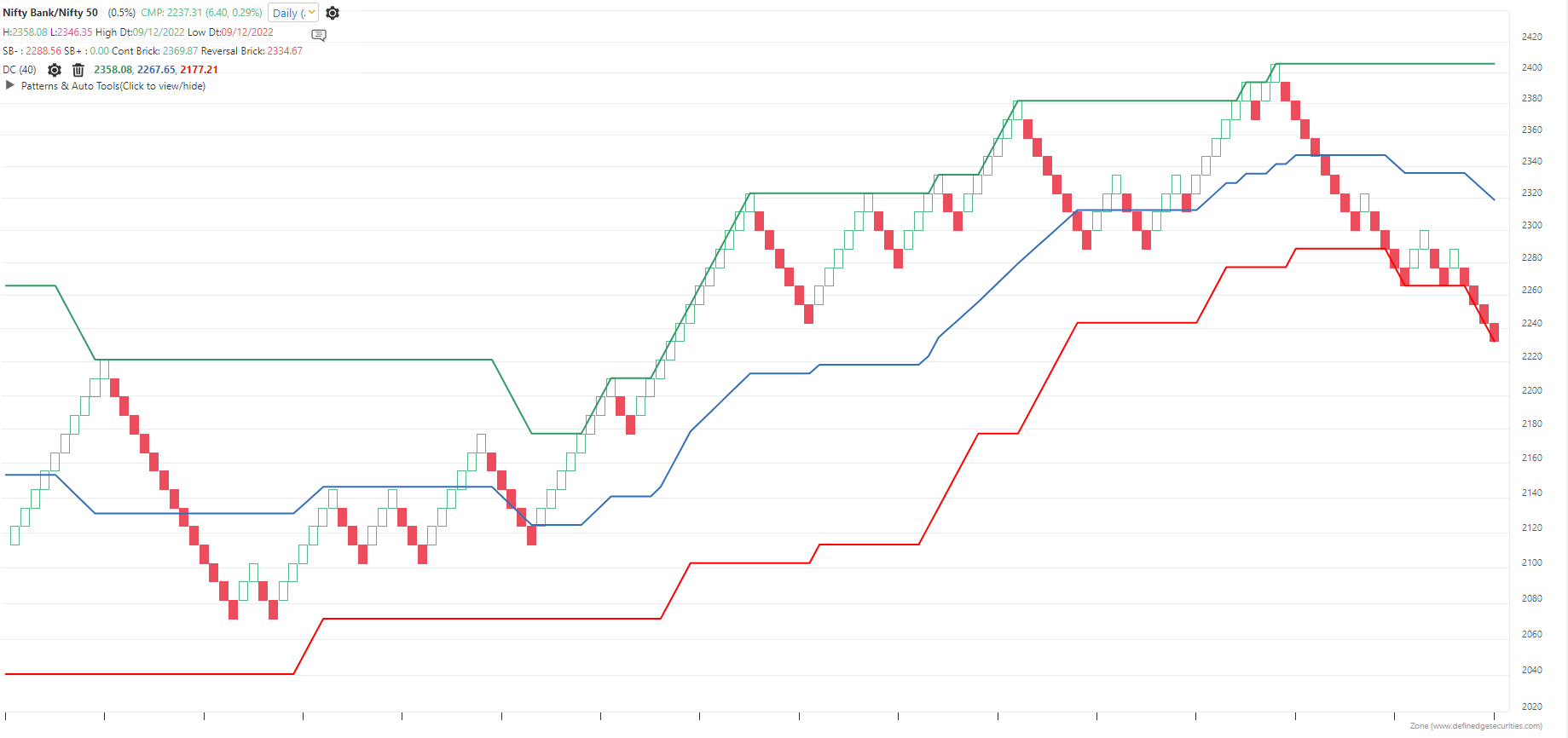
for example this is BNF / NF renko, as we see the BNF is underperforming and given a bearish breakout on Renko RS, but if the Breadth is OS here then will this breakout work or it will fail ?
-
This post is deleted!
-
@Rahulsinh G. Thakore Yes, you can use Donchian on Renko RS as well. Donchian channel has been discussed on Renko charts as well as on RS charts. Combine them and develop the observations on Renko RS charts.
On Renko RS, rising Donchian indicators indicate bullish outperformance and falling bands indicate underperformance.
Breadth will help you decide what not to do.
-
do we have PNF RS or RENKO RS breakout scanner or we need system builder
-
@Rahulsinh G. Thakore Yes, P&F RS and Renko RS scanners are available in TradePoint and RZone. Trading systems that you have created for P&F or Renko charts can also be applied to P&F and Renko RS charts.
-
@Sumit Badwani said in Q&A Thread: Donchian Channel:
No, it will be around 50 wk high as it would consider trading days only excluding holidays
Bullish is over upper band and bearish below lower band
3.yes, as we are using in DON 28 brick high -
Donchian channel and Bollinger band seems to be similar? Is there any gross difference between the two. Please enlighten.
-
Ans:
- Stock is making lower high and higher lows = consolidating or side ways
- Stock is consolidating or sideways
- volatility is very high
- on renko chart it will show recent 20 bricks high