@Anuj Mehta
Hi Sir,
You can create this condition using the System Builder and RS Scanner feature.
Go to System Builder → from the dropdown select Ratio → click on Create System Builder → then click Add → Indicator → select Supertrend → set Expression = 1 and save it.
After that, go to RS Scanner → Ratio Scanner. In the Conditions dropdown, select MY, and then apply the Supertrend condition you created.
You can then run the scan, and it will filter stocks based on your required RS Supertrend bullish crossover condition.
Hope this helps.
N
Nishant Bhandari
Pro User
All Replies
-
-
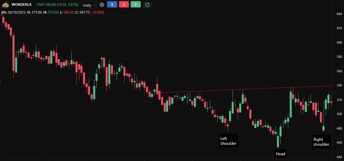
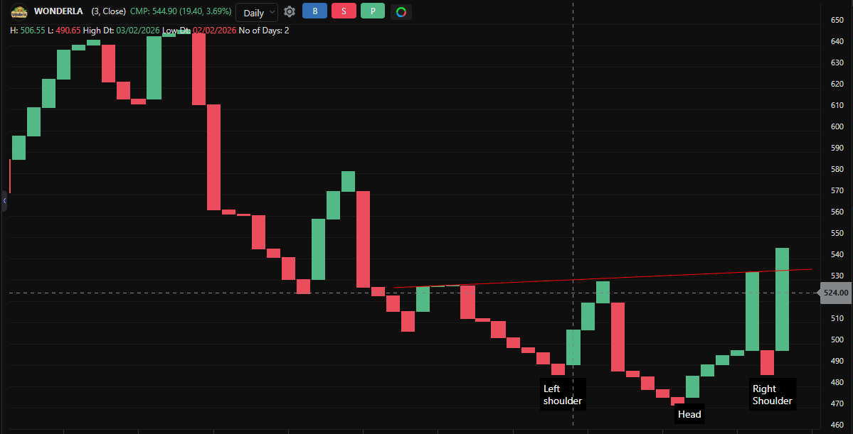
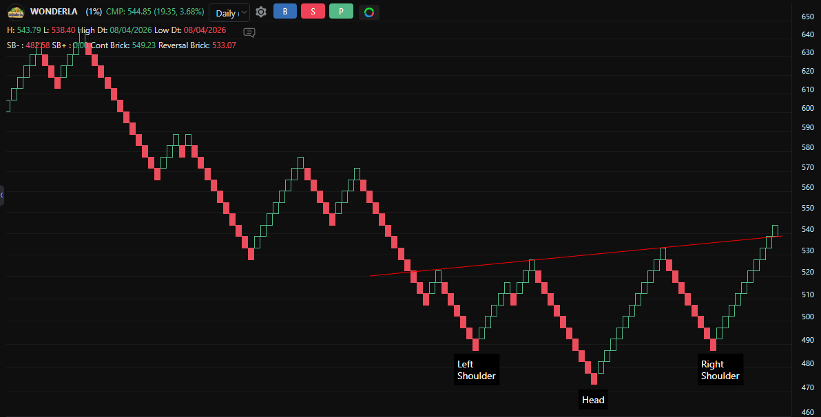
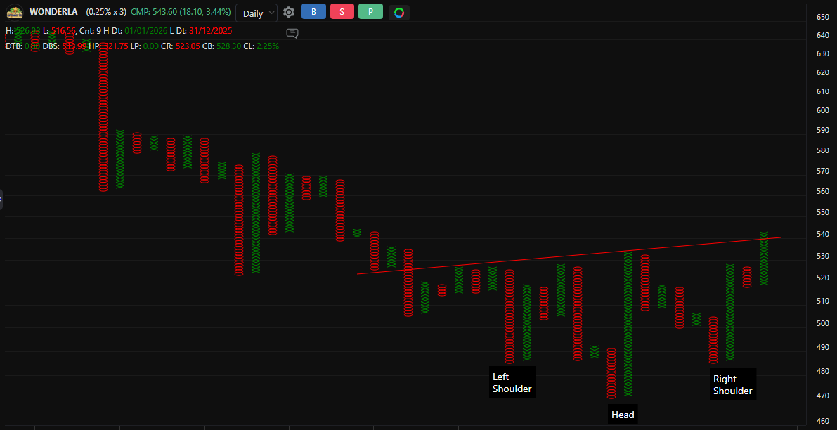
This comparison highlights how different charting methods Line Break, Point & Figure, Candlestick, and Renko can still reveal the same underlying market structure.
In this case, an Inverted Head & Shoulders pattern appears consistently across all four charts at a similar price level.
Despite differences in how price is plotted (time-based vs. price-based), the core price action remains the same.
-
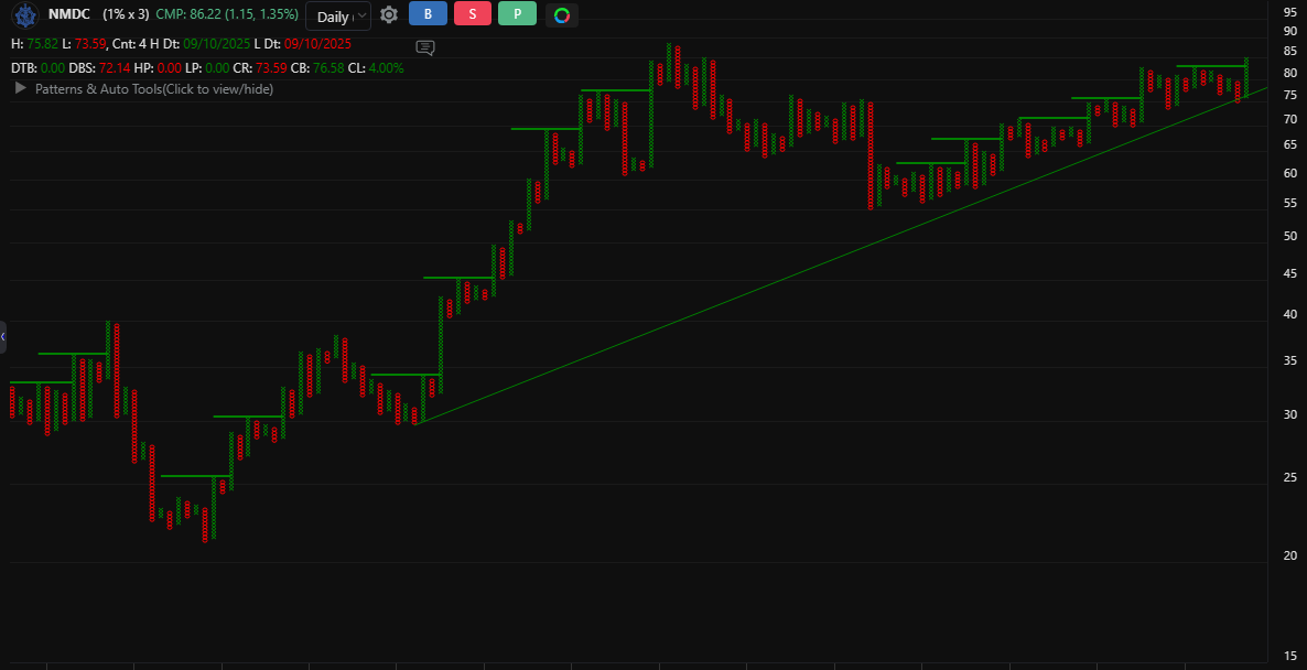
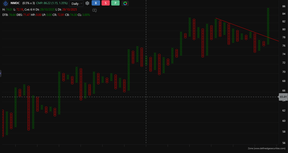
Looking at NMDC across multiple Point & Figure (P&F) timeframes, the picture becomes clear.
Higher box size shows a Turtle Breakout, while lower box sizes show rising support with higher lows, along with a 45° diagonal breakout, a simple structure of support holding and then breakout.
On the 0.5% chart, the structure is strong, but a large anchor column of X is visible. Entering here may not offer a favorable risk-reward, so it’s better to wait for a follow-through buy signal.
When a stock looks good on all timeframes, it means the trend is aligned and more reliable, not just a short-term move.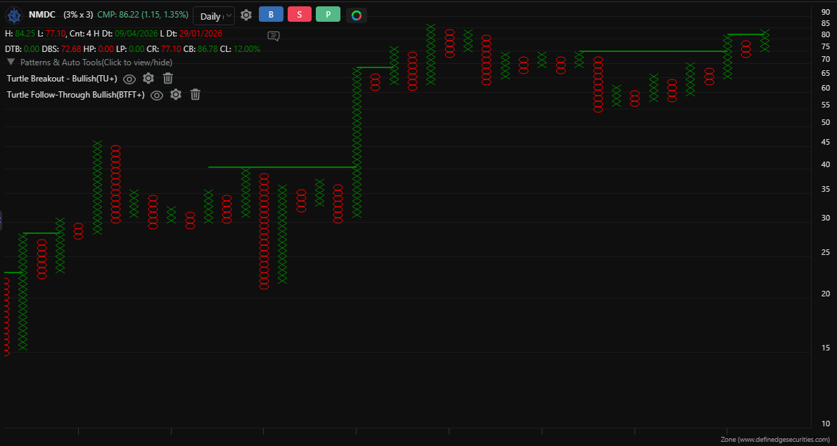
-
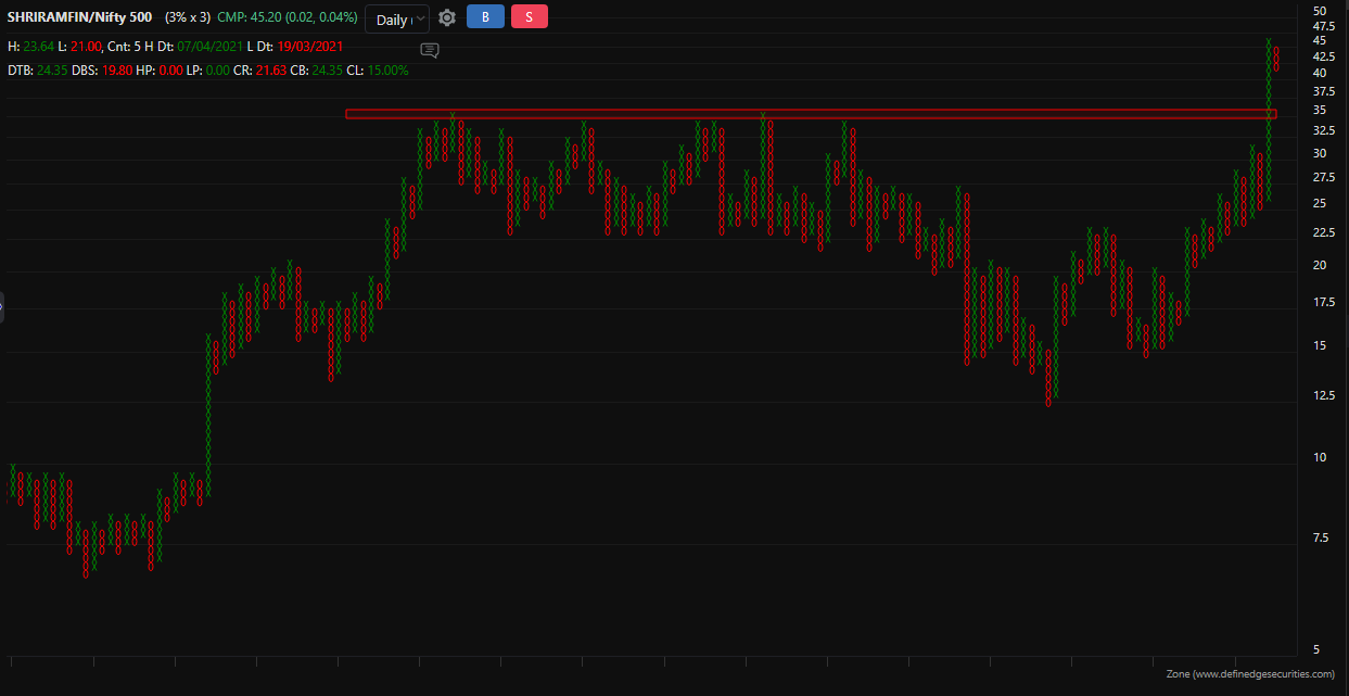
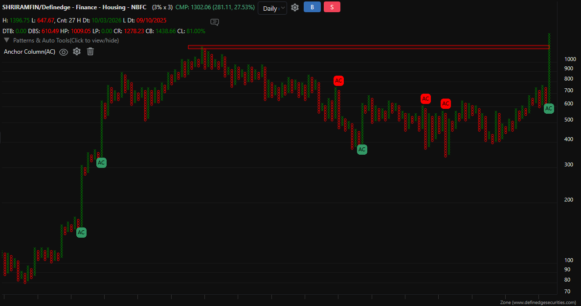
Sharing a view on Shriram Finance through Relative Strength (RS) Point & Figure charts.
Both ratios Shriram Finance vs Nifty 500 and Shriram Finance vs Definedge Finance, Housing, NBFC index are showing a breakout on the 3x3 P&F chart, which is generally considered a long-term structure.This indicates that the stock has been strengthening relative to both the broader market and its sector. At the same time, the current move looks a bit stretched, so some consolidation or retracement in the short term could be possible, while the broader structure remains intact.
If the breakout sustains, it may continue to reflect relative strength. However, if it fails and moves back into the previous zone, the stock could start moving more in line with the indices or may even underperform.
Just sharing an observation from the charts for discussion and learning purposes.
-
Re: Chart of the Day
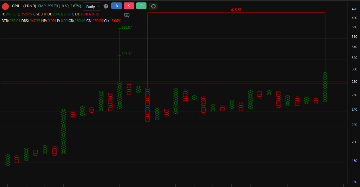
The structure shows signs of base formation. Using Point & Figure (P&F) counts, the chart is analyzed through both horizontal and vertical methods. The vertical count helps in understanding the strength of the move, while the horizontal count reflects the extent of the base formation — together highlighting important price zones where activity can be observed. Overall, this approach helps in studying price structure in a simple way while staying flexible with how the price evolves.
-
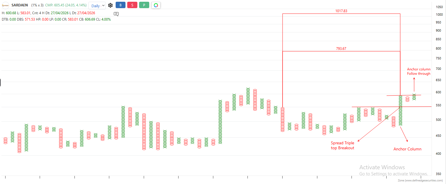
Looking at Sarda Energy on the Point & Figure (1x3) chart, the stock is currently consolidating after a strong uptrend and forming a healthy base.
An anchor column is visible, followed by a follow-through breakout, showing continued strength. The chart has also formed a spread pattern breakout, which is a 7-column structure — the 3rd column falls short, the 5th and 7th columns form at similar levels, and the final column gives the breakout, showing gradual accumulation before the move.
Horizontal counts have also been plotted, which give an idea of the possible zones where the move can extend.
Overall, the structure shows base building followed by a breakout, which can be watched going forward.
If the pattern continues, strength may sustain. However, if the price closes below the anchor column, it may indicate weakness and the trend could change.
Sharing this as a chart-based observation for learning and discussion.
Relative Strength Scanner on Candlesticks Chart
Understanding Multi-Chart Confluence
NMDC: Strength Across Timeframes
Shriram Finance: Relative Strength Breakout on Long-Term Charts
P&F Analysis: Horizontal & Vertical Counts
Sarda Energy: Base Formation with Spread Pattern Breakout